Showing posts with label travel. Show all posts

Saturday, March 30, 2024

49 and Market - Wherever

Hello, hello! Have you been on a big trip lately? How about a road trip near or far? Maybe a local adventure with the kiddos? If yes, the 49 and Market - Wherever collection in the Scrap Shotz shop is for you! So many opportunities to use the collection for memory keeping. 

I received the 49 and Market - Wherever 12x12 Collection Pack, Chipboard Set, Ephemera Bits, Laser Cut Elements and Rub-on Transfers 6x12 Ride in my Scrap Shotz happy mail the other day and have been in my scrappy space creating since. 

Peek A Boo 

For my first layout, I used a folded design to peek a boo the amazing Rub-on Transfers in the background. 

I took a 12x12 pattern and folded it back at an angle. Then cut off the excess of the folded over section at the same angle as the fold to show off both the folded and background pattern. For this one, I wanted a different pattern on the fold so also adhered another pattern on top of the fold for the colour combo I was looking for. 

Before adhering my folded paper combo down onto the white cardstock, I used a bunch of the Wherever Rub-on Transfers to create a messy pattern down the middle of the page so it looked like it was peeking out behind the fold. These Rub-ons are such high quality you can over lap them to make a really great look. I also added some black splatters using watered down Tonic - Nuvo Crystal Drops, Black Ebony and a paint brush, and a few with some Ranger Ink - Distress Oxide, Dried Marigold. 

Once the background splatters dried, I adhered my folded pattern paper down on the right to create that peek a boo with the Rub-ons. From there, I added my photos down the fold (after adding a pattern layer or two behind each). Then it was all about tucking embellishments from the Wherever Chipboard, Ephemera and Laser Cut Elements.  


Large Photo Feature 

For my second layout I reached for this large 8x8 photo of standing stones in Scotland we had the chance to see on our hike of the Arran Coastal Way. When you experience something this amazing you make it the focal point of your layout!  

I started with the 12x12 pattern paper called Trek as my background - adding  some black splatters using watered down Tonic - Nuvo Crystal Drops, Black Ebony and a paint brush, and some repeated Vicki Boutin stamps with Paper Rose Studio Premium Dye Ink, Intense Black above and below where the photo would sit. 

Then, I added a couple of patterns behind the photo to bring some dimension and contrast. I used a Wherever Rub-on Transfers to add the title ‘love this place’ directly on the photo (a little nerve racking but totally worth it - the rub-ons transfer adhered beautifully!) 


With such a large photo and a great pattern background, I didn’t have to do anything more but add a few embellishments. I added a cluster of florals and leaves to the top left and bottom right of the photo using a combo of the Chipboard, Ephemera and Laser Cut Elements. A couple of the chipboard circles worked for a title. 

Monochromatic 

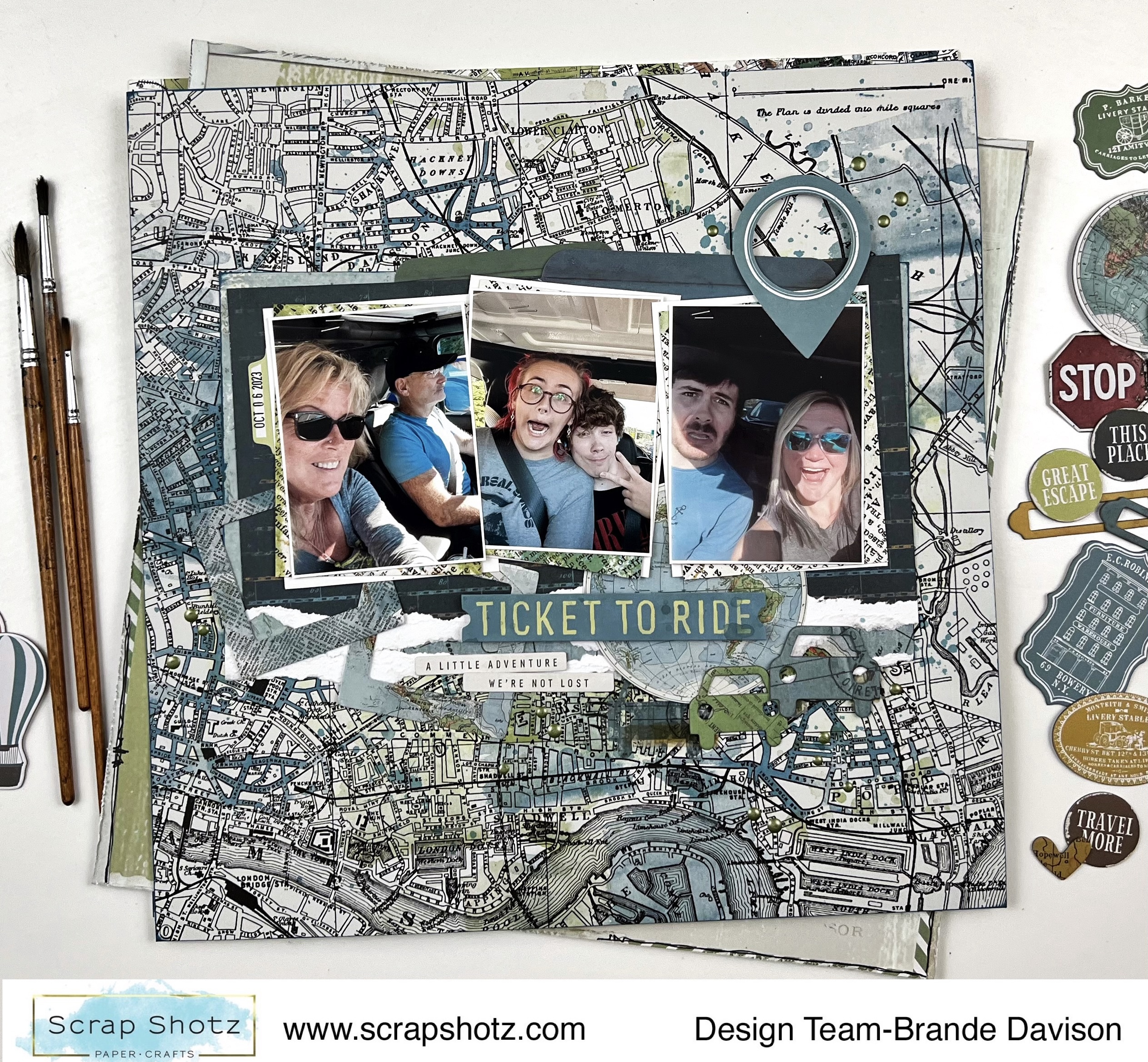
The next layout I worked on was all about the blues with a touch of green in the collection. The colour scheme was inspired by the background paper called Outlook - love that city map pattern! 


First, I prepped the Outlook pattern with some watered down Ranger Ink - Distress Oxide, Bundled Sage applied with an Inky Roller focusing the colour in the upper middle of the page as an anchor my photo cluster. I added a few splatters in the ink as well. 

Once that dried, I added my photo cluster on top of a  bunch of the blue patterns in the collection - letting some of that green ink I added show around the edges. 

Then I riffled through the Chipboards, Ephemera and Laser Cut Elements to find the blue and a few green ones to tuck around my photos. I loved the little cars so added those on the right (we are on a road trip!) and thought the little photo frames tucked to the left were cute too.


Such fun with this collection! I am off the play some more - should be able to share some more Wherever layouts in a couple days! 

If you are playing with these goodies too - we would love to see! Pop up a photo on the Facebook Scrap Shotz Paper Crafting Group.  


Saturday, November 25, 2023

Travel Memories with Mintay Papers

Have you had the chance to get your scrappy hands on a Mintay Papers collections lately? Wow, they are amazing! I am playing with the Mintay Papers, Places We Go collection Scrap Shotz sent me and loving it! 

Let’s show off the Mintay Papers goodness here a little and see how long it takes you to pop over to the Scrap Shotz shop for some Mintay of your own.

Use Circles to Create Focus

Right out of the package, I was drawn to this fantastic brick wall background first – does it have anything to do with my father being a bricklayer? Maybe. I knew with such a bold background I would have to create a design that helped bring focus to my photos. This is where circles can do the work for you.

I cut 4 large circle outlines about 10 inches wide, 2 in white to pop a little and 2 in another pattern from the collection. I placed these centre stage on the page, then used the circles not only to bring focus to the centre where my photos would be but also as an anchor. Any other embellishments, photos, etc. could all be placed along the circle.

I focused on a large photo with a smaller to compliment. I backed both in white to match the white circle, added a few layers of coordinator pattern paper behind and popped them up on foam dots. From there I add a few die cuts to the left and the right of the photos. Inspired by the circles, I tucked in that fantastic chippies globe on the left. For balance I added a couple of chippies words on the right as my title. 

Finally for the ‘design rule of three’ I added a small die cut with chippies cluster at the top right. 

To finish it off I added made some “enamel dots” using Nuvo Crystal Drops. HOW TO: a tiny little drop from the bottle on the page. When it looks like a soft ice cream cone shape do not worry. Gently pick up the page and flick the underside where the dot is with your finger – it will flatten out. The bigger the dot you drop then flick, the larger your “enamel dot” will be. Do I have Nuvo Crystal Drops in EVERY colour for this reason, oh yes I do.

Use Triangles to Create Focus

Another design I go for quite often to create focus is a triangle.

HOW TO: Simply take a background paper and cut it into a large triangle. Then you either put it on the top of the page to point down to your photos OR on the bottom to point up to your photos. Often I will use the ‘from the top’ look when it’s a picture of people, but the ‘from the bottom’ when its landscape, hiking, mountains, etc. I also usually cover the point of the triangle, sometimes make it a little off centre and use a multi layered triangle to show off more patterns. Also, if you have a really busy background paper a plainer patterned triangle can calm down the page (like I did here) OR if you have a really plain background and busy pattern triangle can add some pizazz!

For my background, I reached for that amazing floral pattern which is a little busy so I created my triangles use the simpler patterns in the collection. The point is a little off centre and I used 2 layers – seems I was looking for anyway to use that brick wall paper again. 

Once the triangle was on the page, I added my photo first backed with white paper then some patterns from the collection and popped up on foam dots. Then it was just a matter of tucking and layering the die cuts from the collection to the left and right of the photo, and I dropped in a few of the chipboards as well. Similar to the page above, I added some Nuvo Crystal Drop “enamel dots”. Voila.

I will be back to share a few more pages from this collection! If you want to see these and the additional pages I am finishing off on my scrappy desk come to life, we will be featuring some Reels on the Scrap Shotz Instagram.

Thanks for popping by … see you over in the Mintay Papers section of the shop ;)


Wednesday, October 4, 2023

Simple Stories Here and There Layouts

Hello! Today I have two scrapbook layouts featuring the Simple Stories "Here and There" Collection.

If you did any traveling recently, this will be the collection for you! The main colours are dark blue, dark orange and pink. They really make light and bright pictures jump off the page. The shop has the kit and many embellishments available.


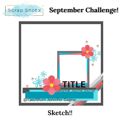
The first layout was inspired by the September challenge sketch in the Scrap Shotz Facebook group. I tend to have a hard time leaving white space on a page so this sketch was good for forcing me to use only one corner of the paper. 

To start, I double matted my photo. Then I cut some strips of paper and used a cardstock sticker for the strips at the bottom. The diagonal paper came in the kit but I added a piece of ribbon for dimension. The flowers are fussy cut from one of the papers. The rest of the embellishments are chipboard stickers or cardstock stickers. The final touch was to use a white pen to journal and then splatter some gesso.


My next layout was built around the title. I used my Silhouette Cameo to weld together the letters from the font. I backed each letter with a different colour from the striped paper in the kit. It always takes me so long to do but it was worth it. This page has more cardstock stickers for embellishments. I kind of cheated with the photo matting and just put strips of paper down the sides of the photos. Overall, I'm glad I got three more large pictures from our Wisconsin Dells trip on a layout!

That's all for today. Have fun scrapping!

Monday, September 11, 2023

49 and Market for Travel Memories


Hi y’all! Brande here sharing some travel memory projects brought to you by the amazing inventory of 49 & Market goodies in the Scrap Shotz shop! 

I used the Vintage Artistry Everywhere collection as my go to kit for these pages adding in some goodies from the Vintage Bits and Essentials collections too. 

Loving the Film Strips 


I love the film strips that 49 & Market have designed! I find myself designing a page then before adhering everything down I decide to also tuck a few film strips in behind and it’s next level! That’s what happened for this one. 

I started with the pattern paper and added a bunch of the messy rub ons, some splatters and a cluster of photos with a few embellishments was almost where I stopped .. then the film strips happened! One of each colour which then inspired the little circle chipboard embellishments to finish it off. Next level from my original vision. 

Words for the Win 


The Vintage Artistry Everywhere Rub-Ons come with a sheet of the most fantastic travel / adventure / explore the world words. I used a bunch of them to frame my layout! I tried to make a few a little off the page and a few fully on the page - sort of mimicking a pattern paper look. 

Then I added some splatters and a stencil pattern with Tim Holtz Distress Ink in Unchartered Mariner. I used this colour to also inspire the embellishments - adding mostly blue touches here and there, and of course more of those amazing film strips! 

Forced Perspective 
 

For this layout I was inspired by the geo tags in the 49 & Market goodies. I love that they point to where you were, where you want to go a map .. or in this case, where the eye should focus on a layout. I cut the black/white pattern paper on this layout  to mimic the bottom of the geo tag that is sitting there all pretty in the middle of the page. 

From there, I created a cluster of small and even smaller photos, added some embellishments to connect all the photos and a few circles cut with the 49 & Market pattern papers. I repeat stamped the word happy over and over in black and coordinating Distress Inks (worn lipstick, twisted citron) behind the photo cluster. 

If you had the pleasure of seeing the Scrap Shotz crew at the Scrapbook Carnival in Edmonton and Calgary this year you may have seen these layouts on display.  

Thanks for swinging by! 


Wednesday, September 15, 2021

P13 Summer Vibes


Not sure about you, but I am not ready to say goodbye to summer just yet. So I am extending the season by focusing only on summer themed scrapbook supplies while in my crafty space, such as P13 Summer Vibes collection. Documenting some of my favourite summer memories with these happy supplies keeps the sunshine around a little longer! 

Layout One - Hello World 

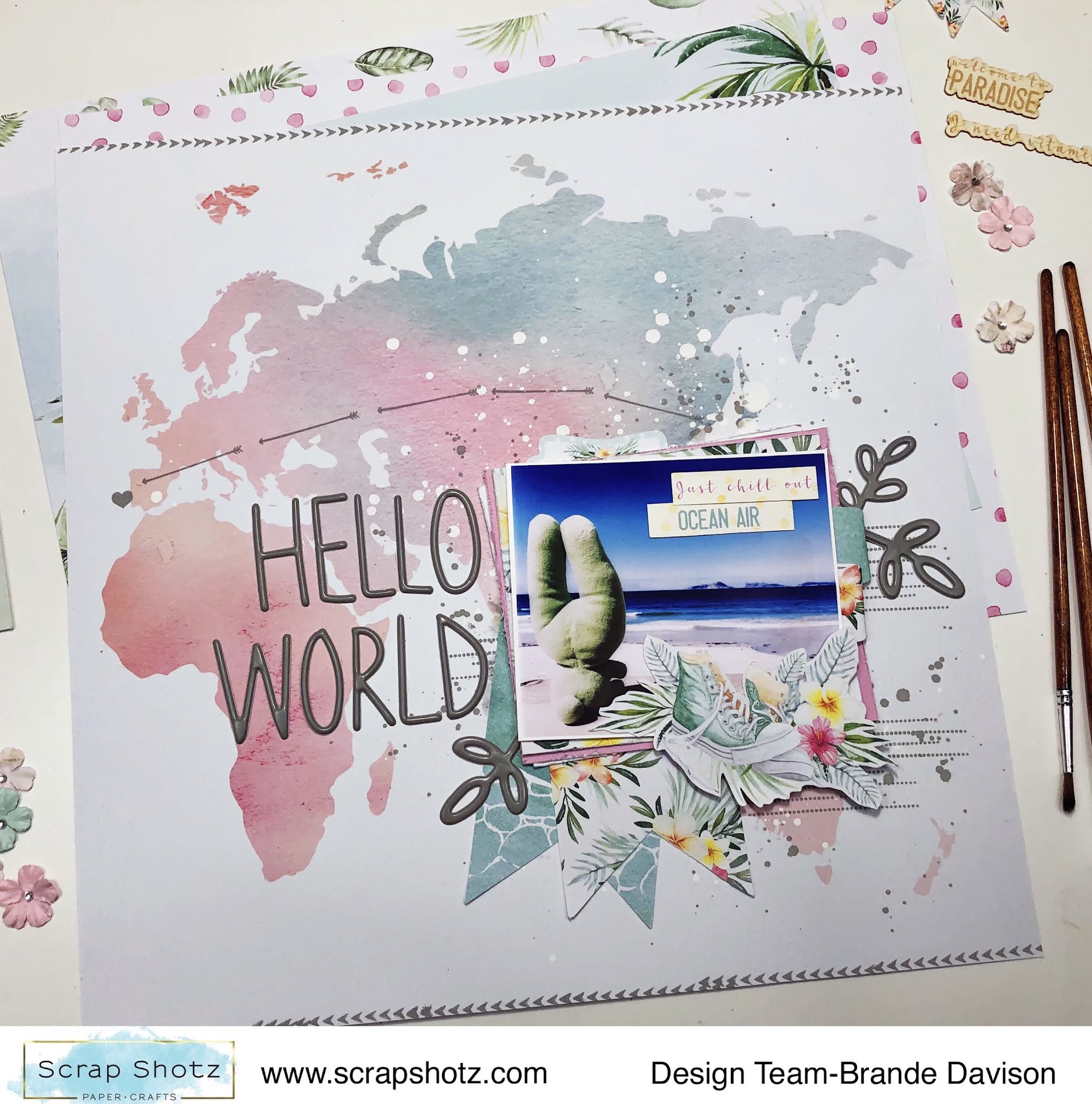
For my first layout with these watercolour summer goodies I went straight for the map pattern paper #06 - I am a sucker for a good map or globe inspired pattern. 


I wanted the pattern to do all the work, so picked just one photo and layered it up with all kinds of goodies from the P13 collection. Then used the Hickory Smoke, Distress Oxide from Tim Holtz to add some arrows and a heart from the photo to Portugal (where the photo was taken). 

I used some of the same ink to add a few splatters behind the photo cluster and some arrow stamps on the top and bottom of the page. 


The title Hello World and the 3 botanical stems are from a gray Thickers collection deep in my stash. I love how bold they look on all the white space, and they matched the stamped ink perfectly. 

Layout Two - Sweet Stripes

For my second layout, I just had to use the diagonal stripe paper #04 - the pastel colours reminded me of a yummy, sweet ice cream cone and there is no one sweeter than my wee niece! She just had to be featured on this pattern paper. 


With this layout, I again focused on creating a fun photo cluster - layering all the cute things and patterns with my photo and leaving the rest of the layout to just be colourful. 

I cut apart most of the pattern stripes and then used my distress tool to rough up the edges of each strip to give the page a bit more texture and dimension - and then glued it all down on a scrap white paper back in the same order of the pattern. 


With my P13 goodies, Scrap Shotz included the cutest, little matching paper florals from Prima Marketing (no one does florals like Prima) - I added a few these to the photo cluster too. I love the touch of feminine to this photo of her in her ‘movie watching’ seat (aka laundry basket with a blanket and stuffies). So cute! 

Layout Three - Surf's Up

For my third layout, I am all about the circles! The pattern paper #05 features gentle waves and instantly inspired me to reach for some boogie boarding photos from South Africa. My photos are not the best so I cut them in circles to try and hide the flaws - and this inspired a circle design layout! 


Once I had my photos cut in circles and scattered down the page, I just played with all the stickers and goodies from the P13 collection until I had a happy, jumbled, layered “mess”. I did add some white acrylic paint splatters on the pattern paper behind the photos as well. 

A few of the embellishments are fussy cut from pattern paper #03. I liked the combo of botanicals and cameras or sneakers on the pattern. I also added some of the die-cut chipboard pieces #08 (they look and feel like delicate wood veneer - love!) to a few spots on the page to bring a little texture to the layout. 

The ‘Surf’s Up’ title that follows along a photo - playing on the circle design - was the finishing touch.

How are your documenting your summer? 

There are still some P13 Summer Vibes goodies in the shop - pop over, grab some of these watercolour inspired designs and extend your summer! 


Thursday, February 25, 2021

Kaisercraft Chipboard Alphas


Have you got your hands on the Kaisercraft Chipboard Alphas yet? Oh my wow, I am having so much fun customizing these to match my layouts! 

Sharing the four layouts I have had the pleasure of creating so far using these chipboards and the Kaisercraft Explorer collection. Hope to inspire you to give them a try! 

Pattern Paper and Stamps: 

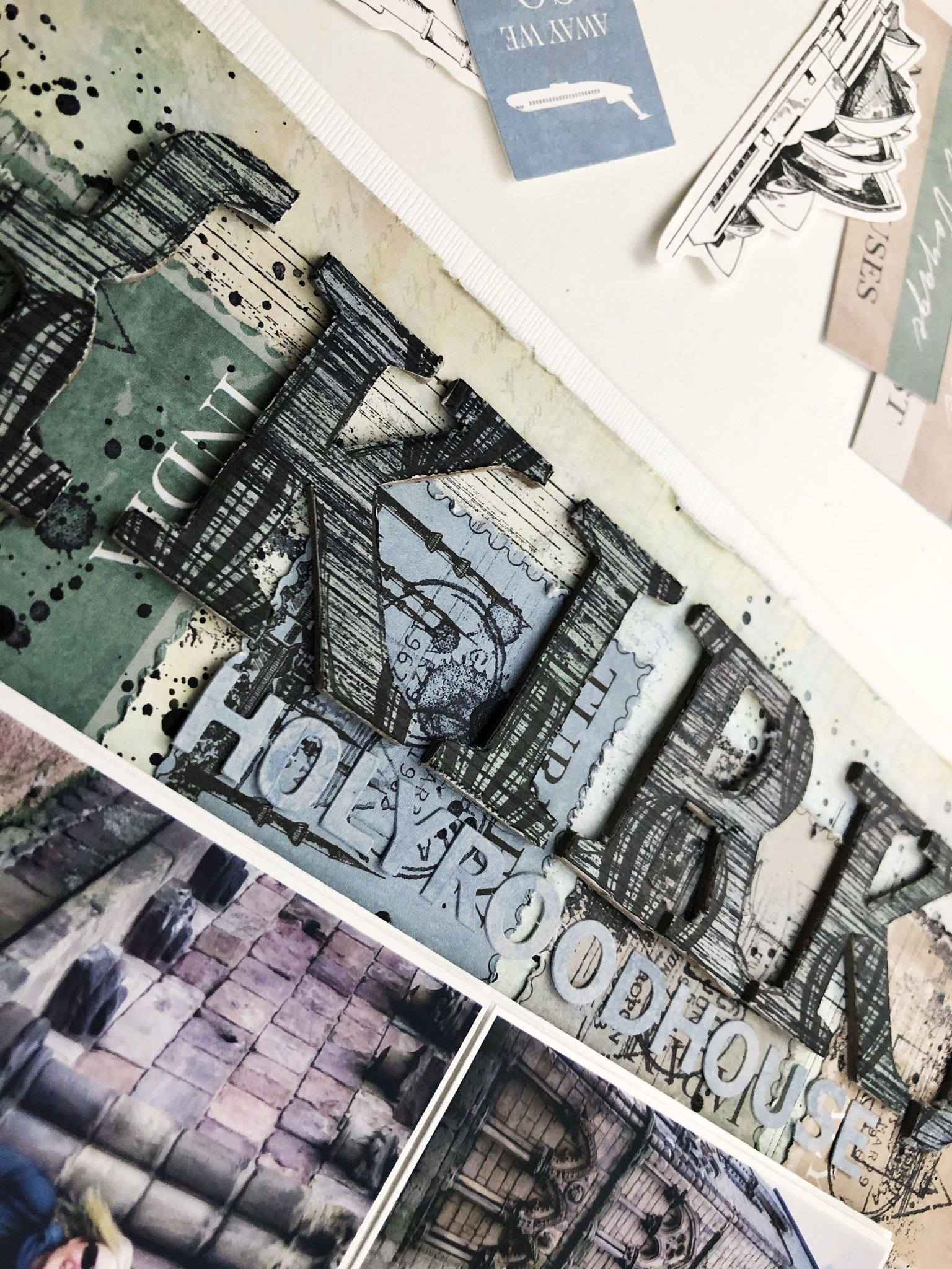
For this layout I customized the chipboard alphas in the word ‘Kirk’ to match using both pattern paper and stamps: 

1) covered each letter with the blue air balloon pattern paper of the collection (Flight) using liquid glue

2) flipped them on their face once the glue had dried and cut around each letter with a craft knife. The chipboard gives the pen a place to push up against making this quick work

3) stamped the front of each letter over and over again with this grungy stripe stamp from my stash in Staz On Jet Black

4) using a black journalling pen I messily traced the outline of each letter on the edge of the pattern paper 

Stamps and Watercolour Paint: 

For my title ‘ROAM’ I used a stamp and some watercolour paints:

1) using the suitcase stamp from the Wild Whisper Designs, Where to Next? set and some Staz On Jet Black to just stamp over and over on the front of each alpha

2) scribbled some Vicki Boutin Art Crayon in blue/grey onto plastic, added some water and after mixing it up with a paint brush used it to paint each letter 

Strips of Pattern Paper and Border Stickers:

For this title ‘Wallace’ I focused on the pattern paper and stickers of the Explorer collection:  

1) cut thin 1/4 inch strips from my favourite patterns from the papers, branding strips and some of the border stickers from the collection 

2) covered each letter with adhesive glue 

3) messily laid down the strips of paper and border stickers in no particular order on each letter 

4) once the glue dried, I flipped the letters over and used a craft knife to cut around each letter to get rid of the excess bits of paper and sticker bits 

Some of my letters got a few random black splatters when I added those to the page - a fun touch! 

Stamps and Splatters: 


For this layout I used the chevron bits and pieces of the chipboard set:

1) stamped a bunch of travel inspired stamps from my stash in a messy way all over the front of each chevron using Staz On Jet Black 

2) scribbled some Vicki Boutin Art Crayon in blue/grey onto plastic, added some water and after mixing it up with a paint brush used the paint brush to splatter the letters 

3) squeezed some Nuvo Crystal Dots Black onto plastic, added a spritz or two of water, then used a paint brush to splatter the letters 

So many possibilities for making these chipboards perfect for your next layout. I should mention I didn’t prepare the letters in anyway with Gesso or anything. Also the chipboard set includes punctuation, arrows and as shown above chevrons too. 

Thanks for stopping by! 


Thursday, July 30, 2020

Make the Alphas Work for You

Alphas are one of my favourite products to play with - I see a good title with some great alphas more of an embellishment than just a name on a page, that finishing touch really. Especially when you can use the title to really hit home the memory!


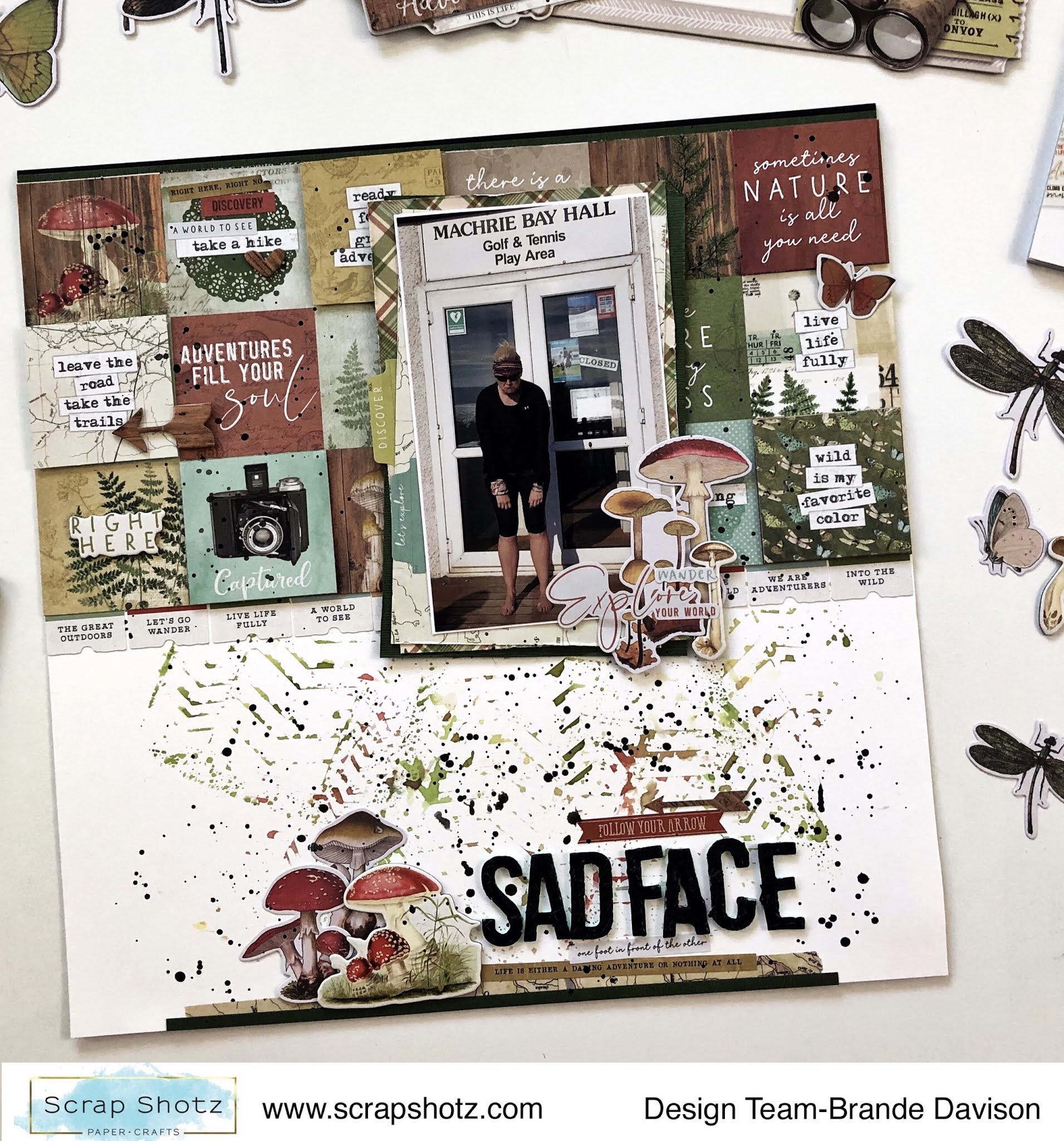
Sometimes though, those alphas need a little extra something-something to make them work for a layout... in the June 2020 Kit, featuring SImple Stories - Great Escape collection, subscribers received these awesome mint coloured, foam Thickers. Such a fun colour that really draws out some of the more subtle green tones of the kit goodies and gives a definite pop of green to those green lovers out there. 

I love the mint but the colour was just not working for me on this particular layout, I felt I really needed a black alpha to bring it all together - so I introduced some black texture paste from my stash, any will do,  to make these great looking alphas work exactly how I needed them on my page. 


I simply used my little spatula tool to spread the texture past across each alpha, tapping the top after with the back of the spatula to make sure the medium dried with some texture. I wanted to get almost an old leather look and it didn't work out too bad. 


While the now black alphas dried, I created the rest of my page. I focused on the pattern paper that features the 2x2 cut-parts. I used half of the paper to pattern block the top half of my page then using some foam tape added a few more of just the cut-apart squares that I loved most as a second, popped-up layer on top of a few of the squares below. I then just went to town adding embellishments to those really, really draw the eye. 


The photo, with loads of layers behind, looked best in almost smack dab in the middle of the cut-apart fun, and I balanced it with a few fun items along the bottom of the page too. 

The background is a tire tread stencil that I had used in greens, reds, and yellows on another layout and what you see on this page is the stencil top pressed down onto a white piece of paper just before I cleaned it off with a paper towel - so sort of the leftover, negative stencil. 

I finished it off with some splatters, of course for this gal, and my now black with mint foam peekaboo alphas. While this page may be titled Sad Face, I was smiling as I finished it off and post it here for you! 


Tuesday, July 21, 2020

Circles, Circles, Circles

When your Scrap Shotz kit features the Simple Stories, Simple Vintage Great Escape with loads of amazing circle elements - you most definitely have to create a design to show them off. 


For this layout I went through the kit and pulled out all the circles that made me happy, focusing on the insect and mushroom elements specifically. I am scrapbooking photos of some Scotland Cows (coos) so wanted to focus on the nature circle elements of the kit and make it look all messy and save the hiking pieces for future layouts. 

After picking one of the pattern papers as a background in muted brown tones (to play off the brown of the Coos), I added some white acrylic splatters for a little texture and to anchor the circles. I also painted just the very outside edge of the page as a sort of border or frame. 


I cut the couple of photos in circles and then just stared clustering the photos and kit element circles in a wide strip down the page. I tried to bring in chipboard, stickers, and some brads into each ‘cluster’ so there was a lot of texture down the design. 


Sitting back I felt I needed something black to give some pop to the muted tones of the kit and give me that messy ‘cows in the mud’ look I was hoping for. I pulled some Tim Holt’s rub on backgrounds from stash, cut them in circles and brought those into some of the clusters as the most bottom layer. I think the black draws the eye to the other circle items. I also pulled some black alphas from my stash for this same reason - a little pop! 

I finished it off with some kit washi and border strips down the opposite side for a little balance, added a few tiny staples for some added texture and black splatters.


I like how it turned out - and that with circles you don’t have to worry about the lines being all straight and perfect the most clustered and crazy the better!   

How are you using your kit this month? We would love to see! Tag Scrap Shotz on social media so we can ohhh and ahh! 


Friday, February 7, 2020

Wild Whisper, Where to Next - Colour Focus

Hello, hello! I am having such a fantastic time playing with the Wild Whisper, Where to Next? goodies from the Scrap Shotz ship this month. The vibrant colours and happy, busy patterns of this collection and embellishments are making me smile!

Speaking of vibrant, bright patterns - today I wanted to share how I created a very simple, full of white space layout by focusing my attention on just a couple of colours from the collection. This is a trick I like to use whenever I am playing with papers or embellishment goodies that are really busy and bright. Which is such a fabulous signature of Wild Whisper collections.

Here is my layout:


My approach was simple - pick a couple die cuts or ephemera from the collection that looked great  together (in both colour and design). This was easy to do thanks to a Wild Whisper - everything in this collection matches beautifully. I picked that fabulous brown camera and the blue post it stamp phrase.


From there, I went through the rest of the collection goodies and found all the other bits and scraps that matched this brown, blue, camera and postage stamp look. I layered a bunch by my photo and makes a little cluster on the bottom right too.


Before adhering everything down, I did use one of the stencils from my stash and some white modelling paste to add a little texture to the Wild Whisper black and white postage stamp pattern and the white cardstock too. Then I added my title ‘Travel Journal’ and added some stitching too!

https://drive.google.com/uc?export=view&id=1kKMxdZmXzmkyV48emHbVmSJXOI9GjNm2


I really like how it turned out - I am off to play some more! Thanks for swinging by!