Hello!
Rosie here to share with you my projects created using the Scrap Shotz March kit featuring the Felicity line by Pinkfresh Studios. This kit is packed with fresh, bright and happy feeling prints along with some fabulous word stickers, wood veneer, puffy stickers, foam alphas and a beautiful piece of gold chevron vellum. I also used the
Felicity Die cuts add-on.
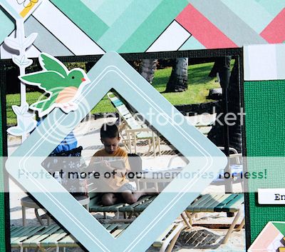
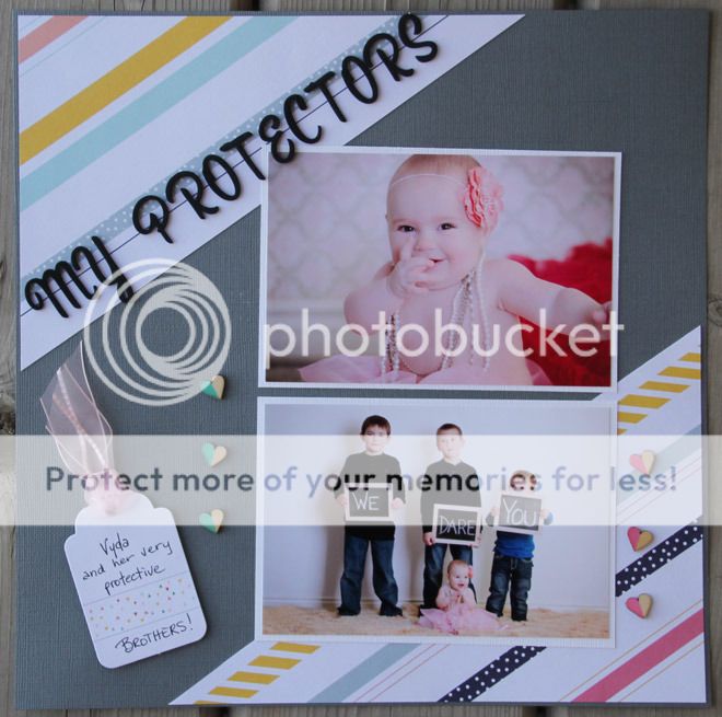
Enjoy the Little Things
This was one of my most favorite papers in the Felicity line, okay who am I kidding...I love it ALL! This layout came together very quickly as I knew I wanted to focus on this fabulous herringbone pattern. I echoed the angles in the paper by turning the square die cut frame on an angle.
The die cut frame is popped up over the part of the photo I want the focus to be on which is an easy way to "crop" your photo without making it teeny weeny. The "Enjoy the Little Things" sticker is also popped up along with the tall sticker on the left hand side.
I thought the little green birdie was a nice accent on the frame as it matches the green cardstock, such a beautiful shade of green. The die cut tag holds my journaling and the wood veener accents finish the layout off.
Oceanside
I often create a layout based on how it "feels" when I start laying down paper and photos. I chose the photos first for this layout and shuffled the papers around until I found a couple that "felt" right, in this case the grey and multicoloured paper along the bottom and a small heart print at the top that I've overlayed the gold vellum on.
While putting away the flowers I stamped and coloured in Vicki Boutin's Distress Water Colouring class, I noticed that the colours and flowers "felt" tropical and would work perfectly on this layout.
I then fussy cut the flowers, moved them around until I liked the positioning and popped a few up with pop dots.
The flower centers are done with
Nuvo glitter drops and I've added the puffy sequin stickers for more visual interest.
Oh Happy Day
The layout began with this scrap piece of the diagonal striped paper, I actually added the pink/red paper in between the dotted and aqua stripes.
Scraps of the gold vellum became the photo mat and a border along the top and side of the diagonal stripes. The swirly die cuts lead the eye towards the photo.
I've created a partial frame around the photo with the puffy stickers, layering them on each other and even cutting apart one of the stickers and laying alongside the middle-bottom right of the photo.
The journal die cut does double duty as the layout title and, of course, journaling spot. I've coloured in the flowers on the die cut with Wink of Stella markers.
The die cut houses anchor the diagonal design in the bottom right hand corner.
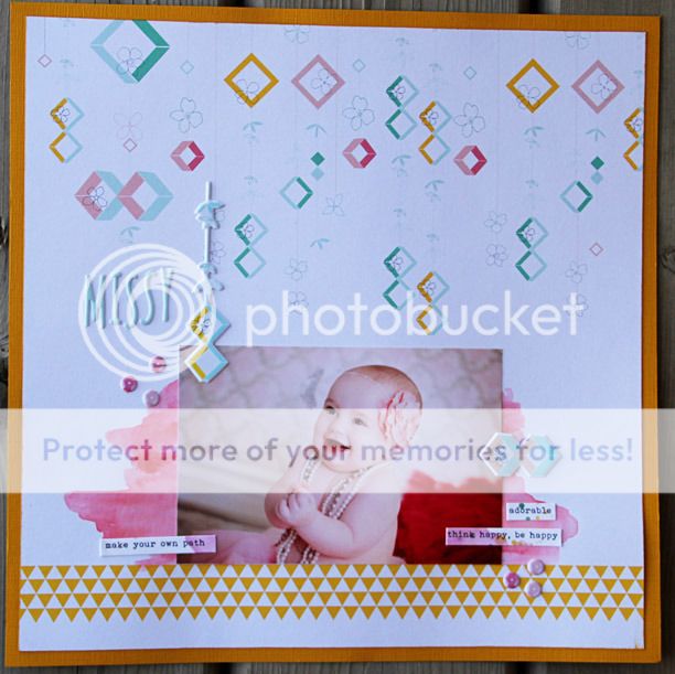
Happy
This is another layout utilizing scraps from the other projects I created.
The long strips along the right side, triple offset photo mat, punched circles and card stock sticker mats are all from leftover scraps.
A spritz of gold glimmer mist in the top left and bottom right corners adds some interest to the white space along with a sprinkle of wood veneer, popped up die cuts and faux enamel dots using Nuvo glitter and pearl drops.
You'll notice the green "swipes" under the photo mat, my son came over to admire his photo and smudged the
Nuvo drops before they dried, I'll call it added texture to the layout ;).
Kindness
This was a super simple card to make, I fussy cut a piece out of the pattern paper and coloured in some of the flowers with
Wink of Stella markers. The sticker became the card sentiment and then a few puffy sequin stickers finished it off.
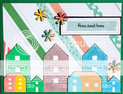
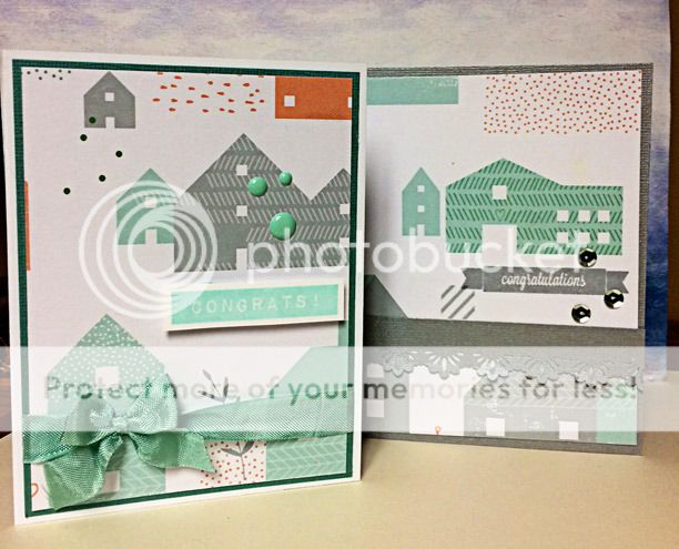
Home Sweet Home
Another project using up scraps, the card background is the diagonal striped paper. I have stamped the large houses with the kit add-on stamp. The small houses are a die cut and a puffy sticker. I then outlined the houses and the sentiment to make them 'pop' off the background. A few wood veener pieces finish off this housewarming/new home card.
Monthly Planner Spread
I just began using a
Carpe Diem planner this year and wow I have seen some gorgeous planner spreads on Pinterest. I keep my planner fairly simple, so far anyway ;), I know I won't use it if I try to make it a uber creative activity as opposed to helping keep track of appointments, etc.
I spend a bit more time with adding pretty stuff on the monthly spread and you can see here I used the Felicity stamp set the most. I've added some of the card stock stickers along with a few of the smaller die cuts that fit the scale of these pages well.
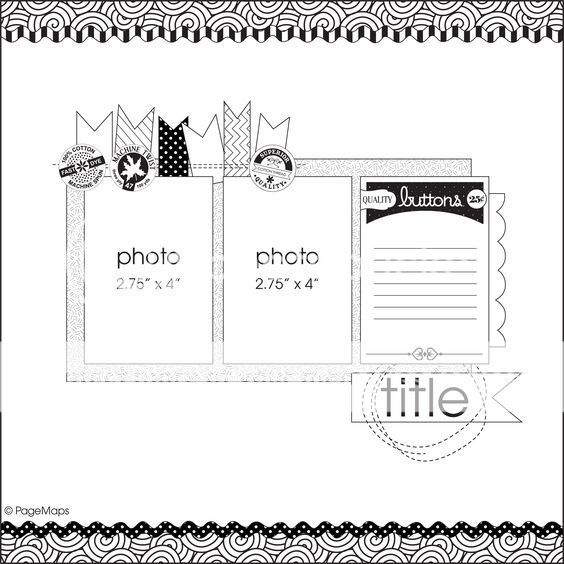
We each create a layout using the same sketch every month and once again here is the lovely Pagemaps sketch we used:
and here is my take on it:
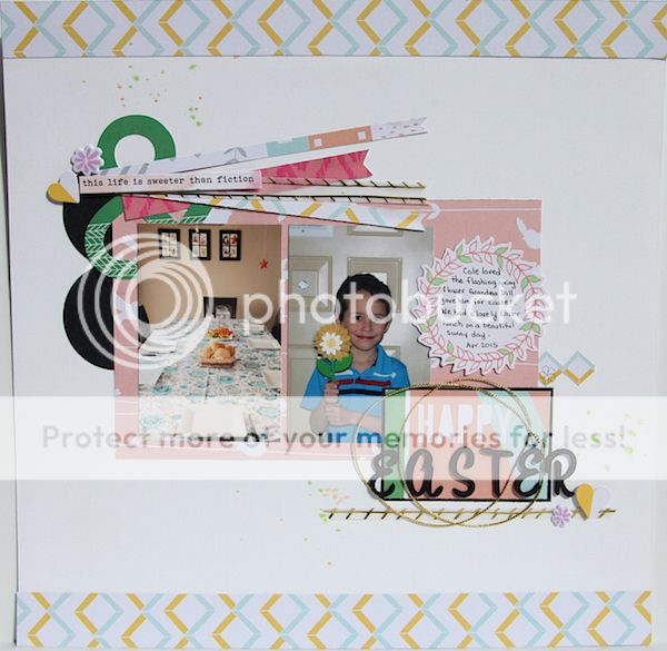
Happy Easter
I created long, thin horizontal flags along the photo block instead of the vertical flags in the sketch. As the flags are layered on an angle over each other I popped up a sticker over the meeting point to hide the meeting point.
For some reason I can't seem to see an ampersand and without thinking it needs to be in a title. I never seem to be able to come up with one and I couldn't think of one for this layout either so I used it as an accent to layer the flags over top.
This title is a journal card that I cut down to fit the space, matted on black card stock and added 'easter' out of the kit alphas. I really liked the circular element around the title on the sketch so I used a bit of Stampin' Up gold cord around the alphas.
Some die cut pieces, stickers and a few drips of Tim Holtz distress spray finish off the layout.
Thanks for taking the time to pop in and peruse my projects, I've hope you've enjoyed all of our projects and getting some insight in to how they came together.
Keep popping in as we've got lots of great stuff planned for the blog.
Cheers!
Rosie