Hello,
Welcome to the blog for a look at my projects made with the April Scrap Shotz kit featuring the fabulous Attwell collection by Fancy Pants Designs.
I have lots to share so top up your coffee or beverage of choice and enjoy, feel free to click on any image to get a closer look :).
Time to Shine
One of my goals for the year is to use my Cameo more so I spent some time in the Silhouette Studio software and created this diamond cut file to showcase the fabulous patterns in the Attwell line.
I created pearls/dots with Nuvo cystal drops to hold down the gold thread and embellish the layout. Puffy stickers frame the photo as well as the corrugated paper mat. The title is courtesy of a flair button placed on the corner of the photo.
Summer Fun
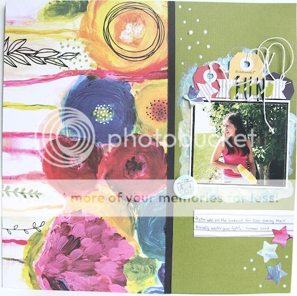
This blooms patterned paper just begs for a starring role on a layout, I trimmed it and turned it on it's side so the blooms draw the eye toward the photo. I painted a base for my photo mat with the Art Alchemy paint included in the kit and layered tags over the top. The banner is cut from the corrugated paper and it holds the puffy banner sticker and alphas from the add-on puffy alphabet letters. I accidentally dripped some paint on the layout so I decided to go with it and dip the end of my paintbrush in the paint and make dots on card stock.
#Brier
This layout is based on
this
Pagemaps sketch Lorraine shared with you on Monday. I created a cut file on my Cameo and then hand cut the patterned paper diamonds to fill the negative spaces on the card stock. I've then popped up a couple of the white card stock diamonds.
The gorgeous
Emerald Creek Crafts brads included in the kit accent some of the diamonds.
The add on puffy striped alphas again comprise the title.
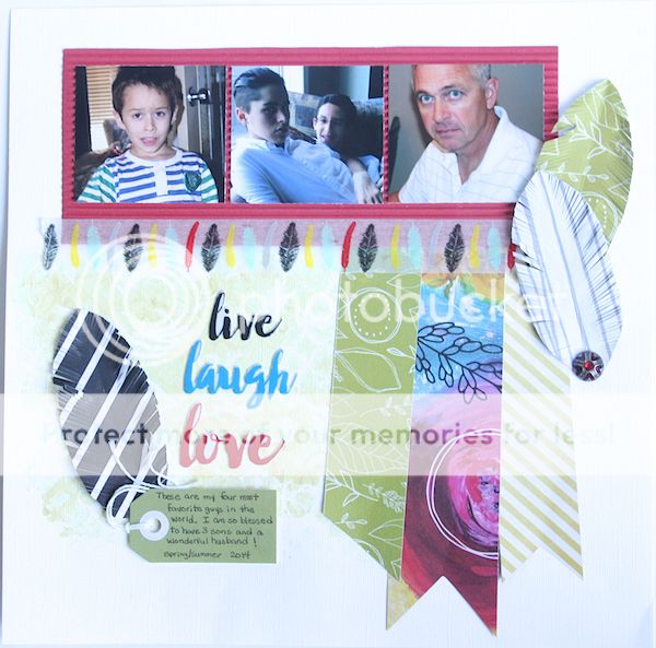
Live Laugh Love
I wanted to showcase the Alchemy paint included in the kit on this layout so I started off with applying the paint over the
Tim Holtz lattice work stencil. I should have taped the stencil down prior to applying the paint as some of the lovely details in the stencil are lost because the paint oozed underneath it but I think it works okay in the end ;).
The puffy word stickers stand out as the title over the painted area. Just make sure you apply a little extra adhesive if you glue anything over top of the paint to make sure it sticks. I've used one of the kit tags to house my journaling for the layout.
The brad sits at the bottom of my hand cut feathers grounding them so they don't appear to be floating in the middle of nowhere ;)).
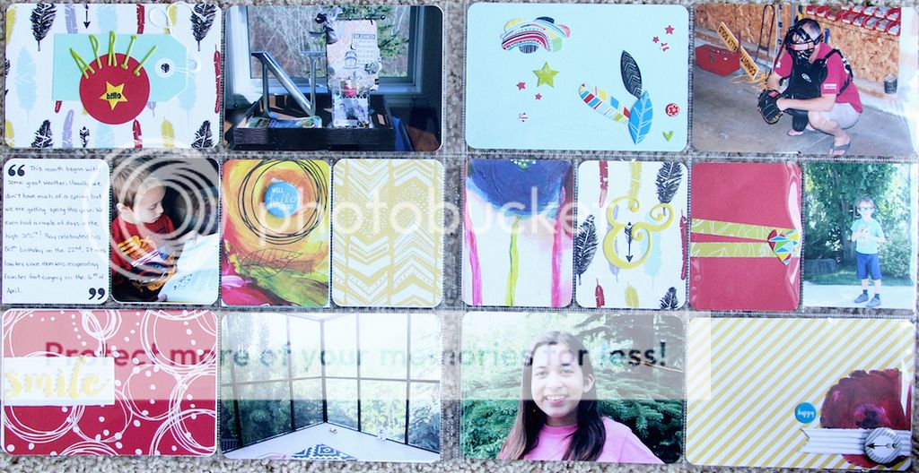
Project Life/Pocket Scrapbook Layout
The top photo is the left side of the layout and the bottom is the right side of the layout. I have to be honest, I wasn't able to get my April photos printed in time so I used some older ones to fill in for now.
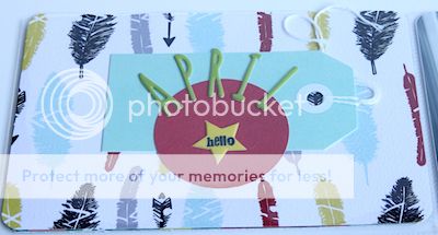
These green puffy alphas are included in the kit, this tag is part of the tag add on for the kit. You can see that I've used a number of the puffy stickers on my filler cards for the pocket pages.
Here is the spread side by side:
Surprise
Isn't this card stock color lovely? It's one of the card stock papers included in the kit. I created a border of tags with the add on tags down the side, then backed the patterned papers on black card stock to make them stand out. Another title with puffy alphas, this time the green ones included in the kit and a few more puffy stickers finish off this layout.
Do What You Love Tag
I've been wanting to play with the
Tim Holtz Distress Watercolor Crayons and the floral paper in the kit inspired this tag. I coloured small portions of this tag and then rubbed the color with my finger to lightly blend. After setting it aside for awhile to ensure the colors "dried", I applied translucent embossing paste to the top left and bottom right corners over a Tim Holtz stencil, let dry, then applied more Distress watercolour, again rubbing it with my finger to bring out the embossed portion of the tag. I spritzed a little
Brushed Pewter Tim Holtz Mica spray and then stamped the blooms and butterfly with the
Altenew Wild Hibiscus stamp set and Archival Ink. I've also brushed a little of the Art Alchemy paint on the stamped images and lastly finished with a flair buttom from the kit.


These two cards feature images from the Altenew Wild Hibiscus stamp set. The top card is simple a piece of scrap patterned paper along the right side, flower image is stamped with Altenew ink and enamel dots are from my stash. The bottom card also uses scraps which are matted on black card stock. The add on striped washi tape unifies the patterns.
I've purposely left the card fronts blank, I'll add a sentiment later depending on whether I need a birthday, thank you, etc. card.
Mosaic Card
I have lots of mosaic type of projects lately and wanted to give one a try myself. I took scraps of paper, trimmed them down and randomly laid them on black card stock, moving them around until I was satisfied with the placement. I wasn't entirely satisfied with the end result so I decided to add a piece of vellum paper over top to soften the pattern. The flower is a stamp from the Altenew Wild Hibiscus set stamped in Versafine black ink and then embossed with clear embossing powder, a little red watercolour highlights the image.
Thank You card
Ths was another very easy card to make, I simple die cut a frame to lay over the floral patterned paper, added the stamped sentiment to a hand cut banner, matted it on white corrugated paper included in the kit and then adhered to a green card stock base.
Thinking of You card
I love the combination of the yellow, black and white and decided to try out stamping with the Art Alchemy paint from the kit. It stamped not too bad considering I just applied the paint to the stamp with my finger, would probably get a better image if I applied the paint with a brayer.
Happy Birthday card
The best part about using papers from the same line is how well the coordinate together. I've used 4 different patterns on this card. I have die cut happy 3 times then glued them together to create a little dimension, die cut and sentiment are the
Mama Elephant Clear Stamp Set Happy Everything.
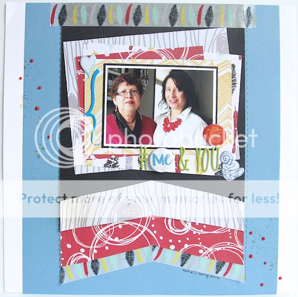
#Me and You
I created a giant flag down the middle of the page with card stock, patterned paper and the feather washi tape included in the kit. The photo is matted on white, then black card stock and layered over a larger photo mat of offset patterned papers. Puffy stickers also frame the photo and the title is comprised of green puffy alphas and a flair button.
I like to have a title on a layout but, to be honest, I often struggle with what to "call" the layout so bring on the hashtag...pretty much anything will work as a title for me beginning with "#".
I hope you've enjoyed my kit projects this month, did you count them as you went along? I'll sum up the total for you:
Layouts: 6
Cards: 6
Tag: 1
Pocket Scrapbooking: 1 spread (2 pages)
for a grand total of 14 projects from 1 kit. Add ons I purchased, 1 washi tape, 1 package of tags.
Thanks for stopping by and have a wonderful day!
Rosie