Showing posts with label scrapbook kit. Show all posts

Tuesday, December 20, 2022

Scrapping with December Kit Club!

 Hello friends! Karla back today with a layout using the gorgeous December Kit featuring 49 and Market Plum Grove!! This is a lovely collection with a fall vibe and amazing florals! You can check out the kit and Add-Ons, or pick up the Plum Grove Collection piece by piece in the shop!

I created this layout Live in one of our Thursday Live Demos! You can check that video out below!! I also used the December Sketchy Challenge from Creative Scrapbooker Magazine, changing it up to add an ephemera cluster in place of a photo on the right! 

I love this photo of my 3 wonderful girls!! The chipboard words are awesome as titles and there are so many pieces in the ephemera pack!


I used the rub-ons on the background, layered over a Southern Ridge Trading Company Stencil - Geo 9- and a ticket stamp from the Crayons Journaling Set from Elizabeth Craft Designs


I layered on ephemera clusters and added journaling right on the layout! 


Here's a look at the Facebook Live Video where you can get a look at the full kit and the process creating this layout! 


Just a reminder, our Facebook Lives will continue January 5th at 1 pm MST!
 I hope you have an amazing Christmas, and Happy Crafting!


Saturday, October 29, 2022

Print Shop, Vicki Boutin - October Scrapbook Kit

I am loving playing with the new Print Shop collection from Vicki Boutin - this month’s scrapbook kit! All the amazing colours and florals and oh my! 


I decided to start my Print Shop adventure with a focus on the flowers and botanical ephemera. There is a great mix of florals, leaves and stems that make layering on a page super easy. Here we go … 

Monochromatic Botanicals


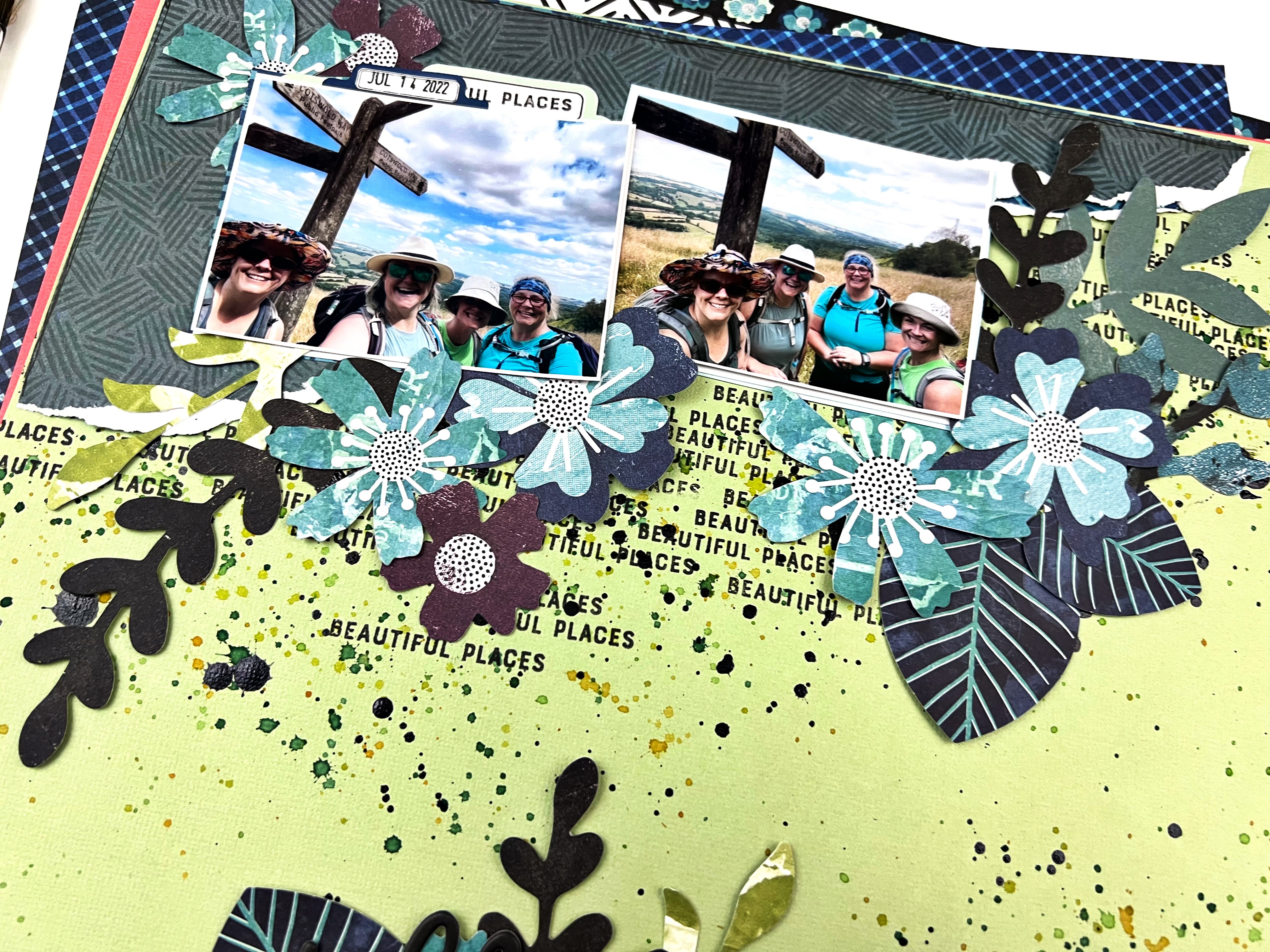
For the first layout I pulled all the blue, green and purple botanicals from the ephemera kit - I also picked out papers from the collection and corresponding cardstock go the same colour scheme. My idea was to feature the design on the top and bottom of the page with all the leaves and such ‘growing’ towards each other to fill the space between. 

I prepped the cardstock background with a bunch of repeated stamping with the word ‘beautiful places’ from a past Vicki Boutin stamp collection using Paper Rose Studio Premium Dye Ink in Intense Black. I also added some black splatters over the stamping using some Nuvo Crystal Drops, Black mixed with a touch of water. To add a touch of colour I splattered some Distress Ink in mowed lawn, crushed olive and peeled paint too. 


From there, I ripped some of the pattern paper to create an anchor for my photos on the top and bottom of the page - making sure to not cover all the stamping and splatters. I added my photos and then spent the next bit tucking and layering the ephemera I had put aside until it looked messy but somehow still organized. 


A little trick if you want to layer after the big stuff like photos and pattern paper are stuck down - only glue or tape down the very center of things so you have lots of room to tuck and layer behind. When it’s all in place you can go back and gently add a few more spots of glue to make sure it stays put. 

The title ‘perfect day’ was the final touch - I love how it’s nestled in with the leaves and stems! 

Overflowing Envelopes


For my next layout I had an idea to create a line of envelopes all overflowing with florals and butterflies. I had three photos of me and my wee niece where she tried to take the selfie of us that make me laugh so much. I thought the ‘overflowing’ design would be a way to how my love this little peanut often feels the same. 

I selected a few of my favourite patterns from the collection and used my Big Shot and the little envelope die from Paper Rose Studio to create 4 envelopes - they are sort of hard to see in the final layout, I may have overflowed the overflowing look.

I selected this text pattern from the kit so there was some pattern but nothing that would overwhelm the envelopes. I prepped the background with the repeated heart stencil from the collection using Distress Ink in scattered straw, saltwater taffy and a touch of crushed olive. First rubbing the inks through the stencil randomly so they blended here and there and second as light splatters across the page. The text pattern already has some black splatters,  so I added a few more to bring some more black in. 


I adhered the 4 envelopes across the hearts and added my 3 photos, then just started tucking and playing with the florals from the die cuts, stickers and chipboard stickers in the kit. A few butterflies here and there added some contrast. Finally I added the title from the phrase puffy stickers in the collection for a pop of black. 


I am off to play some more! There is a whole pattern paper of cut apart tags that I have my eye on - be back soon to show you what I come up with. 


Thursday, September 22, 2022

September 2022 Scrapbooking Kit Inspiration Continued


Hello again! Here to share a couple more layouts I made using the September 2022 Scrapbooking Kit. The Kit features the Simple Stories, Simple Vintage Lakeside collection and coordinating Bazzill Basic Cardstock. - think camping, fishing, hiking, lakeside, outdoor adventures! Such fun.l 

Inspired by an Embellishment

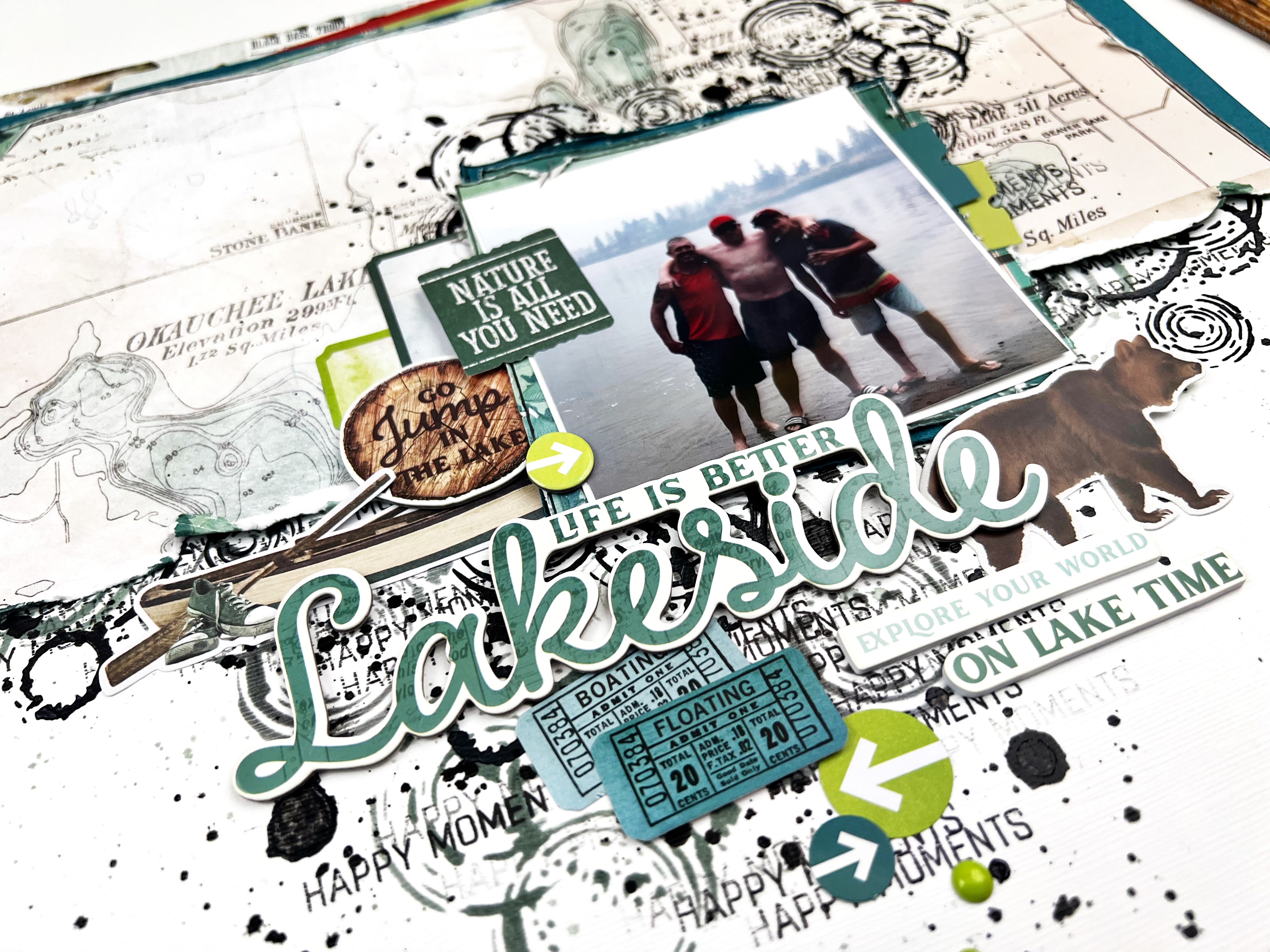
I really like the chipboard stickers in the kit and wanted to use this ‘Go Jump in a Lake’ piece! I found this fun photo of my hubby and our friends - taken just before they did all just do that, jump in the lake. I used the shape of this chipboard peace to start my design. 

I ripped the Take New Trails  pattern paper in half to create a half page design. Then reached for some Picket Fence Studios, Paper Glaze in Black Peony and the Studio Light, Jenine’s Mindful Art Collection and added some of the circles in roughly a diamond shape in the middle of the page. Some on the white background and some on the pattern paper. I wanted to add a little more to the mixed media so also stamped ‘Happy Moments’ repeatedly from the Vicki Boutin, Let’s Wander stamp set with Paper Rose Studio, Premium Dye Ink in Intense Black. The final background touch was some black splatters  using slightly watered down Tonic Crystal Drops on Black Ebony

From there, I spent a bit of time roughing up the edges of the layout with my distress tool, adding some journal pen doodles to the outside edge of the page, and then tucking and adding embellishments. I knew I wanted to feature quite a bit of the embellishments below the photo so this Lakeside title was perfect for filling that space while also getting a great, bold title. 

Pick Just Two Colours 


For this layout I wanted to use the Love This Place (black and white diagonal stripe) and 4x6 Elements B side. I loved them both so knew I wanted to keep my design tight so I could show off both patterns quite a bit! I went with another half page design but diagonal this time. 

Before securing the photos or embellishment goodies, I first stamped ‘Heck Ya’ and ‘don’t quit’ both from Heidi Swapp and a circles texture stamp from my stash. I used Paper Rose Premium Dye Ink in Intense Black for all three for a nice crisp, rich look. 

From there, I had fun picking out all of the green and blue embellishments from the sticker sheets, chipboard, die cuts and chipboard stickers. I just love how it turned out and the arrow embellishments mixed with the enamel dots - the mix of textures is really fun! 

Are you playing with the September Scrapbook Kit? We would love to see what you create! Pop your layouts up in the Scrap Shotz Paper Crafting Facebook Group or tag us on Instagram! 

Take a peek at the first layouts I made with the kit and shared, visit September 2022 Scrapbook Kit Inspiration. You should also check our Carolyn’s fantastic projects, visit Simple Stories Simple Vintage Lakeside Layouts and More Simple Stories Simple Vintage Lakeside Layouts

Thanks for swinging by! 


Sunday, September 18, 2022

September 2022 Scrapbook Kit Inspiration


Are you playing with this month’s Scrapbooking Kit?

The Kit features the Simple Stories, Simple Vintage Lakeside collection and coordinating Bazzill Basics Cardstock. The colours have an outdoor vibe with fantastic greens, blues and touches of brown and a rusty orange red. The theme is, well, lakeside of course but loads of other embellishment bits too for hiking, time outdoors anywhere, forest, arrows, etc. Really fun!

Banner Stickers for the Win 

My approach to a new kit is to pick a few of my most favorite things and use those first! Simple Stories has been including these fantastic banner sticker sheets in their collections lately and I find them such a fantastic jumping off point - so I reached for that first! 

I added a picture to each of the 3 little frames built into the banner sticker and then added pop-up foam tape behind. (My go to foam tape is 3L Scrapbook Adhesives - Crafty Foam Tape Roll. Lasts forever!) 

I decided to go with a ‘bottom of the page’ design for this one. I picked one the more subtle pattern papers from the collection - this one has ducks on it which have nothing to do with my hiking pictures but that’s ok my banner covered those up. I created an anchor for the banner using some Tim Holtz, Distress Inks in Shabby Shutters, Mowed Lawn and Peeled Paint with one of the stencils from Vicki Boutin’s Fernwood collection, a ‘The Good Life’ from the Simple Stories, Vintage Cottage stamp set.

From there I placed the banner down and spent some time tucking and adding in a few more embellishments to make. I added a little ripped paper feature at the top right of the page to give a little balance to the busy banner. 


Show off your Favourite Pattern 

Now that I have used my favourite embellishment from the kit, I am moving onto my favourite pattern paper. I am a sucker for plaids so it will be no surprise I picked this beauty from the kit! 

This is a very bold and busy pattern so I focused on keeping my design simple. I used one of the chipboard frames from the kit as my jumping off point and added two 2x3 photos of my nephew. I like off-setting the frame from the photos so the pattern behind shows through. 

Before adhering down the frame and photos, I created an anchor for all my goodies by stamping in roughly a diamond shape wider and taller than the space my photos will take. The stamp is a bunch on + symbols from Vicki Boutin’s Escape the Ordinary. I also added a few stamps to the bottom and top of the page. I finished off the black spatters using slightly watered down Tonic Crystal Drops on Black Ebony.


With the busy pattern I went with a contrasting colour for my embellishments and focused on that fantastic orange/red colour in the kit. I love how they pop off the page even with so much going on! I finished off the layout by adding a small feature at the bottom of the page for balance. 

I am off to keep creating with this fantastic kit - I am thinking of building a touch of mixed media into my next project. 

Thanks for stopping by! 


Saturday, May 7, 2022

Simple Stories, Simple Vintage Indigo Garden Kit

The Simple Stories, Simple Vintage Indigo Garden collection was the star of our March 2022 Scrap Shotz Scrapbooking Kit. An absolutely beautiful collection with lots of florals, great sentiments, hearts, and so many pretty butterflies. 

I am playing with the simple Stories, Simple Vintage Indigo Collection Kit, Chipboard Stickers, Bits & Pieces Die Cuts, Decorative Brads, Foam Stickers and coordinating Bazzill Basics Cardstock in pink, mint and yellow. Aka the Kit! 


All My Favourite Patterns 

For my first layout I set aside all my favorite patterns from the kit and got to work! I used a large circle (almost the size of a 12x12 paper) and used it to trace and cut out a few different sized wedges from each pattern then used those to roughly create a circle in the middle of the layout. Before adhering the pieces down, I traced the outside of each messily with a black journal pen and distressed the edges. I also used some Tonic Crystal Drops in Ebony Black to add black splatters to the paper wedges and the background pattern. 

(Splatters How To? Squish out some Nuvo of any colour, add a few spritz of water, mix it up with a paintbrush and flick it onto your layout - the bigger the brush and more dramatic the flicks, the more bold your splatters will be!)  


From there I backed my photo with a bunch of the collection patterns and had a lot of fun tucking and layering all kinds of embellishments. I focused on the Bloom & Grow title and florals behind the photo and from then just found other favourite things. So many amazing embellishments in this kit! 

I felt like the layout was missing something though. So used a Vicki Boutin botanical stamp on that dark grey pattern paper and fussy cut them out before tucking them in around the floral embellishments. I like the added contrast! 

Celebrate Indigo

For my next layout, I focused on the indigo bits! There are not too many collections that feature indigo and anything close to purple. So I was pretty excited that this one has pops of indigo - a deep purple with a touch of navy that after playing a little was a lot to found a combo of Tim Holtz, Distress Ink in Blueprint Sketch and Wild Plum to match. 

I started with white cardstock and using a Vicki Boutin stencil add some random stencil spots using the Tim Holtz colour combo. I used the same colours to add some splatters and, of course, a few black splatters too. 

Then I cut the black and white pattern in 4x6 so I could use a 2x3 photo and use the other half as an anchors for some of the floral embellishments. I added a few other patterns behind as well so they would peek out. And, you guessed it, from them I just tucked and layered goodies from  all the embellisments.


I added some black and white twine to the tags and really like the added texture. I was drawn to the green ‘Hello’ in the Foam Stickers so used that as my title and it inspired the added touches of green around the layout. I think it was a great finishing touch! 


Cascading Circles 

If you have seen any other posts form me .. you may know I love, love, love circles and a cascading design like this one is a go to. Such a great way to use way too many embellishments (is that a thing?) and show off lots of the pattern papers too. 

I picked a dark pattern paper for the background on this one, and prepped it with a Vicki Boutin stencil and splatters in Tim Holtz, Distress Ink in Spun Sugar. Then I found all the circle and large heart embellishments in the kit, cut a few more circles from the pattern papers (focusing on the black and white stripe) and made a circle mess down the page. 


No real method to my madness other than just evenly distributing the different patterns and textures throughout. I finished the layout off by dropping this 4x4 photo on the middle, adding the title from the foam stickers and finally the decorative brads.  

Inspired by An Embellishment

There are these cute little tags in the kit embellishments - a little sentiment with a clip - that sparked this page design. I had an idea of a clothesline look with my photos and all kinds of goodies hanging from it. Well, I may have embellished so much you cant see much of the twine - but I still love it. 

I prepped the cardstock with a bit of Tim Holtz, Distress Ink in Black Soot and a Vicki Boutin stencil, a few splatters in the same colour and some white acrylic paint splatters too. I had some yellow texture rub-ons in my stash that matched the kit’s yellow, so added a few bits here and there too.

Once the background was prepped, I adhered a loopy black and white twine across the middle of the page and added ALL those little tags I could find in the plain, chipboard and foam stickers. Then I just went crazy adding all the things - photos and florals and butterflies and more. 


I finished it off by creating a little mirrored cluster at the bottom of the page to balance how ‘heavy’ I made the middle of the layout. I also cut a little bit off 3 sides of the background so I could peek-a-boo one of the pattern papers around the sides.

If you are playing with this collection in the March Scrapbooking Kit, grabbed some from the shop or about to grab some cause now you love the collection as much as I do … we would love to see what you create. Tag us on social media or join the Scrap Shotz Paper Crafting and post your project! 

Thanks for reading and happy crafting! 


Tuesday, November 23, 2021

Welcome Winter


Time to document your winter memories! Have you had a chance to play with the October Scrapbook Kit? The kit features the Carta Bella, Welcome Winter collection and it’s a beauty! So many blue tones, snowflakes and plaid touches - perfect for winter. 

Snowflakes and Circles


For my first layout I played with circles! I started with this great striped pattern from the collection and using an empty paper towel roll and some blue/grey crackle texture paste from my stash created some messy circles down the centre of the page. 

Then I used a circle punch and the 2x2 cut apart pattern paper in the kit to make a bunch of circles featuring different snowflakes from the collection. I grabbed any of the circle embellish (die cuts, chipboard and stickers) and created a cascade of circles with my photo in the middle. 

A few black splatters, a few more splatters in the same crackle texture paste with some water added, a few punched hearts from pattern paper and a small rip and some staples on the left and right of the page finished it all off. 

Embrace the ‘Country’ Look 


For my next layout I wanted to showcase this awesome selfie of my parents! I love that it was taken at Christmas and you can see the heaps of white snow in the front yard behind them as we are all inside, cozy and warm. Perfect winter memory. 

I started with this simple plaid pattern from the kit. Then pulled a 12x12 chicken wire stencil from my stash (love the ‘country’ look for this farm house photo) and added it to the page using a crackle texture paste in blue/grey from my stash. I used that same texture paste with some water to create splatters, and added a few in white acrylic paint too. Using some Tim Holtz, Distress Oxide in Weather Wood I also added some snowflakes using the collection stamps.

Then I used a bunch of patterns to anchor my photo and just had fun layering a whole bunch of chipboard, sticker and die cut titles to the right of the photo. I was excited to tuck one of the plastic snowflakes from the kit in there too. A couple of punched hearts in the amazing silver glitter paper in the kit stapled to the top left of the photo finished it off! 

Think Left and Right 


For this layout I featured 4 photos. Instead of a horizontal layout (my go to) I decided to try the photos down the left of the page. 

I started with a Bazzill Basics Cardstock, Raven (black) from the shop as my base and added some bricks using a Peartree Cutfiles Stencil from my stash and Tim Holtz, Distress Oxide in Weather Wood for some pattern. A few splatters in the Distress Oxide and white acrylic paint finished off the mixed media design.  

Then I created a cascade of photos on the left, backing each photo with a couple of the pattern papers from the kit. To balance the page and create a title, I added a bunch of embellishments to the right. 

In a couple of spots I also added the flag die cuts in the collection - a great way to feature some of the twine included in the kit with a few simple staples.

All the Plaids 


Inspired by the little tree embellishments in the collection and in love with all the plaid pattern paper, I reached for this Christmas Tree cutfile from Peartree Cutfiles. I used a different plaid pattern paper from the collection for each tree and the glitter paper in the kit for the stars. 

I popped up the cutfile on the wood grain pattern, after adding some background splatters in white and black, then had some fun adding my photos, a title from the chipboard set and stars from the kit and my stash. The little feature at the top and bottom of the page are the edges cut off one of the die cuts in the collection. I thought it was a neat touch! 

If you are not a kit member or just looking to add more of this collection to your scrappy stash, lots of goodies left in the shop. Check out Carta Bella, Welcome Winter.


Thursday, September 23, 2021

When Life Gives You Lemons


When life gives you lemons, you make lemonade. When Scrap Shotz sends you the Simple Stories, Simple Vintage Lemon Twist, you make layouts!

I have absolutely loved playing with this collection. At first I honestly was not sure I would have memories to match the style … but I was so wrong. This collection is all about fun, bright, cheery designs and colours; and I have loads of those kinda memories to document! 

Florals for the Win! 

For my first layout, I was all about showing off the amazing floral die cuts in this collection.  Flowers, butterflies and bees and all beautifully coloured and detailed. 

First I stamped the background Paper (Bazzill Cardstock, Raven) with Tim Holtz, Distress Oxide in Hickory Smoke using an older botanical Vicki Boutin stamp from my stash. Adds a few splatters too. Then I simply layered a whole bunch of die cuts up from the bottom of the page and down from the top - a layered jumble! 

The top layer serves as the anchor for my photos (which I backed in just white cardstock) and my title. The bottom layer was a good spot to feature a few phrase embellishments, stickers and a couple of bees too from the collection.  


Hexagons are my Favourite! 

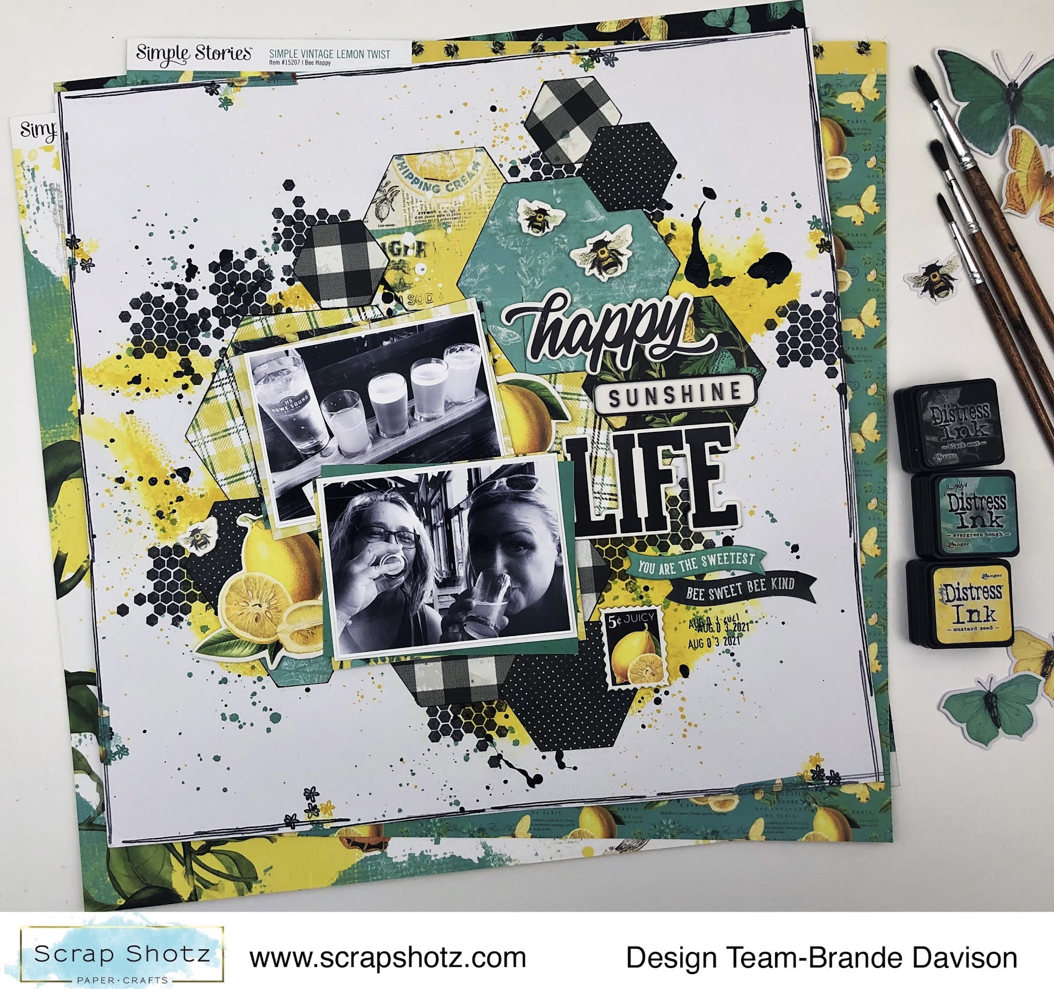
For my second layout, I played on the hexagon/bee inspired elements of the collection. I cut a bunch of different pattern paper hexagons on my die cutting machine. The patterns are so pretty - wanted to show them all off! 


Before adhering any of the hexagons, I added some mixed media to the background. The black small hexagons are another Vicki Boutin stamp from my stash applied with Staz On in Jet Black. Then some packaging technique with Tim Holtz, Distress Ink in Mustard Seed, and finally splatters in more Mustard Seed and some Evergreen Bough. I finished it off with black splatters using slightly watered down Black Nouvo. 

From there I just played with the pattern paper hexagons to create a nice anchor for the photos, and then layered a bunch of title elements down the right hand side of my photos. A little lemon tucked here and there, and a couple bee embellishments and voila! I love how bright it all turned out.

All the Hearts! 

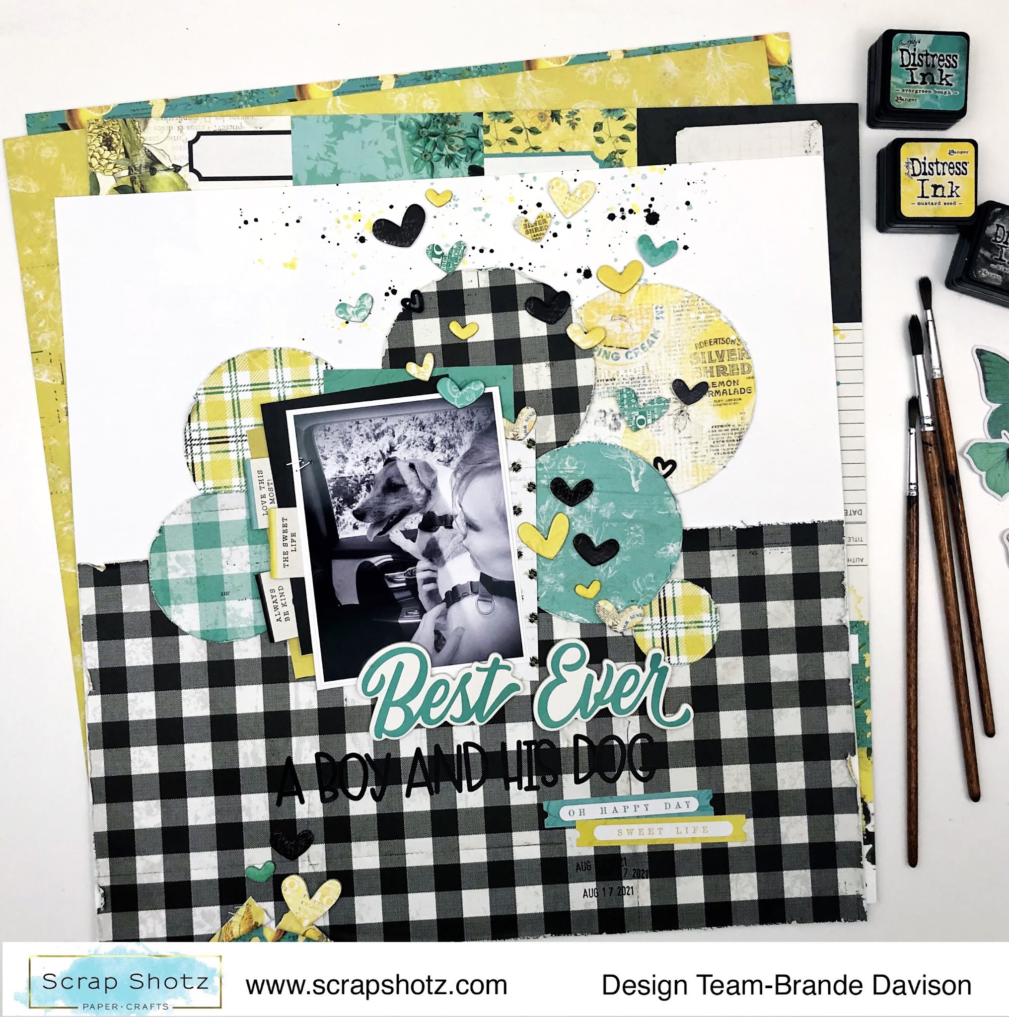
There are so many super cute hearts in this collection - sticker, cardstock and foam hearts… blue, yellow, black and pattern hearts …so many hearts. So I focused on a design that would give me an excuse to use way, way too many! 


First, I covered the bottom half of the page with the black/white plaid pattern. This is my favourite pattern in the collection so I really wanted to show it off. Then I cut a few different circles from some of the other patterns. The circles become the anchor for my photo and created a neat transition from the bottom pattern and the white cardstock (Bazzill Cardstock, Avalanche) on top. 

From there, I backed my photo in a few more pattern papers, and used the stickers sheet to create some fun tabs on the left. I also added a few splatters in Tim Holtz, Distress Ink in Mustard Seed, Evergreen Bough, and Black Soot behind the photos. 

Then it was all about the hearts! I wanted it to look like they are floating up from the love my nephew has for our dog! So focused on scattering them from the photo upwards and widening the scatter as it got close to the edge of the page. I finished it all off with a two alpha title and a little rip and extra heart at the bottom of the page. This one came together real quick - so fun! 

Strips and Stitches! 

For my final layout, I wanted to use all the pattern paper branding strips, scraps of paper and washi tape of the collection. 


First, to add a little more black to the background pattern, I used a honeycomb stencil and rubbed some Tim Holtz, Distress Oxide in Black Soot on it followed by a few sprints of water and then pressed the wet side down to the paper. This gives you a more faint and less perfect negative impression of the stencil which matched the style of the collection quite nicely. You can see it there on the top left side and near the bottom right. 

From there, I cut a bunch of strips of paper, tore each end so there were different lengths and then layered them down the left side of the page. I added a few strips of washi tape in there too for a little touch of shine. After the strips were all in place, I stitched a few with black thread on my sewing machine. I left the stitched ends loose and a little long so it looked nice and messy. 

To finish it off, I added my photo with lots of fun layered embellishments and patterns and this really long title. This collection is in the Scrap Shotz Scrapbooking Kit and included cardstock and Doodlebug alphas - these are those cute black alphas! 

Are you playing with this kit or collection - we would love to see! Tag us on social media or join the Scrap Shotz Paper Crafting Facebook Group and post up your projects! 


Tuesday, May 25, 2021

Using the May Scrap Shotz Kit Club for Scrapbooking & Cards!

Hello friends! Karla back today with a look at the May Kit Club goodies featuring the Echo Park Let's Go Anywhere collection!! One of the awesome things I love about the Scrap Shotz kit club is that you get so much inspiration on using your own kit! Each month, the Design Team puts together blog posts with fabulous projects created using the kits, so you'll never be without ideas!! Here's a look at what I've created with it so far... Plus you can check out what's in this month's kit in the video below and decide if you want to subscribe and be part of the kit club so you don't miss out on any fantastic deals! First up, I've created a 12x12 camping layout using the black and white print/woodgrain paper in the kit.


I didn't want to waste any of this amazing paper, so I cut a 1" frame from the black and white print and then flipped the woodgrain side to the front and placed it back inside the opening! I added some Walnut Stain Distress Oxide ink around the edges and glued each of the pieces to a 12x12 piece of cardstock from my stash. 


Next, I layered a piece of red sky printed paper on top, cut to 8 5/8 x 9 5/8". I added three 3x4 photos and three 3x4 journaling cards. Two of them came from the cut apart sheet from the paper pack in the kit, and one I had previously printed from the Project Life App. I added the Thickers from the kit across the top of the page - these are beautiful black and gold stickers that stick on really well!!

I finished off my title by using some of the fun stickers from the 12x12 sticker sheet included and used some enamel dots and adhesive brads.


I added another sticker and one of the fabulous (my fav 😉) puffy stickers as embellishments on the top right.


I used a white gelly roll pen to add some more journaling and another puffy sticker and adhesive brad on the bottom of my layout.


I used a camera from the ephemera pack and then added a few more stickers and enamel dots to the bottom right to finish off this layout! 


Here's a look at a Video showing you all the amazing products you get in the May Kit Club as well as the Add-Ons we had available this month! Remember to sign up now to be part of the next kit!! You can find all the details on being a Kit Club member HERE!

Next, I have a 12x12 layout to show you that we created Live on the Scrap Shotz Facebook Page! I used some more camping photos and the Creative Scrapbooker Magazine May Sketchy Challenge.


I cut out a circle from the middle of the black/tan cardstock from the kit and flipped it as I did with the layout above, so as not to waste any paper! I used those awesome Thickers from the kit again and created a title to follow the top of the circle cut. I stamped a coffee cut from a Lawn Fawn stamp set and coloured it to fit with the theme of the layout!


I used lots of fun ephemera and stickers and journaled on the 4x4 journaling card from the cut apart paper in the kit. I added an ephemera banner and adhesive brad along with an enamel dot and sticker from the 12x12 sticker sheet to the bottom of the layout.


Instead of journaling on the edges of the layout, as you can see on the sketch HERE, I added stickers and ephemera details.


Here's a look at the Live Video from the Scrap Shotz Facebook Page to see just how this layout came together!


Lastly, I created two cards using this amazing Kit and the Memory Box Put It In Gear 3D Embossing Folder! You can see the video below showing how to make these cards.


I created a fun background with Distress OxidesInks, Embossing Glazes and the New Salvaged Patina Distress Products!


The Kit papers and Chipboard worked well to create a couple of fun masculine cards! I finished them off with the enamel dots and Avery Elle White Ink Spray to create cool splats! 


You can check out how to make these cards in this Live Video here on the Scrap Shotz Facebook Page!


Thanks so much for stopping by! Be sure to check out how to become a Kit Club member HERE and find fun New Products HERE! Don't forget to mark your calendars for Thursdays at 3 pm MST when you'll find me LIVE each week on the Scrap Shotz Facebook Page sharing what's new, fun techniques and project ideas!! I'd love to see you for a crafty chat!