For a peek at my first few pages with this amazing collection, pop over to Cocoa Vanilla Studio - Happy Days. Now let’s get to my newest layouts …
Embrace The Alphas
For a peek at my first few pages with this amazing collection, pop over to Cocoa Vanilla Studio - Happy Days. Now let’s get to my newest layouts …
Embrace The Alphas
I have absolutely loved playing with this collection. At first I honestly was not sure I would have memories to match the style … but I was so wrong. This collection is all about fun, bright, cheery designs and colours; and I have loads of those kinda memories to document!
Florals for the Win!
For my first layout, I was all about showing off the amazing floral die cuts in this collection. Flowers, butterflies and bees and all beautifully coloured and detailed.
First I stamped the background Paper (Bazzill Cardstock, Raven) with Tim Holtz, Distress Oxide in Hickory Smoke using an older botanical Vicki Boutin stamp from my stash. Adds a few splatters too. Then I simply layered a whole bunch of die cuts up from the bottom of the page and down from the top - a layered jumble!
The top layer serves as the anchor for my photos (which I backed in just white cardstock) and my title. The bottom layer was a good spot to feature a few phrase embellishments, stickers and a couple of bees too from the collection.
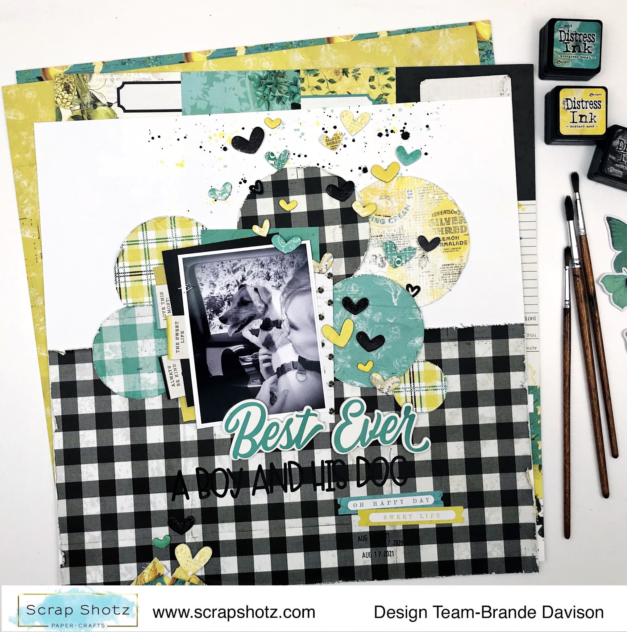
First, I covered the bottom half of the page with the black/white plaid pattern. This is my favourite pattern in the collection so I really wanted to show it off. Then I cut a few different circles from some of the other patterns. The circles become the anchor for my photo and created a neat transition from the bottom pattern and the white cardstock (Bazzill Cardstock, Avalanche) on top.
From there, I backed my photo in a few more pattern papers, and used the stickers sheet to create some fun tabs on the left. I also added a few splatters in Tim Holtz, Distress Ink in Mustard Seed, Evergreen Bough, and Black Soot behind the photos.
Then it was all about the hearts! I wanted it to look like they are floating up from the love my nephew has for our dog! So focused on scattering them from the photo upwards and widening the scatter as it got close to the edge of the page. I finished it all off with a two alpha title and a little rip and extra heart at the bottom of the page. This one came together real quick - so fun!
Strips and Stitches!
For my final layout, I wanted to use all the pattern paper branding strips, scraps of paper and washi tape of the collection.
First, to add a little more black to the background pattern, I used a honeycomb stencil and rubbed some Tim Holtz, Distress Oxide in Black Soot on it followed by a few sprints of water and then pressed the wet side down to the paper. This gives you a more faint and less perfect negative impression of the stencil which matched the style of the collection quite nicely. You can see it there on the top left side and near the bottom right.
From there, I cut a bunch of strips of paper, tore each end so there were different lengths and then layered them down the left side of the page. I added a few strips of washi tape in there too for a little touch of shine. After the strips were all in place, I stitched a few with black thread on my sewing machine. I left the stitched ends loose and a little long so it looked nice and messy.
To finish it off, I added my photo with lots of fun layered embellishments and patterns and this really long title. This collection is in the Scrap Shotz Scrapbooking Kit and included cardstock and Doodlebug alphas - these are those cute black alphas!
Are you playing with this kit or collection - we would love to see! Tag us on social media or join the Scrap Shotz Paper Crafting Facebook Group and post up your projects!
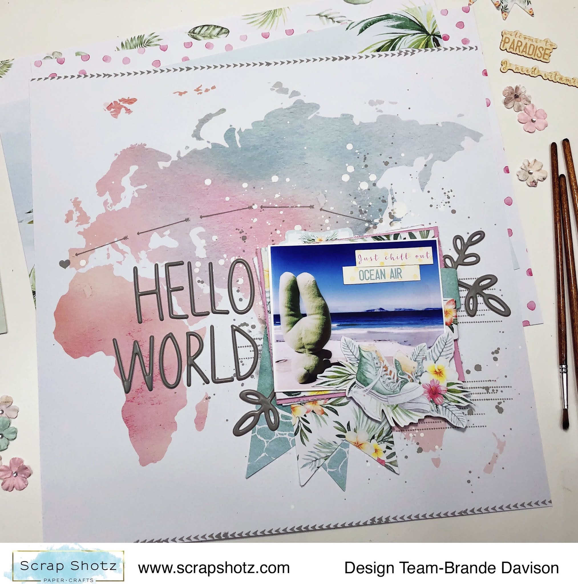
For my first layout with these watercolour summer goodies I went straight for the map pattern paper #06 - I am a sucker for a good map or globe inspired pattern.
I wanted the pattern to do all the work, so picked just one photo and layered it up with all kinds of goodies from the P13 collection. Then used the Hickory Smoke, Distress Oxide from Tim Holtz to add some arrows and a heart from the photo to Portugal (where the photo was taken).
I used some of the same ink to add a few splatters behind the photo cluster and some arrow stamps on the top and bottom of the page.
The title Hello World and the 3 botanical stems are from a gray Thickers collection deep in my stash. I love how bold they look on all the white space, and they matched the stamped ink perfectly.
Layout Two - Sweet Stripes
For my second layout, I just had to use the diagonal stripe paper #04 - the pastel colours reminded me of a yummy, sweet ice cream cone and there is no one sweeter than my wee niece! She just had to be featured on this pattern paper.
With this layout, I again focused on creating a fun photo cluster - layering all the cute things and patterns with my photo and leaving the rest of the layout to just be colourful.
I cut apart most of the pattern stripes and then used my distress tool to rough up the edges of each strip to give the page a bit more texture and dimension - and then glued it all down on a scrap white paper back in the same order of the pattern.
With my P13 goodies, Scrap Shotz included the cutest, little matching paper florals from Prima Marketing (no one does florals like Prima) - I added a few these to the photo cluster too. I love the touch of feminine to this photo of her in her ‘movie watching’ seat (aka laundry basket with a blanket and stuffies). So cute!
Layout Three - Surf's Up
For my third layout, I am all about the circles! The pattern paper #05 features gentle waves and instantly inspired me to reach for some boogie boarding photos from South Africa. My photos are not the best so I cut them in circles to try and hide the flaws - and this inspired a circle design layout!
Once I had my photos cut in circles and scattered down the page, I just played with all the stickers and goodies from the P13 collection until I had a happy, jumbled, layered “mess”. I did add some white acrylic paint splatters on the pattern paper behind the photos as well.
A few of the embellishments are fussy cut from pattern paper #03. I liked the combo of botanicals and cameras or sneakers on the pattern. I also added some of the die-cut chipboard pieces #08 (they look and feel like delicate wood veneer - love!) to a few spots on the page to bring a little texture to the layout.
The ‘Surf’s Up’ title that follows along a photo - playing on the circle design - was the finishing touch.
How are your documenting your summer?
There are still some P13 Summer Vibes goodies in the shop - pop over, grab some of these watercolour inspired designs and extend your summer!
Hello friends! Karla back today with set of summer cards using the fabulous Sandy Paws Collection from Craft Consortium! This is such a cute beachy set, perfect for hot summer days! We recently took a trip to Saskatchewan to visit family and I wanted to send out some thank you cards after our stay, and these were perfect to do just that! The 6x6 paper pad is filled with awesome images and patterns and has some really cool cut aparts too!
Hello scrappy friends. Today I have three layouts (and a bonus one) made with the Simple Stories "Safe Travels" Collection. I love the bright colours and fun embellishments. Perfect for travel pictures with kids.
Layout #1
Hello again! I have one more Carta Bella "Summer" layout to show everyone today (and I may have one more ready for the crop on Friday and Saturday!
This month I'm playing with the Carta Bella "Summer" Collection. It's full of small details and pastel colours. I made a layout and a birthday card and have some more goodies to show you on Thursday!