Showing posts with label distress ink. Show all posts

Sunday, October 30, 2022

Print Shop, Vicki Boutin - October Scrapbook Kit - Continued


The new Print Shop collection from Vicki Boutin is this month’s scrapbook kit and wow is it fun to play with! 

I love how much variety Vicki includes in her collections - this one feature florals and snails to scissors and paint splatters. There are so many memories you can document with that range of goodies! 

Cardstock Grid Layout 


For this layout I wanted to showcase this fantastic coordinating cardstock in this month’s kit - what a colour! I had to add a little mixed media to bring the ‘me’ to the design so reached for the kit’s circle stencil and some Distress Inks. 

Using a ruler I drew a line down the middle of the page horizontally and vertically using a couple of different widths of journal pens to create the grid. Then I used the circle stencil and a random combination of Distress Ink stormy sky, crushed olive, saltwater taffy and a bit of black soot to add pattern to each grid square. 

I didn’t worry too much about how much of each colour I used and purposely made sure it was a bit uneven so it was a little messy. I finished off with the plus sign stamps with Paper Rose Studio, Premium Dye Ink in Intense Black and some black splatters. 

After that I created a cluster of pattern paper behind each of the three photographs and dropped them into one of the grid squares. Making sure each cluster included one of the cut apart tags. Then the real fun begins - embellishments! I had so much fun tucking things here and there until it looked busy. 

All the Patterns 

For this next layout I reached for all of my favourite patterns from the kit and made strips of paper 6 inches wide and of varying heights (about 2 inches each). I wanted to create a cascade of paper strips all messy down the middle of the page to give me lots of places to tuck embellishments. 

Before adhering the strips down, I used a paper punch to give one edge a notebook journal edge. I also used my ruler and a journal pen to create some random stripes across the paper strips. Once adhered down, I went through and added any embellishment that was about creating, making, being awesome and even the cardstock scissors found a home tucked in the layers of pattern paper for this one. 

I have lots of goodies left to play with and you can bet this kit will be on my desk for a while yet - such fun! 

You can also check out the first two layouts I made at Print Shop, Vicki Boutin - October Scrapbook Kit - these ones focused on the floral and botanical ephemera. 

If you are playing with the kit, we would love to see! Pop your creations up on the Scrap Shotz Paper Crafting Facebook Group or tag us on Instagram so we can ohh and ahh! 


Saturday, October 29, 2022

Print Shop, Vicki Boutin - October Scrapbook Kit

I am loving playing with the new Print Shop collection from Vicki Boutin - this month’s scrapbook kit! All the amazing colours and florals and oh my! 


I decided to start my Print Shop adventure with a focus on the flowers and botanical ephemera. There is a great mix of florals, leaves and stems that make layering on a page super easy. Here we go … 

Monochromatic Botanicals


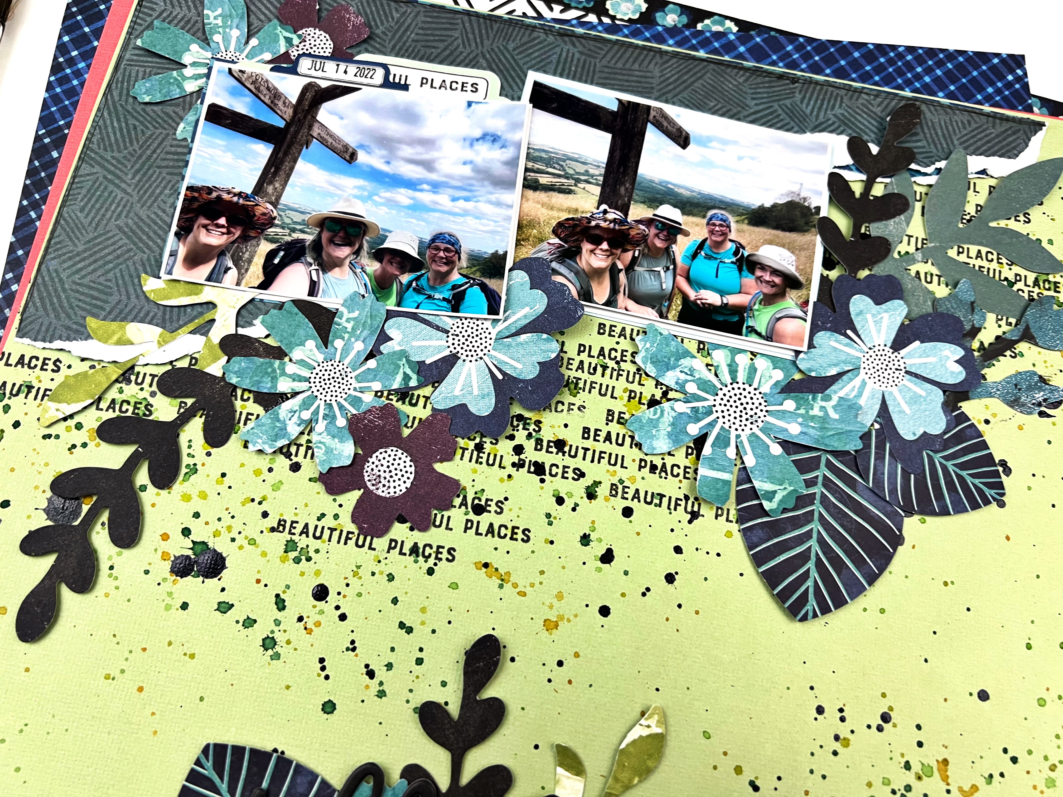
For the first layout I pulled all the blue, green and purple botanicals from the ephemera kit - I also picked out papers from the collection and corresponding cardstock go the same colour scheme. My idea was to feature the design on the top and bottom of the page with all the leaves and such ‘growing’ towards each other to fill the space between. 

I prepped the cardstock background with a bunch of repeated stamping with the word ‘beautiful places’ from a past Vicki Boutin stamp collection using Paper Rose Studio Premium Dye Ink in Intense Black. I also added some black splatters over the stamping using some Nuvo Crystal Drops, Black mixed with a touch of water. To add a touch of colour I splattered some Distress Ink in mowed lawn, crushed olive and peeled paint too. 


From there, I ripped some of the pattern paper to create an anchor for my photos on the top and bottom of the page - making sure to not cover all the stamping and splatters. I added my photos and then spent the next bit tucking and layering the ephemera I had put aside until it looked messy but somehow still organized. 


A little trick if you want to layer after the big stuff like photos and pattern paper are stuck down - only glue or tape down the very center of things so you have lots of room to tuck and layer behind. When it’s all in place you can go back and gently add a few more spots of glue to make sure it stays put. 

The title ‘perfect day’ was the final touch - I love how it’s nestled in with the leaves and stems! 

Overflowing Envelopes


For my next layout I had an idea to create a line of envelopes all overflowing with florals and butterflies. I had three photos of me and my wee niece where she tried to take the selfie of us that make me laugh so much. I thought the ‘overflowing’ design would be a way to how my love this little peanut often feels the same. 

I selected a few of my favourite patterns from the collection and used my Big Shot and the little envelope die from Paper Rose Studio to create 4 envelopes - they are sort of hard to see in the final layout, I may have overflowed the overflowing look.

I selected this text pattern from the kit so there was some pattern but nothing that would overwhelm the envelopes. I prepped the background with the repeated heart stencil from the collection using Distress Ink in scattered straw, saltwater taffy and a touch of crushed olive. First rubbing the inks through the stencil randomly so they blended here and there and second as light splatters across the page. The text pattern already has some black splatters,  so I added a few more to bring some more black in. 


I adhered the 4 envelopes across the hearts and added my 3 photos, then just started tucking and playing with the florals from the die cuts, stickers and chipboard stickers in the kit. A few butterflies here and there added some contrast. Finally I added the title from the phrase puffy stickers in the collection for a pop of black. 


I am off to play some more! There is a whole pattern paper of cut apart tags that I have my eye on - be back soon to show you what I come up with. 


Wednesday, September 15, 2021

P13 Summer Vibes


Not sure about you, but I am not ready to say goodbye to summer just yet. So I am extending the season by focusing only on summer themed scrapbook supplies while in my crafty space, such as P13 Summer Vibes collection. Documenting some of my favourite summer memories with these happy supplies keeps the sunshine around a little longer! 

Layout One - Hello World 

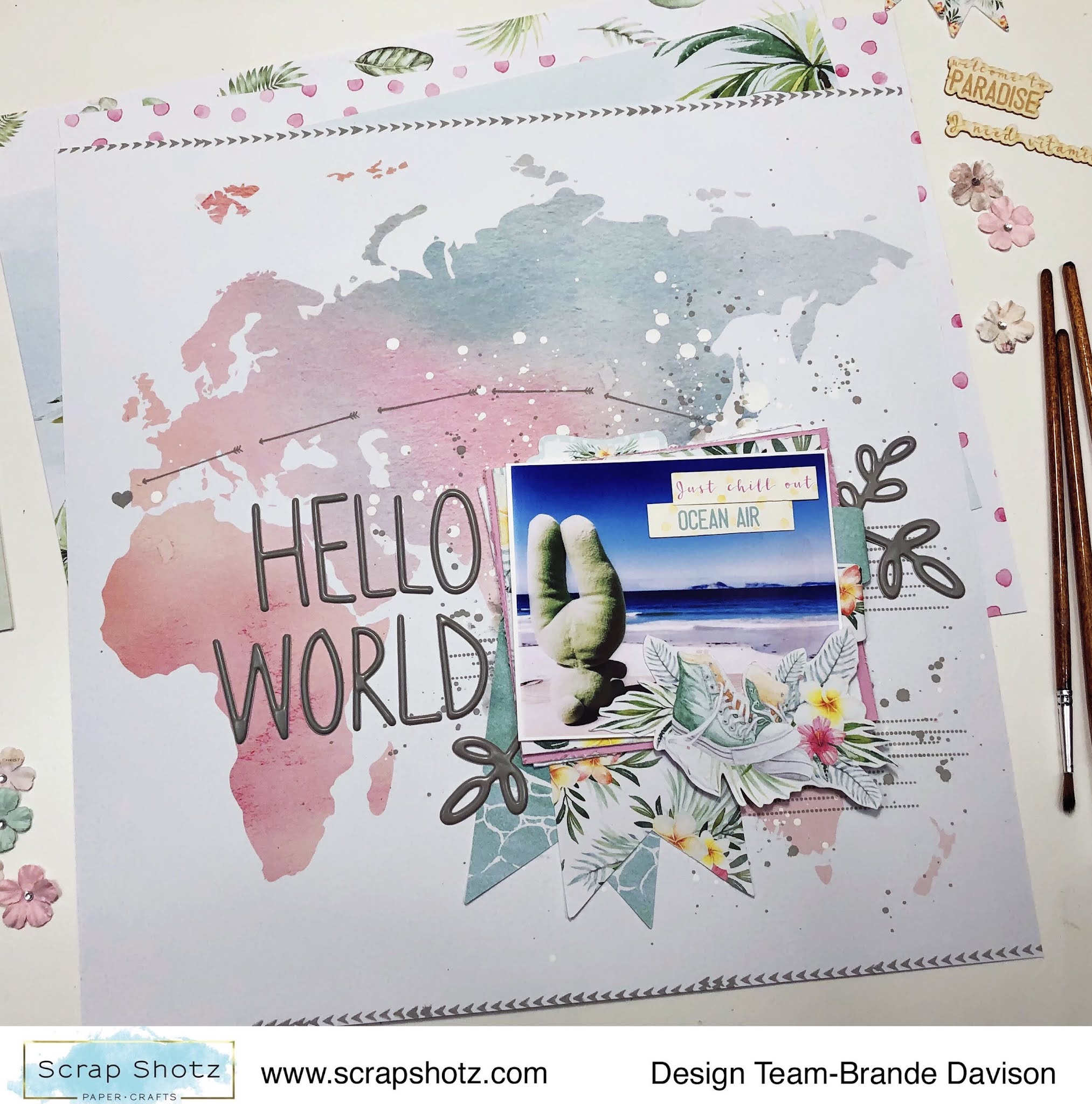
For my first layout with these watercolour summer goodies I went straight for the map pattern paper #06 - I am a sucker for a good map or globe inspired pattern. 


I wanted the pattern to do all the work, so picked just one photo and layered it up with all kinds of goodies from the P13 collection. Then used the Hickory Smoke, Distress Oxide from Tim Holtz to add some arrows and a heart from the photo to Portugal (where the photo was taken). 

I used some of the same ink to add a few splatters behind the photo cluster and some arrow stamps on the top and bottom of the page. 


The title Hello World and the 3 botanical stems are from a gray Thickers collection deep in my stash. I love how bold they look on all the white space, and they matched the stamped ink perfectly. 

Layout Two - Sweet Stripes

For my second layout, I just had to use the diagonal stripe paper #04 - the pastel colours reminded me of a yummy, sweet ice cream cone and there is no one sweeter than my wee niece! She just had to be featured on this pattern paper. 


With this layout, I again focused on creating a fun photo cluster - layering all the cute things and patterns with my photo and leaving the rest of the layout to just be colourful. 

I cut apart most of the pattern stripes and then used my distress tool to rough up the edges of each strip to give the page a bit more texture and dimension - and then glued it all down on a scrap white paper back in the same order of the pattern. 


With my P13 goodies, Scrap Shotz included the cutest, little matching paper florals from Prima Marketing (no one does florals like Prima) - I added a few these to the photo cluster too. I love the touch of feminine to this photo of her in her ‘movie watching’ seat (aka laundry basket with a blanket and stuffies). So cute! 

Layout Three - Surf's Up

For my third layout, I am all about the circles! The pattern paper #05 features gentle waves and instantly inspired me to reach for some boogie boarding photos from South Africa. My photos are not the best so I cut them in circles to try and hide the flaws - and this inspired a circle design layout! 


Once I had my photos cut in circles and scattered down the page, I just played with all the stickers and goodies from the P13 collection until I had a happy, jumbled, layered “mess”. I did add some white acrylic paint splatters on the pattern paper behind the photos as well. 

A few of the embellishments are fussy cut from pattern paper #03. I liked the combo of botanicals and cameras or sneakers on the pattern. I also added some of the die-cut chipboard pieces #08 (they look and feel like delicate wood veneer - love!) to a few spots on the page to bring a little texture to the layout. 

The ‘Surf’s Up’ title that follows along a photo - playing on the circle design - was the finishing touch.

How are your documenting your summer? 

There are still some P13 Summer Vibes goodies in the shop - pop over, grab some of these watercolour inspired designs and extend your summer! 


Tuesday, April 17, 2018

April Kit and CSM Sketchy Challenge

I can't believe how much I love the April Kit featuring Twilight from OneCanoeTwo! The colours are not my go to's and floral backgrounds are out of my comfort zone! But there are so many options that all go together, floral, plaid, the fireflies, so many ways to use this collection.
Here is my layout based on the Creative Scrapbooker Magazine and their April Sketchy Challenge.


 Here are a few step outs showing how I got my pieces together.

I chose my pictures, they were ones i had in 4X4 size so they were a great fit for this layout. Yes, I know it's different to scrapbook travel brochures and wine, but I am a bit different LOL

I cut all my layering squares 4 1/4 X 4 1/4 and edged them in Black Soot Distress Ink. Love the plaid designs in this collection!

I used the matching Twilight stamp set and Distress Ink in Victorian Velvet, Black Soot, Iced Spruce and Shabby Shutters and added them to my border at the bottom of my layout. I used the regular distress inks, but you could use the Oxides and even the markers to colour the stamps.

 Here are a few close ups of the different sections of the layout. Absolutely love the metallic rose gold letters that go with the Twilight collection.

The capital letters are Thickers that are also available in the Scrap Shotz store.

For my strips I used the branding strips from the bottom of the 12X12 sheets of paper. The flowers,leaves and "love" are from the Twilight stamp set.

The layers of paper peeking out from under the pictures.

Yes I took a picture of the lovely wines I brought back from Nova Scotia. The Tidal Bay is a special blend that is only available in Nova Scotia.

Scrap Shotz puts together such amazing monthly kits! And it's not just for scrapbooking. You can create so many things with the kits! Head on over to the store and sign up for your monthly kit!

Keep checking in for some great layouts and projects with the Twilight collection and some fabulous products available in the store!

Have a wonderful week everyone!


Wednesday, April 4, 2018

Shadow Script Words

Happy Wednesday! I can't believe it's April already and Easter is over! But I am ready for spring and flowers! Today's projects are simple cards that you can put together quickly. The new Shadow Script #1 Thinlits are amazing! I don't think you can ever have too many word dies and now the shadow part can be cut out too!

I used bits of paper I had in my scrap pile from the TH Etcetera paper for the words, and for the shadow part I used some dark brown card stock I had .

For my layers, two pieces of Th Etcetera paper edged in Distress Ink in Walnut Stain and these I adhered flat.
To add some texture I used my TH heart stencil and some of the wonderful grit paste, and once it had dried a bit I lightly sponged over it with the Walnut Stain Distress Ink. I love the roughness of the grit paste.

And the finished project!


My second project is using the Sizzix 3-D Bohemian Botanicals Embossing folder. For this one I embossed two pieces, then chose my favorite flower, painted it with Distress Oxides in Wilted Violet, Shaded Lilac, Lucky Clover and Evergreen Bough and then cut it out.


Once my ink was dry, I cut out the coloured piece, layered it on black cardstock with very thin amount of black showing and adhered it to the first embossed layer. Kind of spotlighting just the one flower. I love this technique because you can choose any section you like to spotlight.

You can see at the bottom of coloured piece and at the side that it joins the embossing below.
My finished spotlight card.


Thanks for stopping by the Scrap Shotz blog. Keep checking in because the new monthly kit is being released and you won't want to miss out on that!

Have a wonderful day everyone!