Tuesday, December 15, 2015

Favorite Finds: Altenew Vintage Roses Stamp and Dies

Every year I am amazed at the innovative and beautiful products that the papercrafting industry designs. This year, I am in LOVE with layered stamps. (Pssst! I cannot get enough of the layered stamps.)

One company that stands out to me for its beautiful layered stamp sets is Altenew. Wow, their stamps are simple but complex; sounds like an oxymoron doesn't it?!!! What I am trying to say is that the images are simple in and of itself  but with the layering of the stamps, every image is stunning, dimensional and complex. 

Take a look at the cards below using the Vintage Roses and die set. You can create 5 different roses of varying sizes, each with 3 or 4 layers of stamping. As well, there 8 different layered leaves that complement the roses, each with 2 or 3 layers of stamping. It is the layered stamping that yields rich realistic stamped images. 

Also, I used the Altenew ink groupings to stamp the images below. What I adore about Altenew's ink sets is that all the colours coordinate perfectly with each other. 


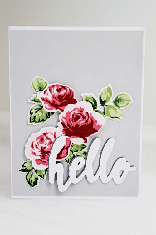
Supplies:  Altenew (Vintage Roses stamp and die set; Halftone Hello stamp and die set; inks); SEI (cardstock and pattern paper)


Supplies: Altenew (Vintage Roses stamp set; inks); Wplus9 (Thank you stamp set); Staples (cardstock)

Monday, December 14, 2015

We're Back....Just in Time for Christmas

Well, hello...it has been a long while since I have posted on the blog. Scrap Shotz has been busy. They presided at the Canadian Scrapbook Carnival held at Spruce Meadows and the hosted their fall crop. In preparation of the Carnival and the crop, I had the opportunity to put some new products through its paces. I'd like to share those projects with you over the next month.

First up, the Minc by Heidi Swapp. That benign rectanglar box makes oh such beautiful things!


I'd like to share with you how I use the Minc. Firstly, the Minc is a laminator. Just pop into your local stationary store and purchase laminating sheets. Place your item between the sheets and insert into the Minc. You may have to adjust the heat so try a tester first.

Secondly, create beautiful tags, pattern paper and accents or your cards and layouts using Heidi Swapp's pre-made tags, labels, paper and accents. Just add the foil of your choice and insert into the Minc. In seconds you will create beauty! The "Smile" accent is a pre-made Heidi Swapp accent.


Next, you can foil your stamps. What??? Yes, you can foil your stamps. I have found bold strong outlined stamps work best. Heat emboss Ranger Sticky Embossing Powder onto an image stamped with the  Ranger Emboss It pad. Once it cools, add foil and insert through the Minc machine and beauty will appear!

Lastly, I use the Minc machine almost exclusively with my dies. Here I create a paper sandwich of cardstock and Stick It. (Stick It is my double sided adhesive of choice with dies.) Die cut an image. Remove the release paper from the Stick It. Add foil and insert through the Minc machine and again beauty will appear!


The Seasons Greetings die by Quietfire and Elizabeth Craft is easily cut and foiled to create that fabulous card!

I hope the Minc is on your Christmas list this year!


Monday, July 20, 2015

Fabulous Find: Spellbinders Shapeabilities In'spire Die Cowboy Stomp


Yeehaw!!! If you are looking to add a western flair to your layouts and cards look no more! The Spellbinders Shapeabilities In'spire Die Cowboy Stomp is a beautiful intricate die that adds pizzazz to any project. Check out the card by Rosie N. combined with the Heartfelt Creations flowers.


Beautigul - thanks Rosie!

Tuesday, June 16, 2015

Fabulous Find: Wendy Vecchi/Studio 490 and DreamWeaver Translucent Embossing Paste

This powerhouse embossing paste has changed my view of embossing. I adore a tone on tone look and I also love a full embossed background to layer accents on. Well, this can be achieved in minutes with the Wendy Vecchi/Studio 490 and/or DreamWeaver Translucent Embossing Paste.

Let me tell you a bit about my experience with this embossing paste. Firstly, it is easy to apply - just use a palette knife and spread a thin coat through a stencil of your choice. I let it air dry for about 5 minutes and then heat the embossing paste. Unlike the Viva Ferro paste, the translucent embossing paste feels somewhat rubbery after being heated and is quite flexible. It also cleans up wonderfully with warm water - no soap for this girl! Then a few passes through my Vagabond with the Wplus9 Happy Trio die and another finished card.


If you would like to take your translucent embossing paste to the next level, sprinkle embossing powder over the translucent embossing paste that you have applied through your stencil. Then heat and add your accents. Here I used the Wplus9 Hand Lettered Hello die, available directly from Sandy.


A quick word...you can skip the silver embossing powder - translucent embossing paste combo by using Wendy Vecchi Silver Embossing Paste, also available directly from Sandy. (Psst...it also comes in Gold Embossing Paste too!)


Monday, June 15, 2015

Fabulous Finds: Elizabeth Craft Design Stickers, Glitter Ritz, Embossing Folders and Copics

Elizabeth Craft Designs has a diverse line of stickers. When I say stickers, I mean beautiful intricate designs that become show pieces for cards, art journals and layouts. See these stunning samples made by Carolyn W. against dry embossed backdrops. These cards showcase the sticker, ultra fine glitter and copics technique.

For our first card, the Darice Assorted Stars Embossing Folder is used to create the card background.


The Darice Floral Butterfly Embossing Folder is showcased on this card along with the Elizabeth Craft Butterfly Label 1 Stickers.


Flowers Label 1 in Black by Elizabeth Craft Designs is showcased on this card.


It may seem early for Christmas but it isn't! Christmas supplies sell out fast. This versatile sticker by Elizabeth Craft Designs shown below is called Birds and Branches. It can be used for Christmas but also as an all occasion or sympathy card.


Don't forget that most Elizabeth Craft Designs stickers can be used twice as much as regular stickers. Why? Because you use the positive AND the negative of the sticker! I personally love them.


Friday, June 12, 2015

Fabulous Fundamental: Watercolours

The look of watercolours is all the rage now...and I understand why! There is a softness that prevails but at the same time, there is intricate texture. I idolize Amy Tan because she makes the watercolour technique look so easy, casual yet at the same time, elegant.

You can achieve the watercolour look in a variety of ways. Connie V. (from our card swap) used watercolours and a Julie Nuttig stamp - you can order it directly through Sandy.

Editted: February 7, 2016: Connie V.'s card image is currently out for publication. (Yeah Connie!)

Don't you love how Lorraine M. achieved this look with Tim Holtz distress inks?


And for the card below, I stamped with my Faber-Castell gelato to achieve the soft watery look of watercolours.


Have I inspired you to dabble with the watercolour look?


Tuesday, June 9, 2015

Fabulous Inspiration: Happy Birthday Cards

I am very sorry it has taken me so long to post cards from Scrap Shotz's recent card swap; however, better late than never!

Whenever I receive cards from the Card Swap, I am wowed by the creativity and then consumed with inspiration. I hope you will feel as energized as I was by these cards!

(Ladies! Sorry if I have the wrong artist for each card - drop me a note and let me know, ok?)

From Connie V. The multi-hued chevron background and the watercoloured look makes this a rather spunky contemporary card!


Ellen Y. made this masculine card. The blue jean blues hint at familiarity, comfort and love for sure but that pop of red really captures the recipient's eye! Love this card!


This card by Rosie N. showcases the My Favorite Things - Die-namics Peek a Boo Squared die. At first glance, you might overlook this uber versatile die but look how Rosie made this die into a shaker card? It is an exciting card for a birthday Boy or Girl!


This card is so simple yet oh so stunning. Using the negative of the star border die to show a bold green makes this card a show stopper! Awesome job Tammy L.!


And this is my card, very much inspired by a Pinterest image I saw. I love the look of gold and silver together and dug into my Teresa Collins sequins from a recent Scrap Shotz monthly kit as well as some star shaped glitter. As well, I have serious love for the Wplus9 Happy Trio dies!


I hope this blog post inspired you to create too - let me know!

Sunday, June 7, 2015

Fabulous Find: Viva 3D Stampers Paint

Want to make a stunning one of a kind card for a special someone super quick??? Try using Viva 3D Stamp Paint.

Viva 3D Stamp Paint adds a vibrant sparkly look to your project. It is both smear- and water- proof. I used a make-up sponge to apply the paint and used an almost dry baby wipe to clean up.

To make the cards below, I heat embossed a background stamp to cardstock. After the heat set embossing powder cooled, I used a small amount of paint (about the size of a pea) and rubbed it over the embossing. The embossing resisted the paint and created the cool effect below. It is hard to see in the photos but there are no areas of light and dark on the card front; its my picture taking ability, or lack thereof.


To finish each of the cards, I added a "happy" from the Wplus9 Happy Trio die and an Elizabeth Craft butterfly die cut. 

Other ways I have used the Stampers Paint? Well, I have coloured wood veneers, flowers and die cuts. I have also used it as an accent in my art journal. 

Have you tried the Viva 3D Stampers Paint? I'd love to hear what you have used it for! I am still experimenting with it!

Thursday, June 4, 2015

Fabulous Fundamental: Tinted Texture Paste and Distress Inks

Are you loving the monthly release of the Tim Holtz distress inks as much as I am? My creative juices start flowing whenever a new colour is released.

With the Cracked Pistachio distress ink, I experimented with Peacock Feathers and Pine Needles for the majority of the background. To add interest to the background, I sprinkled water onto the background. It does not matter how many times I watch but I love how the distress inks react with water...it is so amazing!

After heat setting the water reaction, I stamped the sentiment from a Wplus9 stamp set and inked the edges with Vintage Photo.

At this point, I thought the card was done but I looked across my desk at my new Tim Holtz Layering Stencil, specifically, Blossom. So I tinted Ranger Texture Paste with Cracked Pistachio distress ink on my craft mat and applied it through the Blossom layering stencil.

Here is the card!


Do you like this colour combination? Do you tint your texture paste? I'd love to hear from you!

Monday, June 1, 2015

Fabulous Find: Hero Arts Ombré Stamp Pads

One of the hottest trends now is Ombré Inking. So what exactly is Ombré? Ombré comes from the french word meaning shaded or shading; that is, there are colour gradations moving from dark to medium to light. The colours can be from the same colour family or they can be from related colour families.

This card has been previously posted as an example of Ombré inking using the Tim Holtz distress inks. There are dark, medium dark, medium, medium light and light sections.


While it was rather easy to ink an ombré background using distress inks, Hero Arts has made it extremely easy to create ombré looks, be it a single stamped image or an entire background with their new Ombré ink pads.  Check out the beautiful colours Sandy is carrying in the store: Butter to Orange; Grey to Black; Mint to Green and Pink to Red.

Below is a set of cards using the Pink to Red Hero Arts Ombré ink pad.


I love that rich texture Ombré inking affords to a card, accent or layout. As well, the Ombré inks dry permenant, are fade resistant on glossy papers and are waterproof for watercolours and markers.

What do you think of Ombré inking?

Friday, May 29, 2015

Fabulous Find: WPlus9 Stamp and Die Set

Wplus9 makes a wonderful product. We featured their stamp and die set as another make and take at the recent annual Scrap Shotz NSD crop.

What I found easiest was to die cut the shapes I wanted on the card. Then I used the corresponding stamp to stamp the die cut shape. After letting the pieces dry, I assembled them on my card front. The card on the left was stamped with the Tim Holtz distress inks - Cracked Pistachio, Mermaid Lagoon and Abandoned Coral. On the right the die cut pieces were stamped using Ranger Dye Inks.


For the sentiment, I die cut several Wplus9 Happy Trio die cuts. Then I followed one of Jennifer McGuire's wonderful tips and adhered 6 die cuts together to create a dimensional chipboard like accent. The hammered metal look on the "happy" die cut was created using Ranger Metallic Paint Dabbers

On the stamp set, there are two styles of flowers in 3 different sizes. Layered together, they would make a beautiful 3D flower. But I wanted to use the stamps. With 3 different colours, I randomly stamped my paper. Then I cut a frame and adhered it to my card front. The sentiment stamp is by Kaisercraft. A few pearls by Prima and voila the card is finished!


Thanks for stopping by! 


Tuesday, May 26, 2015

Fabulous Find: Tim Holtz Crazy Bird


In the words of Beyonce, I have been "Crazy in Love" with Tim Holtz' Crazy Bird stamps!


These guys are so adoreable - look at their faces! There is a bird for every card and the fun I've had making sentiments to match? Well, let me just say I have had a perpetual smile on my face.

A few things about these stamps that I have experienced...and I am by no means a Power-Stamper! For me, I love the material that these stamps have been made with because they yield a crisp clear image. The stamps sit solid on my block, ink beautifully with either archival ink, distress ink or even paint! There are so many options on how to colourize the birds.

In the card below, I chose a more "painterly" approach and coloured the bird with Claudine Helmuth acrylic paint. The bird was fussy cut using my fabulous Elizabeth Craft Fine Point Scissors. (A quick word about the scissors...ummm they are very very sharp!)

The background was created by applying Wendy Vecchi Translucent Embossing Paste through the Tim Holtz Woodgrain Layering Stencil.  Using distress inks and a waterbrush, I created a watercolour swatch of sweet colours that once dry was die cut using the Wplus9 Happy Trio die (that can be ordered directly from Sandy) to create the sentiment.


When all these elements are put together, it creates a fun card to give a special someone in your life! 

Have you been enjoying your set of Crazy Birds???

Sunday, May 24, 2015

Fabulous Find: My Favorite Things Die-namics Steel Fancy Flourish and Heartfelt Creations

So often a flourish is the perfect accent for your papercrafting project. It looks beautiful with flowers as shown below in the card created by Rosie N. (keep reading for more on those unique customized flowers);


or it can be adorned with gems and pearls...or it can serve as the perfect backdrop for a focal point image as in the layout created by Rosie N. below.


Now a special word on those fabulous flowers!!!! Aren't they absolutely gorgeous??? Yeah, I think they are gorgeous too and Rosie showed me how to make them using the Heartfelt Creations Deluxe Flower Shaping Kit. Let me be completely honest with you...when I first saw those flowers, I was convinced I would not be able to make them. But in 3-4 easy easy peasy steps, I watched Rosie create them...and yes, I can make them. For all the Heartfelt Creations accessories, click here.


Thursday, May 21, 2015

Fabulous Find: Spellbinders Butterfly Expandables

At the annual Scrap Shotz NSD crop, one of our make n takes showcased the Spellbinders Shapeabilities Butterfly Magic Expandable Die shown below. What makes this die so unique is that you can lengthen and extend your initial die cut. Each side of the die matches to itself perfectly. To learn how to use the die, here is a YouTube link that gives you more information.

From my sample below, I used the die cut individually. I also cut an extra die cut but isolated the butterfly. The butterfly was coloured with the Abandoned Coral distress inks. I heat set the distress ink and applied a layer of Ranger's Glossy Accents to the top.


To create the background, Mermaid Lagoon and Cracked Pistachio distress inks were applied. Are you as in love with Tim's monthly released colours of distress inks that I am???

Wednesday, April 15, 2015

Fabulous Inspiration: Just Because Cards

Have you heard the phrase, "A little bit goes a long way?" Sometimes I send a card to my Mom or a friend for no specific reason. When my Mom receives it, she is thrilled and I feel like a million bucks because I've put a big smile on her face. That small gesture made her so happy!

Below are some "Just Because" cards from the card swap. Sending one of these cards is sure to put a smile on its recipient!

Check out this faux-filigree window card by Rosie N. Gorgeous, right? Rosie told me she cut the design on her Cameo but you could easily replicate this look with any die cutting machine and a more intricate die.


Lorraine M. made a stunning background of striated colours as a backdrop for her cutting plate die cut.  It love how Lorraine made the focus her die cut - everything else is a complementary addition.


Don't you love this soft muted rose toned card by Tammy L.? The matted blocks showcase her stamped image beautifully.


I was gobsmacked by Connie V.'s water coloured card and I must confess I spent time deconstructing it so I could learn how to make it!!! The finishing touches are what drew my eye...like the tulle and heart clasp on the ball gown - just beautiful...


Ellen's cards are so perfectly coordinated. This quilt block look is classic and elegant...just like Miss Ellen! The hints of grey in the blues, taupes and purples make this card so versatile as the recipient could be a male or female. Gorgeous!


And lastly, I have shown you my Just Because card in an earlier blog post. That Spellbinders die is so well loved and used!


Thanks for dropping by - I hope we have inspired you to create.

Monday, April 6, 2015

Fabulous Find: Ombre Backgrounds

As you know I peruse various blogs like Jennifer McGuire and Pinterest...and I also watch oodles of videos on YouTube by manufacturers and craft reviewers. Why? Because I love to see what new products are coming to Scrap Shotz, check out the latest trends and even more, I love to see how other artists use the product creatively. All that inspiration incites me to create, create, create!!!

One of the recent techniques I have seen is Ombre Colouring or Ombre Stamping. Hero Arts recently released a set of ombre stamp pads - very very cool! It made me wonder how I could achieve a similar result using inks and colours I already had on hand.

I decided to use my Tim Holtz distress inks because I adore how fabulously they blend. As well, I love how distress inks react with water. If I decided to add an extra subtle shimmer with my Ranger Perfect Pearls, it would be easy to do. In the end, I did not add any Ranger Perfect Pearls but a girl likes to have that option! (*wink* *wink*)

Using Tattered Rose, Worn Lipstick and Pickled Raspberry, I applied colour to a piece of white cardstock. I made sure to have visible areas where the blended inks appeared so in essence, I wanted to see 5 gradations of colour on my background. Once the colour was applied, I quickly heat set the inks.

In the interim, I used my Spellbinders Shapeabilities - Floral die to die cut an intricate overlay for the ombre background. Then I adhered the overlay to the ombre background using a nominal amount of liquid adhesive, to not activate the distress inks. A few Prima gems and a quick sentiment the card was finished. I am happy with the results.


Supplies:  Bazzill (white cardstock); Tim Holtz (distress inks); Prima (gems); Close to my Heart (sentiment stamp)

Do you like the ombre trend???


Thursday, April 2, 2015

Fabulous Inspiration for Kids' Birthday Cards

Hello hello hello!!! In our recent Scrap Shotz card swap, one of the categories was Kids' Birthday cards.  Don't you absolutely love everyone's card?

For this card, adhere 4-6 die cuts to create dimension with your die cut on the card. Then colour the Taylored Expressions balloon die cut with Tim Holtz distress ink and spritz it with Ranger Perfect Pearls for some glitz. Add a bow made using the WRMK Envelope board.

By Virginia W

Check out the fresh and fabulous take on ombre stamping on Connie's card! And the innovative use of the scalloped dies as puffs of smoke from the rocket launch - fabulous!

By Connie V.

The bouquet of birthday balloons with striped twine are adorable on Lorraine's card. The white background makes the green pop for an eye catching card!

By Lorraine M.

Rosie embossed a basket weave background for her card. The detail yet subtle background complements her dimensional sentiment matted in a bright coloured label shaped die. Absolutely lovely!

By Rosie N.

Who doesn't love an Etch-a-Sketch?? This adorable card by Tammy is a cute take on a kids' favorite toy. Clean, simple and fabulous!

By Tammy L.

And last but not least, here is Ellen's wonderful kids' birthday card. I fell in love with the embossed candles with a touch of ink edging it - doesn't it look like the candle flame.  The colours are so very party-like! So where is the party???

By Ellen Y.

I hope you are as inspired by the cards from the card swap as I was! Leave me a comment as I would love to hear from you!

Monday, March 30, 2015

Fabulous Fundamental: In-laid Die Cuts

Dies, dies, dies...I can't get enough of them...sigh. They are uber versatile and I love how uniform the die cut is. So to further my love of dies, I have spent a "fair" (wink wink) amount of time perusing pinterest and stalking blogs for unique and interesting ways of using dies.

Below is my take on cards I found on pinterest...and as it happens I made several of these for the card swap but in the end, they didn't make the cut!

This card was made using distress inks painted onto water colour paper using a water brush. I actually love the perfectly imperfect look. After I applied the inks, I let it air dry and then spritzed it with some Ranger Perfect Pearls for some shine. You can't see the shimmer in this image...sorry but there is just a little something extra on it.

When the water colours were completely dried, I die cut the "happy" sentiment. For this card, I wanted the "happy" sentiment to be slightly elevated so I cut another 4-5 sentiments and glued them together. Then I inserted the sentiment into the die cut watercolour paper, matching up the colours.

Also I flicked on some Prima charcoal mist. I remembered watching a Ranger video where the artist mentioned black makes colour pop so that is what I did. Unfortunately the black Prima mist smudged and hence did not make the card swap cut. I'm not sure why the mist smudged because I let it air dry overnight but it was a bit disappointing to me as was the leaking nozzle. The "happy" die is from Wplus9. This die gets alot of mileage as I pair it with sentiments such as birthday, anniversary and so on.


Another look that I've seen Jennifer McGuire profile is the non-dimensional inlaid die cut look. Its beautiful, easy to replicate and looks like a million bucks! This "hello" die is also from Wplus9.  (If you are interested in these dies, just pop an email to Sandy.)


Thanks for dropping by - I am going to showcasing the stunning cards from the card swap!

Tuesday, March 3, 2015

Thinking of a Card Swap????

Have you ever joined a card swap??? If not, please give it some consideration. It is an excellent opportunity to join the very friendly online community of Scrap Shotz. You also receive stunningly beautiful cards, maybe ones that you would not normally make for yourself and best of all, it inspires you to try new products and techniques.

Below is a picture of the "Hello" card swap category we did last fall. (Swappers - I am sorry that I don't remember who made which card but everyone is from the Scrap Shotz community!)


I hope to see you soon!

Wednesday, February 18, 2015

Scrap Shotz Forum Card Swap: Love is in the Air


If you did not already know, Scrap Shotz has a lovely active forum.  One of the activities we regularly participate in is card swaps. It is an excellent way to build your card stash with a variety of stunning cards. Look below at the cards swapped for Valentines!


By Connie V.

By Tammy L.

By Virginia W.

I hope you will join us on the forum and participate in the many swaps!