Showing posts with label P13. Show all posts

Wednesday, September 15, 2021

P13 Summer Vibes


Not sure about you, but I am not ready to say goodbye to summer just yet. So I am extending the season by focusing only on summer themed scrapbook supplies while in my crafty space, such as P13 Summer Vibes collection. Documenting some of my favourite summer memories with these happy supplies keeps the sunshine around a little longer! 

Layout One - Hello World 

For my first layout with these watercolour summer goodies I went straight for the map pattern paper #06 - I am a sucker for a good map or globe inspired pattern. 
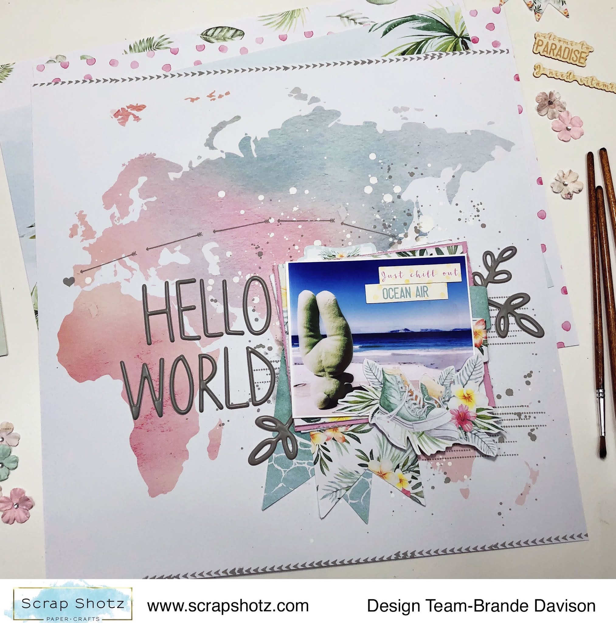

I wanted the pattern to do all the work, so picked just one photo and layered it up with all kinds of goodies from the P13 collection. Then used the Hickory Smoke, Distress Oxide from Tim Holtz to add some arrows and a heart from the photo to Portugal (where the photo was taken). 

I used some of the same ink to add a few splatters behind the photo cluster and some arrow stamps on the top and bottom of the page. 


The title Hello World and the 3 botanical stems are from a gray Thickers collection deep in my stash. I love how bold they look on all the white space, and they matched the stamped ink perfectly. 

Layout Two - Sweet Stripes

For my second layout, I just had to use the diagonal stripe paper #04 - the pastel colours reminded me of a yummy, sweet ice cream cone and there is no one sweeter than my wee niece! She just had to be featured on this pattern paper. 


With this layout, I again focused on creating a fun photo cluster - layering all the cute things and patterns with my photo and leaving the rest of the layout to just be colourful. 

I cut apart most of the pattern stripes and then used my distress tool to rough up the edges of each strip to give the page a bit more texture and dimension - and then glued it all down on a scrap white paper back in the same order of the pattern. 


With my P13 goodies, Scrap Shotz included the cutest, little matching paper florals from Prima Marketing (no one does florals like Prima) - I added a few these to the photo cluster too. I love the touch of feminine to this photo of her in her ‘movie watching’ seat (aka laundry basket with a blanket and stuffies). So cute! 

Layout Three - Surf's Up

For my third layout, I am all about the circles! The pattern paper #05 features gentle waves and instantly inspired me to reach for some boogie boarding photos from South Africa. My photos are not the best so I cut them in circles to try and hide the flaws - and this inspired a circle design layout! 


Once I had my photos cut in circles and scattered down the page, I just played with all the stickers and goodies from the P13 collection until I had a happy, jumbled, layered “mess”. I did add some white acrylic paint splatters on the pattern paper behind the photos as well. 

A few of the embellishments are fussy cut from pattern paper #03. I liked the combo of botanicals and cameras or sneakers on the pattern. I also added some of the die-cut chipboard pieces #08 (they look and feel like delicate wood veneer - love!) to a few spots on the page to bring a little texture to the layout. 

The ‘Surf’s Up’ title that follows along a photo - playing on the circle design - was the finishing touch.

How are your documenting your summer? 

There are still some P13 Summer Vibes goodies in the shop - pop over, grab some of these watercolour inspired designs and extend your summer! 


Wednesday, April 22, 2020

New Moon Collection by P13

Hello everyone! Carolyn here to show you a layout from a new collection in the Scrap Shotz Shop. It is called New Moon by P13. One side of the papers has a night time feel (think stars and moons). The other side of the paper has a daytime, garden feel (think flowers, leaves and even some bugs!).


I decided to scrap these pictures of my daughter overtaking my new shelf with her dolls. As I was setting it up, she was setting it up as her own. I thought the purples and blues in the pictures would work well with the blue background. I also thought the stars went with the idea of sleep.

I used the April sketch from Creative Scrapbooker Magazine as inspiration.
No photo description available.
For the title, I layered a few of these tags. I used the purple alphabet stickers on the bottom and layered the blue Happy Birthday collection alphabet stickers on top. I used a white pen to journal.


To back the photos, I used paper #3. Then I fussy cut the flowers from paper #2. To embellish the page, I added some decorative tags and phrase stickers. The good night sticker is from this sticker sheet.


That's all for now. Make sure to join the Scrap Shotz Facebook Group. There is going to be an online crop on May 2. Hope you can join us!


Thursday, April 9, 2020

Happy Birthday Cards and Layouts with P13

Hello everyone! Carolyn here hoping you are all doing well and finding some extra scrappy time. It felt good to get scrappy again after a few crazy weeks. It was even better having this bright and cheery birthday line to work with. This might be the first time you've products by this company - P13. Check out the links in this post to see the products up close in the shop.

I'll start with this birthday layout using a cut file. If you would like to use this cut file, it is free on the Scrapbook and Cards Today blog. It is designed by Paige Evans.
I used paper #5 for the background and a piece of white cardstock for the cut file. I then used all the different papers in the collection to back the title. I traced around the file and cut the insides slightly smaller than my tracing and use a glue pen to attach the cut outs.
 
 I fussy cut lots of pictures from paper #7 to decorate the page. I used some dimensional glue dots to lift them off the page a little. I added a few phrase stickers from this sheet. The flag at the top is from this tag pack. Lastly, the date is done in these alpha stickers.

I made another layout using the March sketch from Creative Scrapbooker Magazine. Check out their Facebook group! For this layout, I used paper #4 as the background. I matted the photos with Bazzill Lagoon cardstock and paper #3.
The yellow dots are Liquid Pearls. I put them on scalloped circles I made with punches. Many of the tags are from the flag pack and the circle pack. Can you figure out where the yellow paper came from with my journaling? It is the backing of the tag packs.
No photo description available.
Lastly, I used some leftover papers to make 2 cards. Just so happens we had two birthdays this month so the timing was perfect. 
The cards use some fussy cutting and cut apart cards. The finishing touch was using the Liquid Pearls. Here are some close-ups.
Thanks so much for stopping by! Have you joined our new Facebook group? It is called the Scrap Shotz Papercrafting Friends Group. Come join us so we can share together. Stay safe everyone!