Showing posts with label Brande Davison. Show all posts

Monday, March 10, 2025

Bloom and Grow, Cocoa Vanilla


Are you ready to scrapbook bright and floral and fun? I know I sure am - something to take my mind off the cold rainy days here in Vancouver and bring on Spring in my happy scrappy space! So I reached for the Cocoa Vanilla Studio, Bloom & Grow collection from the Scrap Shotz shop! 

In classic Cocoa Vanilla fashion this collection has fantastic colours, great embellishments, woodgrain elements and more. Their collections are also so easy to play with for all kinds of memories. 

Fold Back

Feature two patterns with just one collection paper! 

For my first layout, I was inspired by the Floral Ephemera - 58 pieces of floral goodies in this one little pack of ephemera! I wanted to create a layout that sort of spilled out these beauties. 

So I picked a pattern paper with both an A and B side that would complement the florals to create a ‘fold back’ design. Super simple to achieve this design: 

  1. Select your patter paper and cut a slice in the middle to about half way down the page 
  2. Fold back the cut sides so it looks like an envelope or pocket (to show of the other side of the pattern)
  3. Adhere down each fold (use pop up dots for some extra dimension) 
  4. Cut off the excess paper of the each fold that are off the 12x12 page (or whatever size layout you are working with) 

Once I had my fold back adhered down, I added my photos (each backed with a couple pattern papers from the collection first) over the middle of the fold. Then I embellished with the Floral Ephemera so it looked like florals were spilling from the fold behind the photos. 


The title is from the collection’s Raw Chipboard Titles coloured to a complementing grey using Ranger Ink Distress In. And a few of the collection Accessory Stickers finished off the layout. 

Circle Anchor 

Use a large circle to focus the eye on your photos! 


This design another great way to feature two patterns and still keep your page focused on the most important thing - your photo. Simply cut one of the busier patterns in a large circle and drop into onto a simpler pattern (Cocoa Daisy woodgrain for the win every time). If you done have a machine or tool to cut a large circle, pop into the kitchen for a plate to trace!  

After dropping my circle down, I added some white acrylic paint splatters for my go-to grunge touch. Then I added my two photos - each with a few layers of collection patterns behind at a few different angles to show off a touch of each pattern.

The circle gives you a great anchor for embellishments. I like to go top left and bottom right for my clusters (the flow feels nice to me), or pick three spots around the circle (design rules are usually in three or a triangle) or tuck and layer all the way around the circle - have fun with it! Cocoa Vanilla has the BEST at Floral Ephemera so you cannot go wrong no matter how you do it.


A few stickers tucked here and there and finally the title ‘best friends’ painted white from collection’s Raw Chipboard Titles finished off this one.  

More Circles 

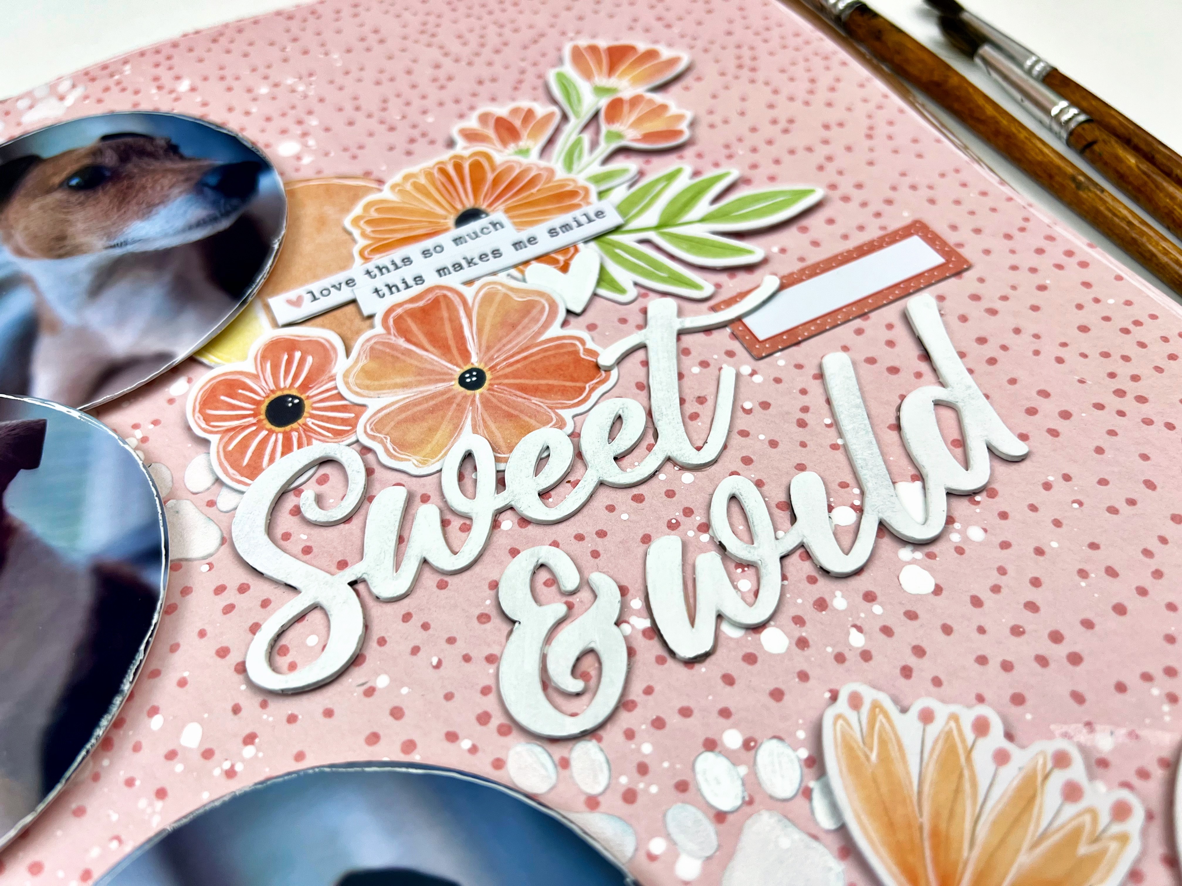
For my third layout, I kept going on the circle theme but this time making them a little smaller. I will admit, almost anytime I have floral embellishments to play, with I am drawn to circle elements as they flow together so nicely. That is especially true with Cocoa Vanilla florals.

I started this layout off with that fantastic tone on tone pink pattern - and added some white puppy paws using a stencil from Peartree Cutfiles and The Crafter’s Workshop - Stencil Butter Pearl White from the shop, and some white acrylic paint splatters. 

I used a circle tool to cut my photos in circles and a few from one of the collection pattern papers. Before adhering them down in a cascade on the left of the page, I distressed the edges a bit and outlined them in white journalling pen.


From there I literally just clustered some of the  Floral Ephemera beside each of the circles. I made one cluster a little bigger than the others so I could use it to anchor my title which is from collection’s Raw Chipboard Titles painted white. A few collection stickers and voila! 


Have you played with Bloom & Grow or other spring inspired collections? Show off your  projects so we can ohh and ahh over on the Scrap Shotz Paper Crafting Group on Facebook! 


Thursday, December 19, 2024

Deck the Halls, Cocoa Vanilla Studio

Wow, I can’t believe it is almost Christmas!

I love embracing the holiday season so have all the Christmas inspired goodies on my scrappy desk including the new Deck the Halls from Cocoa Vanilla Studio. I am loving this collection - all the seasonal touches but in the soft colours and classy touches that Cocoa Vanilla is so good at! 

Present Inspired 

For my first layout I was inspired by the idea of a present - that first rip your make to pull back the paper and get a glimpse of that amazing surprise inside. 


To create this look you simply pick a pattern paper you like both the A and B sides of (like this one I picked from Cocoa Vanilla - beauty!). Then you fold it to show half of each but don’t fully press the crease down so you get on a little dimension to the page at the fold. Be sure to add a little adhesive to hold the crease down and cut off the small amount from the fold that goes over the edge at the bottom of the page. I like to adhere my folded page down on another coordinating pattern as my background -  like I did here - but it also looks great on white cardstock too. Really pops. 

From there you add your photos and your embellishments on top of that fold. I love when they look like they are sort of spilling out. For my layout I went for the cute little town scene using the Chipboard Sheet and Ephemera so layered a row of homes likes a little Christmas Village along the bottom of my photos. 

A few white splatters to reinforce that Christmas Village look and some stars in ‘the sky’ finished off the look. I added a few little pennants at the top right to balance the busy middle a little and finally a gold title from the Puffy Gold Title Stickers.

Classic Photo Cascade  

They say that designers aim to create ‘threes’ on a page - three embellishment clusters, three photos, etc - it draws the eye. I am not a designer but admit three photos feels very natural to me. Like I did here for this layout. 

I love to cascade three photos overlapping just slightly either down the right or left of the page OR across the ‘just above’ the middle space on the page horizontally. I back each photo with a couple of coordinating papers and then focus most of the embellishments around the photos too. 


For this one, I anchored my title on the fantastic Christmas tree from the collection, and focused on the present inspired embellishments from the Chipboard Sheet and Ephemera to tie into the Christmas tree feature. 

A few white splatters on the page and some of the cute little stars from the Puffy Stickers and a few phrases from the Accessory Stickers finished it off nicely.

White Space 

For my third layout I took a step back from all the pattern papers and instead used white space to focus my design. 


I printed my photos that were taken in quick succession to tell the story of this moment in black and white to balance the colour of the collection. I backed each with a couple patterns each and a couple patterns behind the horizontal clusters too. Before adhering my favourite photo of the bunch I popped it up on foam dots as my focal point. 


From there, I selected all of the Christmas decoration embellishments as my theme and cascaded those down the page - making sure to tuck a few in and around the photos. The Christmas tree from the Chipboard Sheet tucked beside my feature photo helped add further focus on my fav photo. 


To finish off the layout, I used some of the Puffy Gold Title Stickers for my title and a few of the Puffy Stickers in and around the decor. I also added a couple of phrases and hearts to the bottom left for balance using goodies from the Chipboard Sheet and the Accessory Stickers

Are you playing with the Cocoa Vanilla Studio, Deck the Halls collection? We would love to see! Pop over to the Scrap Shotz Paper Crafting Group on Facebook and show off your amazing projects! 


Monday, November 18, 2024

Paige Evans - Adventurous

Hello! Have you had a chance to check out the Adventurous Collection from Paige Evans in the Scrap Shotz shop? Such fun! 

This collection is full of the colour and whimsy that Paige Evans is so great at - no one does patterns like Paige does. While this might be a ‘travel collection’ it is perfect for so much more. The embellishments, sentiments and patterns are also perfect for those everyday adventures in our lives. 

Cut Apart Tags


For my first layout, I reached for the pattern paper with the cut apart tags to create one of my go-to designs. I love how the tags give you a great way to showcase so many of a collection’s patterns and colours, and each tag is like a little anchor so I can load up on embellishments! 

I started with the grid pattern paper (great way to make sure your tags line up straight) and added 8 tags from the cut apart in a grid. Outlining each tag with a white journaling pen and splattering it all with white paint. 


I printed 4 of my photos in 2x3 and, after adding  a couple of layers of pattern paper behind each, dropped them onto each of the top layers of tags. Then I printed the photo of me and the hubby in 3x4 as my feature. This one I backed with a few pattern papers and placed it horizontal on the bottom row of tags. 


I finished the page off tucking in a bunch of the Cardboard Stickers, and Puffy Thickers. The title is from the collection’s Puffy Phrase Stickers. I love using a combo of different fonts. 


Another Grid Go-To 

For my next layout I leaned into another of my go-to designs. With Paige Evans collections you want to show off as many patterns as possible and this one does the trick. 


I started with a dark woodgrain from my stash and splattered it with slightly watered down white acrylic paint. Setting that aside to dry, I grabbed 3 different patterns and cut them down to about 9 by 7 (enough width and height to frame 4 3x4 picture or journal cards). I outlined each layer in white journal pen and then dropped them middle of my background with a different tilt to each to show off each pattern. 


From there, I printed 3 3x4 photos and backed each with a few more patterns (which I also outlined in a white journal pen). I left the 4th spot without a photo and just a pattern paper in 3x4 so I would have a place to anchor some embellishments from  the Cardboard Stickers, and Puffy Thickers and the title from collection’s Puffy Phrase Stickers


Piece It Together 

For my third project with the Adventurous collection, I reached for all the embellishments and papers featuring that fantastic green and blue! 


I love creating a background using fun angled pieces - like a puzzle. The trick for me is to create a puzzle pattern where each piece fits perfectly and then slice a thin amount of each side so the white background shows through. Really make the colours pop! I added a few splatters with white paint and outlined each piece in white journalling pen as well.  


Once I had my background prepped, I dropped a couple photos in the middle (each backed with a few pattern papers first. I played for a bit with some other green and blue embellishes until I landed on these fun tags from the cut apart patterned papers. 

The title is from the collection’s Puffy Phrase Stickers and I tucked in a few of the  Puffy Thickers in as well.  

Such a fun collection - off to play some more! 


Tuesday, October 22, 2024

49 and Market Rust and Revs


Do you have some of the 49 & Market, Rust and Revs goodies on your scrappy desk from the Scrap Shotz shop? I do and am loving it - such a great collection to document workshop, race car, mechanic shop, home renovations and more. 

Here are a few of my layouts so far. 

Inspired by a Die Cut


As I flipped through the Laser Cut Outs I immediately loved this old timey truck and was so excited to have the perfect jumping off point to document a photo of my grandpa’s old truck. I have so many memories of his truck - including riding in the back down the gravel road in the country [ It was a different time! Pre-seat belts and sun screen ;) ]

I started with the wood grain 12x12 pattern and added some white splatters (by adding a little water to a dollop of white acrylic paint and a cheap paint brush to flick the paint onto the page). Then I printed my photo in black and white at 4x6 and backed it with a few layers of the coordinating pattern papers.

After dropping those down, I had added my truck die cut and then just flipped through the Laser Die Cuts and Die Cute Elements to tuck and layer them all around the photo. A few Rub Ons on the top left and lower right finished off the page. 


 Come on! Isn’t that truck adorable?

Embrace the Pattern Paper 

The 12x12 papers with the collection include a combination of full patterns, like wood grain or plaid, and a number of what I would call pre-designed pages. Pages that have a combination of patterns, some images of the die cuts and generally look like the start of a layout - a great jumping off point. 

The squares of journalling lines and map patterns on the polka dot background here are the pattern paper - not me. I used this area to anchor my photo and all the embellishments. 


I added some additional pattern papers behind my photo for some texture and depth, and the frame die cut to draw the eye. From there, I piled on the Laser Cut and Die Cut Elements behind, beside and in front of the photo. I wanted it to look like a busy, messy mechanic shop so just kept layering on the goodies! 

Think Outside the Box 


When I see grungy plaid pattern, I think home renovations. While this collection might be more about mechanic things it works for so many other memories. We bought a fixer upper a few years ago so there are a lot of home renovations and any excuse to get photos of these memories on a layout works for me! 

I find for home renovation the photos are not great but the story is - it’s fun to look back and remember what that wall or room looked like. So I went with a number of small 2x3 photos to show the progress of turning an outer wall into a new entry for the mom-in-law suite. I used a frame die cut to highlight my favourite photo of the bunch. 


The die cuts include a bunch of old timey window frames - how perfect - so I used those as embellishments by cascading a few messily down the page behind my highlighted photo. A bunch of the cogs in the Laser Cut Outs and Die Cuts and some word phrases finished off the embellishing around the photos. 


I finished off the page with some Rub Ons clusters on the bottom and top of the page and black splatters (same approach here as the white splatters, a little water with some black acrylic paint and flicked on the page with a paint brush). 

If you are playing with the Rust and Revs we would love to see! Join us over on the Scrap Shotz Facebook Group and post up your creations so we can swoon! 


Monday, April 1, 2024

49 and Market - Wherever Continued

49 and Market - Wherever continues to bring joy to my crafty space …

I received the 49 and Market - Wherever 12x12 Collection PackChipboard SetEphemera BitsLaser Cut Elements and Rub-on Transfers 6x12 Ride in my Scrap Shotz happy joyful mail. I  am excited to share with you my fourth and fifth layouts with this collection - it is so versatile, you can use it for any adventure memory! 

(To my first few pages pop over here

Build on the Pattern 

For this layout, I let the pattern paper do all the work! 

I found this beauty in the Collection Pack and added some of the Rub-on Transfers to the right of the page and then focused my photos on the left for balance. First I added my right side rub-ons making sure some of them went off the page and added a couple chipboard and ephemera bits as part of the run-on cluster for dimension. 

Then, to balance all that right side good stuff - I created my photo cluster on the left. I printed my photos in 4x3 and used the ephemera frames on top. I added some Waxy Flax looped above each to play on the frame design. From there, I added a few rub-ons behind and then focused on added in the chipboard, ephemera and laser cut elements in and around the photos.

The final touch was some black splatters across the page with a big focus on the right side rub on area. 

Play on the Embellishments 

For my next layout, I focused on the air balloon embellishments and chipboards. I wanted to give a feeling of them floating up and out of the layout. 

First, I created an anchor for my photos using Ranger Ink, Distress Ink - Black Soot though a Vicki Boutin Stencil a bit messily in the middle of the page. Then added some black splatters over the stenciled area.

Then I backed the photos with the pattern pages - the small photos were layered on one patter, and  the main photo of me sitting outside the Aberdeen Train Station in a couple patterns a little messily. After adhering the photos down in a grid like pattern, I added a bunch of repeated phrase stamps from my stash and Whatever Rub-on Transfers around the grid - including my title, travel more. 


The final touch was a couple of tags out the left of the grid and those fabulous air balloons. Layered in and around the left side of the grid pattern to give the sense of them in flight. I love the flow of the air balloons in contrast to the grid. 


Just loving this collection - for those road trips, travel far or close from home, a big trip or a little adventure - this it the collection for all those things. 

If you are creating with the 49 and Market - Wherever collection we would love to see! Pop over to the Facebook Scrap Shotz Paper Crafting and post a photo. 

Thanks for stopping by! 


Saturday, March 30, 2024

49 and Market - Wherever

Hello, hello! Have you been on a big trip lately? How about a road trip near or far? Maybe a local adventure with the kiddos? If yes, the 49 and Market - Wherever collection in the Scrap Shotz shop is for you! So many opportunities to use the collection for memory keeping. 

I received the 49 and Market - Wherever 12x12 Collection Pack, Chipboard Set, Ephemera Bits, Laser Cut Elements and Rub-on Transfers 6x12 Ride in my Scrap Shotz happy mail the other day and have been in my scrappy space creating since. 

Peek A Boo 

For my first layout, I used a folded design to peek a boo the amazing Rub-on Transfers in the background. 

I took a 12x12 pattern and folded it back at an angle. Then cut off the excess of the folded over section at the same angle as the fold to show off both the folded and background pattern. For this one, I wanted a different pattern on the fold so also adhered another pattern on top of the fold for the colour combo I was looking for. 

Before adhering my folded paper combo down onto the white cardstock, I used a bunch of the Wherever Rub-on Transfers to create a messy pattern down the middle of the page so it looked like it was peeking out behind the fold. These Rub-ons are such high quality you can over lap them to make a really great look. I also added some black splatters using watered down Tonic - Nuvo Crystal Drops, Black Ebony and a paint brush, and a few with some Ranger Ink - Distress Oxide, Dried Marigold

Once the background splatters dried, I adhered my folded pattern paper down on the right to create that peek a boo with the Rub-ons. From there, I added my photos down the fold (after adding a pattern layer or two behind each). Then it was all about tucking embellishments from the Wherever Chipboard, Ephemera and Laser Cut Elements.  


Large Photo Feature 

For my second layout I reached for this large 8x8 photo of standing stones in Scotland we had the chance to see on our hike of the Arran Coastal Way. When you experience something this amazing you make it the focal point of your layout!  

I started with the 12x12 pattern paper called Trek as my background - adding  some black splatters using watered down Tonic - Nuvo Crystal Drops, Black Ebony and a paint brush, and some repeated Vicki Boutin stamps with Paper Rose Studio Premium Dye Ink, Intense Black above and below where the photo would sit. 

Then, I added a couple of patterns behind the photo to bring some dimension and contrast. I used a Wherever Rub-on Transfers to add the title ‘love this place’ directly on the photo (a little nerve racking but totally worth it - the rub-ons transfer adhered beautifully!) 


With such a large photo and a great pattern background, I didn’t have to do anything more but add a few embellishments. I added a cluster of florals and leaves to the top left and bottom right of the photo using a combo of the Chipboard, Ephemera and Laser Cut Elements. A couple of the chipboard circles worked for a title. 

Monochromatic 

The next layout I worked on was all about the blues with a touch of green in the collection. The colour scheme was inspired by the background paper called Outlook - love that city map pattern! 


First, I prepped the Outlook pattern with some watered down Ranger Ink - Distress Oxide, Bundled Sage applied with an Inky Roller focusing the colour in the upper middle of the page as an anchor my photo cluster. I added a few splatters in the ink as well. 

Once that dried, I added my photo cluster on top of a  bunch of the blue patterns in the collection - letting some of that green ink I added show around the edges. 

Then I riffled through the Chipboards, Ephemera and Laser Cut Elements to find the blue and a few green ones to tuck around my photos. I loved the little cars so added those on the right (we are on a road trip!) and thought the little photo frames tucked to the left were cute too.


Such fun with this collection! I am off the play some more - should be able to share some more Wherever layouts in a couple days! 

If you are playing with these goodies too - we would love to see! Pop up a photo on the Facebook Scrap Shotz Paper Crafting Group.