Showing posts with label layout. Show all posts

Tuesday, October 22, 2024

49 and Market Rust and Revs


Do you have some of the 49 & Market, Rust and Revs goodies on your scrappy desk from the Scrap Shotz shop? I do and am loving it - such a great collection to document workshop, race car, mechanic shop, home renovations and more. 

Here are a few of my layouts so far. 

Inspired by a Die Cut


As I flipped through the Laser Cut Outs I immediately loved this old timey truck and was so excited to have the perfect jumping off point to document a photo of my grandpa’s old truck. I have so many memories of his truck - including riding in the back down the gravel road in the country [ It was a different time! Pre-seat belts and sun screen ;) ]

I started with the wood grain 12x12 pattern and added some white splatters (by adding a little water to a dollop of white acrylic paint and a cheap paint brush to flick the paint onto the page). Then I printed my photo in black and white at 4x6 and backed it with a few layers of the coordinating pattern papers.

After dropping those down, I had added my truck die cut and then just flipped through the Laser Die Cuts and Die Cute Elements to tuck and layer them all around the photo. A few Rub Ons on the top left and lower right finished off the page. 


 Come on! Isn’t that truck adorable?

Embrace the Pattern Paper 

The 12x12 papers with the collection include a combination of full patterns, like wood grain or plaid, and a number of what I would call pre-designed pages. Pages that have a combination of patterns, some images of the die cuts and generally look like the start of a layout - a great jumping off point. 

The squares of journalling lines and map patterns on the polka dot background here are the pattern paper - not me. I used this area to anchor my photo and all the embellishments. 


I added some additional pattern papers behind my photo for some texture and depth, and the frame die cut to draw the eye. From there, I piled on the Laser Cut and Die Cut Elements behind, beside and in front of the photo. I wanted it to look like a busy, messy mechanic shop so just kept layering on the goodies! 

Think Outside the Box 


When I see grungy plaid pattern, I think home renovations. While this collection might be more about mechanic things it works for so many other memories. We bought a fixer upper a few years ago so there are a lot of home renovations and any excuse to get photos of these memories on a layout works for me! 

I find for home renovation the photos are not great but the story is - it’s fun to look back and remember what that wall or room looked like. So I went with a number of small 2x3 photos to show the progress of turning an outer wall into a new entry for the mom-in-law suite. I used a frame die cut to highlight my favourite photo of the bunch. 


The die cuts include a bunch of old timey window frames - how perfect - so I used those as embellishments by cascading a few messily down the page behind my highlighted photo. A bunch of the cogs in the Laser Cut Outs and Die Cuts and some word phrases finished off the embellishing around the photos. 


I finished off the page with some Rub Ons clusters on the bottom and top of the page and black splatters (same approach here as the white splatters, a little water with some black acrylic paint and flicked on the page with a paint brush). 

If you are playing with the Rust and Revs we would love to see! Join us over on the Scrap Shotz Facebook Group and post up your creations so we can swoon! 


Thursday, February 8, 2024

Traveler's Notebook Layout with 49 and Market

 Hello, Jenn here to share a Traveler's Notebook layout. I've been inspired by Scrap Shotz challenge for the month of February to get an unfinished project FINISHED! I know I'm not alone in having a pile of half finished projects that need some attention so I think this challenge is the perfect push to pick one and get it done. The first project I've chosen is my May 2019 Traveler's Notebook, which only has a few pages left to finish, one of which just happened to be a picture of my peach lemonade from Starbucks, the perfect match for the 49 and Market Color Swatch Peach Collection that I got from Scrap Shotz! Here is what I did:


All month long I have been playing with the sketch that I created for February so I thought it would be fun to try shrinking it down to a Traveler's Notebook size for this layout. I threw in a few of my favourite techniques, as well, to ingnite some creative sparks and complete the rest of the notebook. To start I used some watered down Abandoned Coral Distress Ink to create splatters on my background. While that dried, I chose the cover paper from the Peach collection, which has a small sample of each paper pattern on it. I really love using this paper in every collection to stretch my collection. I tore strips of paper from this sheet so there would be multiple patters on each strip, for my horizontal and vertical layers. This gave me a lot of colour for my layers without having to sacrifice a small strip torn off of multiple pieces of paper. The torn edges also give a lot of texture and interest without too much dimension. 


I layed down in strips in layers, similar to the sketch, and then added an envelope and tag from the Peach Envelope Bits pack, and some leaves and butterflies from the Peach Acetate Leaves pack. I also had a piece of a cutfile that I used as a stencil for an earlier layout in the Traveler's notebook and thought might make a nice embellishment so I cut it apart to fit it around my little picture. The finishing touches were a few sequins from the SpiegelMom Scraps Peach Fizz sequins mix and a sketchy border around the layout using a peach marker.


I always enjoy creating fun little layouts that come together quick and easy. I like to stick to my comfort zone to get started with finishing a project that I haven't touched for a little while, and then I can slowly build up my creative confidence with go-to techniques. For me, those include using a sketch to inspire design, using scraps, paper tearing, splatters, sequins, and sketchy borders. I try to keep it simple and use a limited amount of supplies, like a single collection. After creating this layout, I went on to finish three more and completed this project, WOOHOO!!! Please check out my Youtube Channel for a more detailed list of all of the unfinished projects I am working on this year, as well as the process video for this layout and a flip-through of the finished Traveler's Notebook. To find all of the supplies I used, click the links that are highlighted, or head to the Scrap Shotz store to see all of the beautiful 49 and Market products now available.

Thanks so much for popping by, Happy Scrapping :)
Jenn


Tuesday, November 23, 2021

Welcome Winter


Time to document your winter memories! Have you had a chance to play with the October Scrapbook Kit? The kit features the Carta Bella, Welcome Winter collection and it’s a beauty! So many blue tones, snowflakes and plaid touches - perfect for winter. 

Snowflakes and Circles


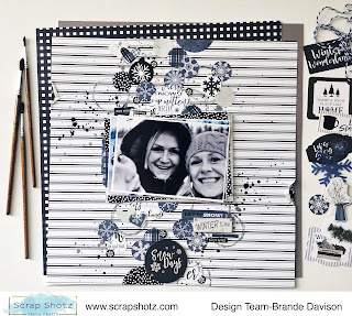
For my first layout I played with circles! I started with this great striped pattern from the collection and using an empty paper towel roll and some blue/grey crackle texture paste from my stash created some messy circles down the centre of the page. 

Then I used a circle punch and the 2x2 cut apart pattern paper in the kit to make a bunch of circles featuring different snowflakes from the collection. I grabbed any of the circle embellish (die cuts, chipboard and stickers) and created a cascade of circles with my photo in the middle. 

A few black splatters, a few more splatters in the same crackle texture paste with some water added, a few punched hearts from pattern paper and a small rip and some staples on the left and right of the page finished it all off. 

Embrace the ‘Country’ Look 


For my next layout I wanted to showcase this awesome selfie of my parents! I love that it was taken at Christmas and you can see the heaps of white snow in the front yard behind them as we are all inside, cozy and warm. Perfect winter memory. 

I started with this simple plaid pattern from the kit. Then pulled a 12x12 chicken wire stencil from my stash (love the ‘country’ look for this farm house photo) and added it to the page using a crackle texture paste in blue/grey from my stash. I used that same texture paste with some water to create splatters, and added a few in white acrylic paint too. Using some Tim Holtz, Distress Oxide in Weather Wood I also added some snowflakes using the collection stamps.

Then I used a bunch of patterns to anchor my photo and just had fun layering a whole bunch of chipboard, sticker and die cut titles to the right of the photo. I was excited to tuck one of the plastic snowflakes from the kit in there too. A couple of punched hearts in the amazing silver glitter paper in the kit stapled to the top left of the photo finished it off! 

Think Left and Right 


For this layout I featured 4 photos. Instead of a horizontal layout (my go to) I decided to try the photos down the left of the page. 

I started with a Bazzill Basics Cardstock, Raven (black) from the shop as my base and added some bricks using a Peartree Cutfiles Stencil from my stash and Tim Holtz, Distress Oxide in Weather Wood for some pattern. A few splatters in the Distress Oxide and white acrylic paint finished off the mixed media design.  

Then I created a cascade of photos on the left, backing each photo with a couple of the pattern papers from the kit. To balance the page and create a title, I added a bunch of embellishments to the right. 

In a couple of spots I also added the flag die cuts in the collection - a great way to feature some of the twine included in the kit with a few simple staples.

All the Plaids 


Inspired by the little tree embellishments in the collection and in love with all the plaid pattern paper, I reached for this Christmas Tree cutfile from Peartree Cutfiles. I used a different plaid pattern paper from the collection for each tree and the glitter paper in the kit for the stars. 

I popped up the cutfile on the wood grain pattern, after adding some background splatters in white and black, then had some fun adding my photos, a title from the chipboard set and stars from the kit and my stash. The little feature at the top and bottom of the page are the edges cut off one of the die cuts in the collection. I thought it was a neat touch! 

If you are not a kit member or just looking to add more of this collection to your scrappy stash, lots of goodies left in the shop. Check out Carta Bella, Welcome Winter.


Saturday, October 23, 2021

Family Fun

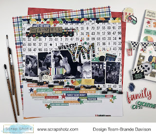
Does your family play a lot a games and do a lot of puzzles? Mine sure does! 

Anytime we are together - no matter if we are in the dining room or a table at the pub - there is some sort of game and most definitely a selfie of us playing. We do this so much, I have a whole bunch of photos waiting to be scrapped. 

Simple Stories, Family Fun collection I picked up from the Scrap Shotz shop to the rescue. This collection has everything you need to scrap games and puzzle nights. From board game pieces to video game sticker or arcade and bowling and mini golf die cuts and more. So much fun! 

Sorry, not Sorry


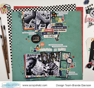
For my first layout I grabbed this awesome teal pattern paper called Your Turn from the collection as my background. I used some Tim Holtz Distress Ink in Chipped Sapphire with a Peartree Cutfiles Stencil to give the layout a touch of mixed media. I liked that the stencil looks a little like the Connect 4 Game. Remember that game? 


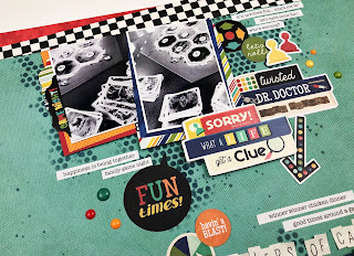
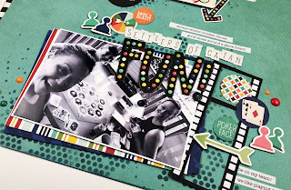
From there I created a top and bottom of the page cluster - focusing on layering all the things behind a 4x6 photo of us playing Settlers of Catan (such a great game!) on the bottom of the page and then a couple of smaller photos of the game on the table at the top of the page. I tied it together with an arrow and the title in the empty space between. 

This collection is full of game board related stickers, die cuts and clipboards - so easy to create fun, themed clusters! 

All the Words 


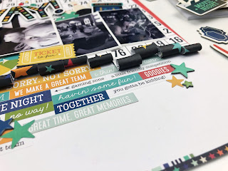
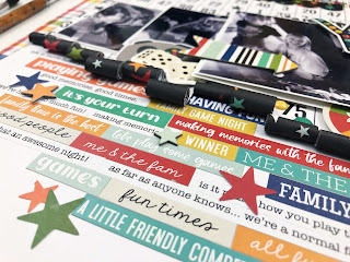
For my second layout I wanted to try two techniques. Using the word and phrase stickers from the Collection Kit sticker sheet and sticker book, and I wanted to try the paper rolling touch I have noticed on Instagram lately. Done! 

I started with the pattern paper called Good Times. I cut along the lines of the number rows from bottom to about halfway up the page. Then using the end of a skinny paintbrush rolled each of the strips up - making sure the rolls were at different heights on the page. I used a little tape to keep them in place. 

Then I secured that on white cardstock and then created a grid of word and phrase stickers on the bottom half. Making sure the design started right below the rolls of paper and not worrying about covering the whole white space. Where the stickers didn’t quite line up, I added a chipboard, sticker or die cut star to hide the oops. 


From there all of my focus was on the paper rolls. I added my photo and just tucked and clustered a bunch of die cuts, stickers, and chipboard to create a nice little mess of fun! I love using a large photo to draw the eye and then a bunch of small photos to add more details. 

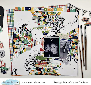
Triangles for the Win

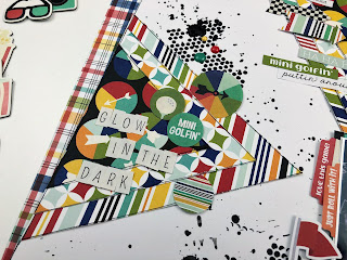
For my final layout I was inspired by a throw back Let’s Get Sketchy sketch - 4 triangles on each edge of the page to draw the eye to the centre where the photo sits. I thought the border of triangles would be a great anchor for loads of goodies! Sure was! 


To start, I grabbed some white cardstock and used that same Peartree Cutfiles stencil and my most favourite mixed media paste, Picket Fence Paper Glaze in Black Pansy, to add a little black texture to the background here and there. 

Then I created 4 triangles using 3 layers of the pattern paper each. I adhered these on the middle edge of each side of the page creating a focus point in the centre - where I placed my photos! From there it was all about adding in all the mini-golf related die cuts, chipboard and stickers. So many to choose from! 


I really cannot believe how much fun it was creating these layouts - the collection is so easy to play with and it was great to relive these awesome family moments. 

If you play Quirkle or Uno, master the 1000+ pieces puzzles or have fun at arcades or go-carts or mini-golf … you just might need the Simple Stories, Family Fun collection. Lots of goodies still in the shop ;) 


Wednesday, May 26, 2021

Playing with Photoplay, Wicker Lane


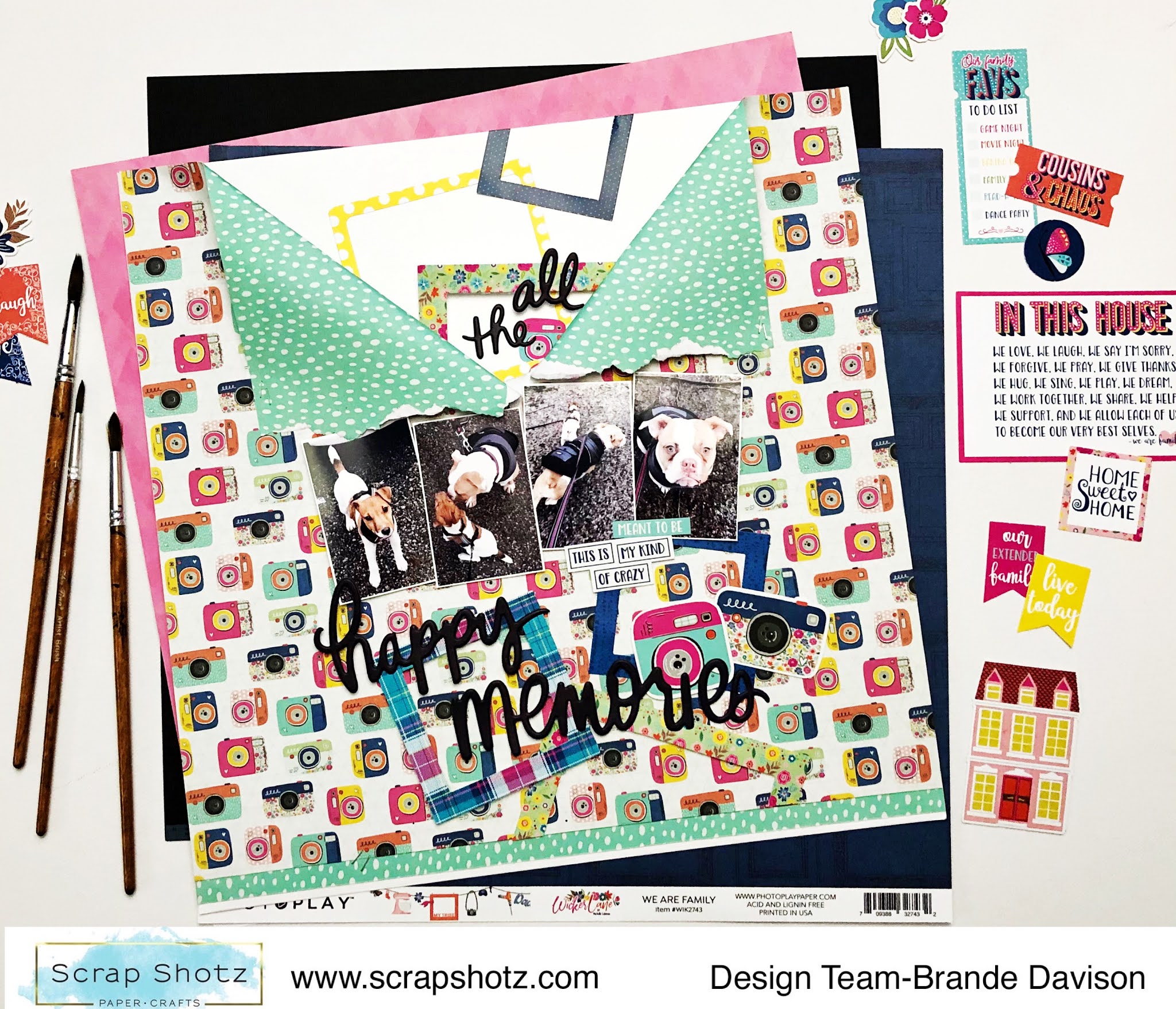
If you were lucky enough to get your scrappy hands on the new Wicker Lane collection from Photoplay from the Scrap Shotz shop then this post is for you! This new collection is another example of Photoplay’s fantastic skills at creating colorful collections - so bright and fun. 

For my first kick at the Wicker Lane goodies I played with the diagonal stripe pattern ‘our house’. I sliced the paper up to get just the actual stripes to use as an anchor for my title and photo. This photo is a family portrait drawn by one of my little siblings! 

From there I found all the little embellishments that made me happy in the collection and added the puffy hearts and title from Vicki Boutin’s Color Study, The Details Puffy Phrase Stickers  and some black splatters touches. I love how colorful but also how much white space there is too on this page - might be a new go to design. 


From there I moved on to playe with the fantastic camera ‘moments’ pattern paper. I love this pattern so much I had to think of a design that would show off as much as possible - insert the ‘zipper’ design. Well, ok not sure thats an official design name but it’s the best name I could think of. Zipper it is folks! 

I used all of the frames in the collection ephemera package to build on the photo theme and then grabbed the Vicki Boutin phrase puffy stickers creating a title that sort of follows the cascading pattern of the frames down the page or zipper. 

Final touch? These adorable pics of my pup Bella Bean (the Jack Russell) and her bestie Lola the pup of one of my close friends. So cute! 

For this next one, I fell in love with this cut apart 3x4 pocket card from the collection and let it inspire the page design. ‘A little bit of crazy, a little bit of loud,  a whole lot of love’ describes our pup perfectly. Thanks Photoplay! 

I wanted to keep the page design really simple - this one is all about that saying and the cute pic of Bella Bean. A little Tim Holtz Distress Ink, Black Soot blended through a stencil, a couple pattern layers behind the photo, title and all the little puffy colour dots from the Vicki Boutin puffy phrase stickers to create a blast wee bits of colour from that cute furry face. Really easy to create this design and I love how it turned out. 


These layouts will create a great pop of colour in my albums - lots of fun to work with so many coordinating, fun patterns! 

If you played with Wicker Lane let us know - pop a post up in the Scrap Shotz Paper Crafting Group on Facebook or tag us on Instagram so we can ohhh and ahh!


Friday, March 19, 2021

Well Hello Today


Are you one of the lucky ones who has the Simple Stories, Hello Today in your stash? This super fun collection is near all sold out from the Scrap Shotz shop, so a bunch of us do. I blame my need to have this collection on Design Team member Karla! Her layouts were so inspiring, I had to have it too and ohh I am loving playing with this one! 

All the Numbers  


For my first layout I started with a Bazzill Cardstock, Raven and some Picket Fence, Paper Glaze in Black Pansy and a Tim Holtz number stencil - inspired by the numbers in the Hello Today collection. I wasn’t sure if the black glaze would shop up on the black background but it sure does and wow I love it - a nice subtle touch of texture and shine.


From there I found this fantastic photo oh my littlest brother,  printed in black and white, and just had fun tucking and adding any of the die cuts or stickers that were numbers. I wanted to create this sort of  ‘all the ways I love ya bro and think you are one of the coolest humans I know’ sort of idea.

I was a little torn on if I could pull off the black and white flowers but I think it totally works for the memory and story. Some white splatters to finish it off (seems I need something messy on every layout) and I love it! 


All About the Title 


For some reason anytime I see a pattern paper or embellishment with a lot of orange, especially when paired with yellow or red, I think retro and I think bowling. Perfect! I had some cool Instax bowling photos to document! 

Inspired by the ‘Hello today’ die cut in the Hello Today Page Pieces I decided to anchor the entire design on this title. I ripped a couple of my favourite pattern papers for the bottom of the page and then started added the photos and little layers here and there all around the title. I used some Tonic, Nuvo Crystal Dots in Moroccan Red as paint to add a little colour behind all this goodness. 


There was a little too much white space above all this good stuff so I added a little bit of a confetti look up top with some die cuts, chipboard pieces including some cute hearts, and of course splatters. 


All the Circles 

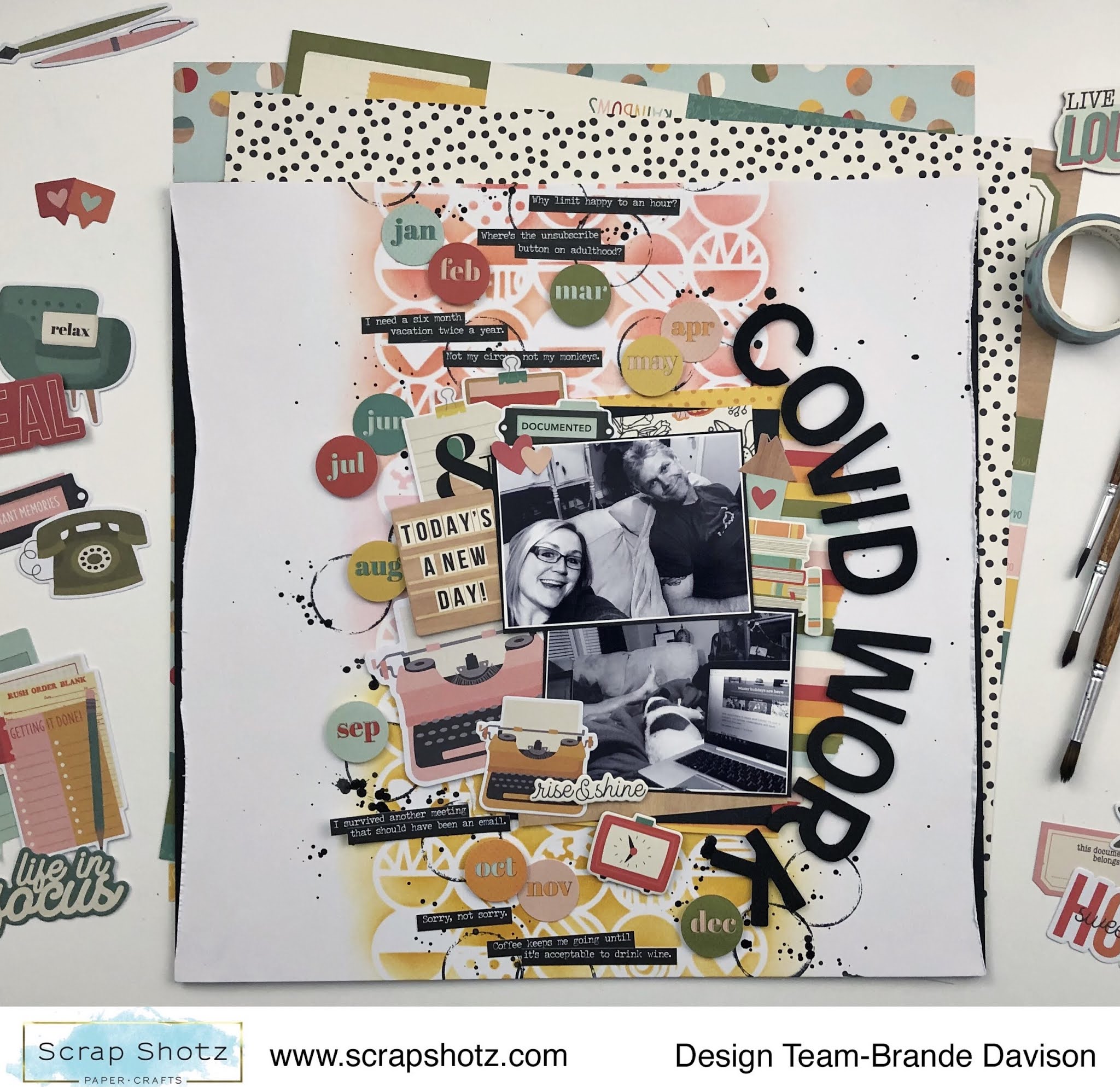
For this layout I was inspired by the die cut circles for each month in the collection! So cute! So I grabbed a circle stencil from my stash and used some Tim Holtz Distress Inks in matching colours to the collection and a Ranger Blending Tool to create a multi coloured background. 

From there it was a matter of playing with the circle die cuts and my photos to bring it all together. I used these bold black foam alphas from my stash and some cheeky Tim Holtz phrase stickers in black to bring a little drama to the page - I love the pops of black. 


Such a fun collection to play with. If you had the chance to grab some of these goodies from the shop, we would love to see your projects. Drop your project onto the Scrap Shotz Paper Crafting FaceBookGroup or tag is @scrapshotz on Instagram! 


Tuesday, October 13, 2020

Use ALL the Die Cut Words

Hello, me again playing with the Cocoa Vanilla, Daydream collection (the September Scrapbook Kit). 

I know I have said it in past posts but I will say it again ... I love this collection, it really is so dreamy! I have not spared a single embellishment or touch here or there, no hoarding is possible with this beauty. All of it must find a forever home on a layout. 

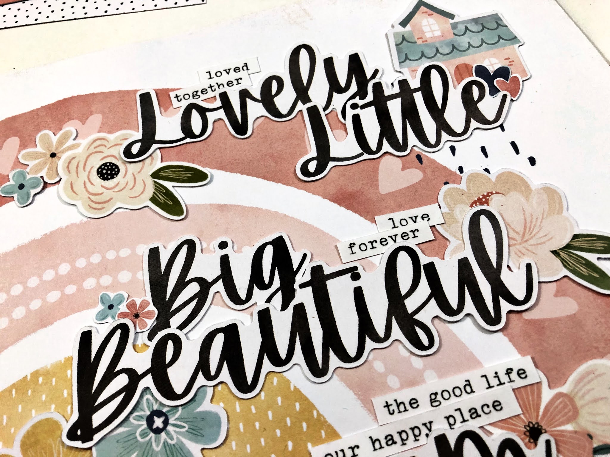
In my pursuit to use it all (kill the kit as you may see on social media, a great hashtag to follow btw), I decided to take all of the remaining Die Cut Words and see if I could make a sentence to inspire my next layout. Well, my grammar is a bit off but the sentiment is perfect! 

Here is my layout titled "Lovely, little, big, beautiful, dream together. Our home."


Honestly, I did not do too much more to this layout besides the "fancy" title which I jazzed up a little by tucking the 3 little homes and some florals from the Die Cut pack in and about, added a few floral and heart stickers (which I first backed on white cardstock then fussy cut),and then tucked in a few of the phrase stickers too. The rainbow background pattern did all of the work for this design! 


The photo is an awful one - well I love the photo but it is not of great quality - so I printed it quite small 2x3. Printing small also left loads of room on the page for my long sentence title. (The photo was a just-for-fun selfie I took while we were out house hunting. We didn't know at the time this would be our home. We just moved in a couple of weeks ago!) 

I used one of the tags in the Die Cuts and the Pinkfresh Studio alphas in my kit to document the actual house address, and then tucked that behind the photo so it just peeps out. 


I love how this page turned out - sometimes I am inspired by a photo or a story, and sometimes I let the product do the work. Between the little Die Cut houses in this kit and the fact that such a fitting sentence came together for a big bold title is well .. a Daydream. See what I did there? wink, wink