Showing posts with label Watercolor. Show all posts

Wednesday, April 15, 2020

Colour Blocking to Use All the Embellishments

When the new Noteworthy collection from PinkFresh Studio arrives in your mailbox from Scrap Shotz - you find a way to use every cute embellishment...

There is nothing whimsical about this COVID-19 pandemic but I refuse to let my scrapbooker display the morose mood in the air - instead, I will design my pages focusing on the good things this has brought to our home and journal the hard stuff in some hidden way. 

With this in mind, I set out to use every cute embellishment I could from the Noteworthy collection using colour blocking.


I split my page into quadrants, sewed a bunch of times down the middle of the 4 quadrants, picked 4 colours that show up most on the collection and painted each section a different collection - then added every embellishment that matched that colour. 


I tried to use a few enamel dots, some of the stickers, and the puffy stickers in each quadrant to give a touch of texture. The chance to use little couches and potted plants and coffee mug puffies was to fun to pass up! 

I used the white alphas to add a COVID word that comes to mind in each quadrant and the little together piece from the layered stickers as my title. I love how it turned out - happy and bright! 

Looking to use up all those embellishments in a kit or collection, try colour blocking. You do not need watercolour paint to do it either - try just for 3x3 pattern papers, or strips of paper or circles and more. Simply pick a few colours and then, without overthinking, bring in every embellishment of that colour to match. 

Have fun! 


Wednesday, August 28, 2019

Back To School Teacher Card

Hello! It's Karla back today to share a cute teacher card for back to school. We have had a fabulous summer vacation, but I think we are all just a bit excited about heading back for another year and getting back to a routine. My girls of course want to bring cards for their new teachers, so I grabbed a few different stamp and die sets and combined them for a cute card with a fun mixed media background.


I started off by colouring in the Hello Bluebird Just Sayin' animals with Zig Clean Color Real Brush Markers. They blended nicely on Bristol Cardstock stamped in Gina K Amalgam Ink. This is truly my favourite stamping ink! It can be used with Copics or watercolours like the Zig Markers. 


I added the 'yay' and 'hello' sentiments from the Hello Bluebird set along with 'god bless you' from the Mama Elephant Mini Everyday Messages stamp set in the little signs the cute critters are holding. The 'Many Thanks' sentiment came from the Lawn Fawn So Owlsome stamp set. I just love how fun this card was by combining the stamps I had in my stash! 


The background piece was something from my craft drawer from a day I'd been playing with some watercolour mediums and my craft mat. It worked perfectly to layer being a stitched window diecut as a base for this fun, bright card. 


Inside, I used a sentiment from another school stamp from Studio Katia and coloured in the tiny ruler. 


The crayons were just perfect for this card, and came in the Hello Bluebird stamp set along with the little scissors. I added Glossy Accents to the crayons and used some white gel pen to add highlights. And, of course, all teachers love gold stars, so I found three to add just a bit of bling!


Thanks so much for joining me today! I hope this has given you some inspiration to pull out different stamp sets and see how fun they can work together. Don't forget to check what's new in the Scrap Shotz Store, and have a very happy, very crafty week!

Saturday, July 27, 2019

New Wild Whisper Designs Collections with Video

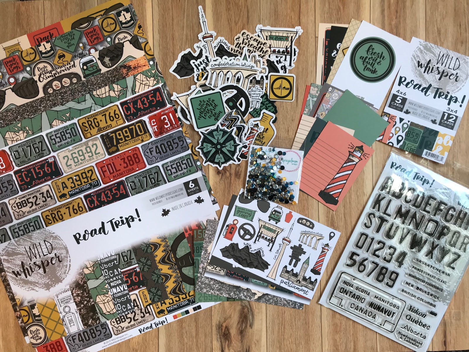
Hello! I hope you've been having a wonderful summer so far. It's Karla back today with some exciting new products from Wild Whisper Designs! There is a brand new, amazing release this month that Scrap Shotz has in the store right now - and you are definitely going to want to check out. I've done a little unboxing video, below, of two of the new collections so you can get a good look at them - Road Trip and Pam Bray Watercolor. Road Trip includes lots of Canadian symbols, and you'll find papersequinsephemera, flair and even metal in the shop!


Pam Bray has teamed up with Wild Whisper to release a fabulous Watercolor paper line! The colours and textured look of this paper is amazing.


Here is a look at the backside of these papers - so cool!


You can see the complete unboxing in this video here -

And here is a look at a layout created for the Wild Whisper Blog using the Road Trip collection - perfect for any of your summer adventures!


Thanks so much for stopping by. I can't wait for you to check all the fun new goodies in the Scrap Shotz Store. Have a wonderful crafty summer friends!


Monday, July 1, 2019

Completed Colour Burst Trio Cards

Hi Crafty Friends!

Happy to see you here and I am revealing the cards I created from the card front/backgrounds in the THIS post.

Let me refresh your memory with the color burst panels:


On to the first card:

The white portion was masked off with 1" painters tape and I coloured in the embossed images with the Ken Oliver Color Burst Trio Ocean Waves. The sentiment is stamped from the Altenew Spring Fling stamp set. The entire panel is then matted on a white card base.


I chose a leaf image from the stamp set and combined it with the Gina K wreath builder stencil to create this card:


Here are the supplies used for this card.


All the images were stamped withVersafine Black Onyx ink, stamp placed within the wreath builder stencil to create the 'wreath' and the card stock is turned within the stencil


Here is the completed "wreath" which was then covered with clear embossing powder and heat set.


Stamped image is now heat embossed.


Feel free to leave any questions about these projects here, thanks for stopping by and taking a look!


Thursday, June 27, 2019

Ken Oliver Color Burst Trios

Hi Scrap Shotz Friends!

Rosie here with a couple of projects to show you using the Ken Oliver-Color Burst Trios Ocean Waves


Here you can see the Color Bursts themselves along with the Altenew Delicate Flower Bed stamp set used to create the card fronts. I'll show you the cards themselves in my second post, this post will focus on the process of creating the backgrounds with the supplies.

So, what are Color Burst powders? They are a concentrated powder that reacts with water and can be used in a number of ways. They can be added to water and sprayed over water colour card stock and mixed with water, painted on a clear stamping block and "smooshed" on water colour card stock in addition to the techniques shared below.

1. Apply water to your water colour paper, drop a small amount of powder and then spritz with a water sprayer to spread the color. Add the remainder of the trio as desired, you can also pick up the paper and tip it side to side to move the color around. This results in the panel on the bottom left of the photo above.

2. Drop the 3 colours of powder into separate wells of a pallette, add water to the wells.  


Paint water over a piece of water colour paper, apply the color trio in large bands.


3. Stamp the Altenew Delicate Flower Bed stamp with embossing ink on water colour paper-masking off a portion with 1" painters tape, cover wet ink with Emerald Creek Glacier White embossing powder and heat set.


Using the Ocean Waves Colour Burst Trios, apply colour to the embossed images with a small paintbrush.


Here's the trio of completed media:


Stay tuned for my second post to see the completed projects! 

Thanks for stopping by!


Saturday, June 22, 2019

Less is More, Sparkle City Sure Does Sparkle

Hello crafty friends!

This month the amazing Scrap Shotz team sent me some of Shimelle's Sparkle City collection to play with and, wow, talk about colour and vibrant and silly and fun. My favourite!

As with all of Shimelle's amazing collections, this one is full of purples, pinks, reds, greens and all the amazing patterns. The puffy stickers are gorgeous and the die cuts are so cute (think smiling cartoon pigeons and little french fry containers) - some of them are even holographic!

Take a peek ...


To be honest with so much colour and so many options (the paper pad alone has 48 sheets), I was a little overwhelmed. I wanted to play with all the things. So I started small. Small photos and a small amount of product. A 'less is more' approach to get the Sparkle City spark going.

My approach ...

In my photo stash, I had two tiny (2x2 inch) colour photos of my crazy nephew following me around a tourist shop in Victoria, B.C. wearing a plastic horse mask. I was laughing so hard at his antics I could barely take the photos  - so they are horrible. But good photo or not, this memory had to be scrapbooked. Besides how good does a photo of an 11year old in a plastic horse mask need to be?!

Now usually with a bright collection, I use neutral or even black and white photos and very large photos to help bring some calm to the layout. However, this is Shimelle's collection and I feel she is all about colour and would appreciate a more vibrant approach, so I went for it - a big colour, but a small product and photo, approach.


You can probably see that I used very little product - less is more with the super bright and cute collections for me. I used 4 die cuts (the camera and the little city building), two small scraps of paper behind my photo and roughed up the edges to bring some mess and dimension to the layout, 3 tiny stars, 3 phrase stickers and a title. A lot goes a long way with this much sparkle!


I really wanted to draw the eye to the tiny photos so decided to place the photos cluster on a two-tone watercolour 'mess'. I chose purple and red as those are two of the colours of the little die cut buildings but also because I just love these two colours together. I simply found some red and purple watercolour paints in my stash and used the packaging technique to smoosh a puddle of wet paint onto the page. Yes, smoosh is a technical term - all the mixed media gals are using it (wink, wink). 


Once assembled, I finished off the layout with some journal pen stitching around the border of the page - this is where you literally freehand lines down each side of the page with a couple of random squiggles as if the "sewing machine" got all caught up. Then added a few matching purple and red splatters. I like white space but only so much. 

I love how this layout turned out! Off camera and before it went in the page protector, I added some freehand horizontal lines below the photo to the bottom of the page and added my journaling. I was chuckling to myself as I wrote- what a ham my nephew is. Oh he makes me laugh! 

Now that I have cracked open the Sparkle City vault - I am dying to make more, off I go!  Hope you all have a few mins to get crafty this weekend too. 


Monday, April 23, 2018

April 2018 Kit - 1 Canoe 2 Twilight Layouts

Hi there!

Today, I am sharing two layouts made with the beautiful April Kit featuring 1 Canoe 2 Twilight.  Oh, my!  These papers are just gorgeous!!

The kit includes a specialty water colour paper, and that was the one I had to start with. I will say that there is a bit of a learning curve on this paper, but I am so happy with the effect. Unlike most water colour, this paper has some kind of coating on it.  I tried to use the technique of adding water first to a section and then add the watercolour paint.  However, it would just pool and not sink in.  I figured out that it works best just using a small amount of watercolour paint and no extra water.  I don't have very fancy paints (just Michael's brand), so that might have been the problem.  And it was difficult to keep the paint from covering the gold resist areas.  So, after hours of painting, this is the hot mess I got.


I was in deep now, so I kept going.  Using a very small paint brush and water, I cleaned up the resist areas. It was painstaking.  LOL! But it worked like a charm.  Once it was all dry, I fussy cut the entire design from the white background and mounted it on a piece of the patterned paper.


The flower was a lot of embellishment already, so I just added a few of the die cut embellishments included in the kit. The butterfly is fussy cut from one of the cut apart sheets. The alpha title is made from Pink Paislee Pick Me Up Thickers and mini tile stickers from my stash. I added some black splatters, sequins and some Stickles to finish everything off.

I was pretty spent working for hours on the first layout, so my next page needed to be quick. That's when the large print paper comes in handy.  I have to admit that I think this paper is so beautiful, I was tempted to just put in in a frame and use it as art.  ;)


The nice thing about using a paper like this, is that you don't have to make the page too complicated.  I didn't want to hide it with a bunch of "stuff". The photo is mounted on some patterned paper and cardstock and embellished with some of the diecuts.  The little wood veneer fireflies are so darn cute!! I added some gold Heidi Shine and some Nuvo drops from the kit to tie in the "fireflies" from the grass area on the paper, to the cluster at the top.  I used a few word strips from the March kit to finish everything off.

I just love the projects I made with this collection.  Be sure to check out the April kit in the store for all the details.

Thanks for looking!
Sylvie