Showing posts with label pinkfresh. Show all posts

Saturday, April 30, 2022

Pinkfresh Happy Heart Layouts from the February Kit

 It's Carolyn here with part 2 of my Pinkfresh "Happy Heart" layouts. I made three more layouts with this pretty kit from February. There are still kits in the shop which you can find here.


My first layout has a lot of fussy cutting. All the windows were cut from a different paper because I wanted to make a grid pattern and make sure all the faces were looking across the paper. This was my nephew's baby shower which had a ton of pictures and this layout used 9 of those pictures! I used some ephemera, puffy stickers and Nuvo drops for embellishments. The title is a mixture of different embellishments. There is a wooden accent and a title from the title pack. The word "we" is actually from the word "awesome" which I cut apart. The word "Theo" is from the word "hello" and I turned one of the "l's" upside down and drew a couple more x's to make the letter T. I'm quite impressed that I found all the letters I needed!


This paper had most of the flowers already printed on it so it was very easy to create. I made a border and a matte for the picture using some cardstock in the kit. I used some of the title ephemera and puffy stickers for embellishments. Would you believe after all the titles I've used on my 5 layouts with this kit, I still have some leftover? They go a long way. The butterflies are fussy cut and propped up on foam to make them fly. I also drew some flight paths.


This border paper is so pretty, I had to use it. I cut out the middle and replaced it with the opposite side of the cutout. The edges were not so pretty so I found some shiny cord in my stash to cover it. I fussy cut the butterflies in the corners and used a title from the title pack. There are some Nuvo drops to add some more colour and dimension and I made flags with scraps from my other layouts. 

Thanks for looking at these layouts! Have a scrappy day!

Monday, April 25, 2022

Pinkfresh Happy Heart February Kit Layouts

Hi friends! Carolyn here today to show you some layouts using the February Kit. The kit features the Pinkfresh Happy Heart Collection. This collection has soft yellow, pink, green and blue features, perfect for all sorts of occasions. 


My first layout uses one of the papers as a frame for the layout and I cropped another paper a little bit smaller to fit in the frame. I outlined it with a black pen to make it pop. I used a circle cutter to trim my photos and my Silhouette Cameo to cut out the frames for the pictures. I wanted to keep with the circle theme so I added three of the wooden embellishments to create a visual triangle. I fussy cut three butterflies from one of the papers to create another visual triangle. 


Before I glued everything down, I splattered pink and black paint to add even smaller circles to the layout. I realized after gluing that there was an open spot so instead of trying to splatter more I used it for my journaling. The final touch was the titles. There are so many to choose from in this kit! 


My second layout dug into the title ephemera pack - big time! It was fun laying them on the paper trying to come up with a way to make them work together. Once I was happy with their placement, I looked for puffy stickers and ephemera that could fill the small gaps around the words. I didn't always  have something small enough, so I used some Nuvo drops and Stickles from previous kits to make some dots. 


Thank-you for stopping by the blog today. I'll be back later this week with three more layouts to share. 

Wednesday, July 15, 2020

Let's Stay Home Some More!

Hello again! I'm just loving this new Pinkfresh Studio Collection "Let's Stay Home". I've got three more layouts to share today.
The first layout is about home schooling. Ok, maybe my picture isn't quite what people had in mind when they made this collection. But how cute is it to teach all your stuffies? There is a paper in this collection that has all these triangles. My daughter and I were playing with them and she came up with the idea to turn them into houses. 

I covered the page in gesso and splattered some Color Shine mists around the page. The buildings are all fussy cut from another paper. The puffy alphas in this collection are awesome for building titles. Finally, I had to add a fabric bow to all my layouts.
My second layout I made while I was at the lake. No fancy tools or cutting machine to help me so it forced me to keep it simple. 

A little bit of fussy cutting and some ephemera embellishments made this quick and easy. The title is in the ephemera pack which makes things so much easier!
The last layout features another paper in the collection. The paper pack comes with two of each paper so I used the back of the second one to matte a lot of my photos but I strategically cut around part of the rainbow so I could use it again (the bottom part of the layout). 

The title was in the ephemera pack and I immediately thought of this picture. On this layout, I added some puffy stickers and journaling to match the top of the rainbow.

I hope you've been inspired today! If you don't have this collection there are still many elements in the shop including the paper kit. 

Have a great day!

Monday, July 13, 2020

Let's Stay Home Scrapbook Layouts

Today I'm excited to show you two layouts with the Let's Stay Home by Pinkfresh Studios Collection. If you have quarantine pictures to scrap, this collection will fit the bill. I happened to use some older photos and they worked just as well.
For my first layout, I fussy cut the triangles from one of the papers. It was really easy to do. I love how there are so many patterns you can make with triangles. I used a quilt pattern I found on Pinterest as a guide and laid out the triangles. 
The picture I popped up with a piece of foam backing. The rest is a combination of ephemera and puffy stickers. The title is made with the Puffy Alpha Stickers. The awesome bow is from a whole pack of fabric bows that you just fold and stick. Finally, I outlined everything with a white pen.
The second layout shows off my daughter's new love of baking. I pulled out everything in the collection that related to food. The title is in the ephemera pack along with many of the embellishments. The puffy stickers, puffy alphas and a fabric bow finish it off. The blue stripe is from the cover paper in the paper pack. The paper pack comes with 2 copies of each paper. I love when that happens so I don't have to overthink which papers I want to cut into.
I'll be back Wednesday with some more Pinkfresh inspiration! Have a great week!

Friday, April 17, 2020

Building Up Pattern Paper Design

The Noteworthy, Pinkfresh Studio I am playing with this month from Scrap Shotz continues to bring my joy! 

There are many, many things to love about Pinkfresh Studio collections - but one of my favourites is their pattern paper. The patterns are the perfect foundation to build on! I like to add elements to the pattern to give even more texture to the already great design! 


For this page, I added small strips of paper and some word phrases to the highlighted phrases to bring in more of the navy and pink from the collection into the layout: 


For this page, I added some acrylic paint splatters and some sticker elements to play on what is probably meant to be a cut-apart paper but I liked it as a background:


I love how they turned out! Are you playing with the Noteworthy Collection from the shop? We would love to see - tag us! 


Wednesday, April 15, 2020

Colour Blocking to Use All the Embellishments

When the new Noteworthy collection from PinkFresh Studio arrives in your mailbox from Scrap Shotz - you find a way to use every cute embellishment...

There is nothing whimsical about this COVID-19 pandemic but I refuse to let my scrapbooker display the morose mood in the air - instead, I will design my pages focusing on the good things this has brought to our home and journal the hard stuff in some hidden way. 

With this in mind, I set out to use every cute embellishment I could from the Noteworthy collection using colour blocking.


I split my page into quadrants, sewed a bunch of times down the middle of the 4 quadrants, picked 4 colours that show up most on the collection and painted each section a different collection - then added every embellishment that matched that colour. 


I tried to use a few enamel dots, some of the stickers, and the puffy stickers in each quadrant to give a touch of texture. The chance to use little couches and potted plants and coffee mug puffies was to fun to pass up! 

I used the white alphas to add a COVID word that comes to mind in each quadrant and the little together piece from the layered stickers as my title. I love how it turned out - happy and bright! 

Looking to use up all those embellishments in a kit or collection, try colour blocking. You do not need watercolour paint to do it either - try just for 3x3 pattern papers, or strips of paper or circles and more. Simply pick a few colours and then, without overthinking, bring in every embellishment of that colour to match. 

Have fun! 


Wednesday, September 18, 2019

Pinkfresh Studio Just a Little Lovely Layouts

Hello! Carolyn here today with a whole lot of layouts using the September kit! It is soooo pretty. The kit is mostly Pinkfresh Studio - Just a Little Lovely collection. It has beautiful acetate flowers, watercoloured papers and hand written puffy words. So awesome.

Layout #1 - Precious Moments
My first layout is about a very special member of my community. She wore the best outfits and I was lucky enough to get a picture of her and my daughter on a tropical themed day at church. Of course I loaded up on the flowers to go with their outfits.
The frame is a cut file from the Silhouette Store. I used the cardstock in the kit to cut and back it. The acetate flowers needed to pop so I backed them with white paper. I also was pretty impressed I could find ways to incorporate the phrase stickers into my journaling.

Layout #2 - Never Grow Up
I really wanted to colour these flowers. I used a rainbow strip at the bottom of the page and painted the flowers like the colour was coming up into the page. I tried to paint them lighter as I went up the page. I used some pop dots to pop up some flowers from the ephemera package. I love making titles with the handwritten words and the mini puffy alpha stickers. I had to restrain myself from painting this whole page!

Layout #3 - Ladder Ball
This layout was inspired by the September sketch on the Creative Scrapbooker Magazine's Facebook page. Here is the sketch:
The circles made sense to me with the theme of ladder ball. So I used all sorts of enamel dots, a few punched cardstock circles and some of the Studio Katia Rainbow Dots. This was really easy to make so I encourage you to give it a try! How unique are those tags with the wooden tops?

Layout #4 - Smile, Sparkle, Shine
My final layout is probably my favourite. Who can resist a flower wreath? The background paper did all the work. I just backed my photo and tag with cardstock and added some embellishments. The tag has puffy sticker flowers on it because the flowers on the card didn't have any colour. Now it blends better with the wreath. 

I hope you found some inspiration here today! I can't wait to see what people make with this kit. Be sure to check out the new and improved website. I'll be back on the 25th with another September kit layout as part of our team blog hop. Have a great week!

Monday, February 18, 2019

February Kit Club and Creative Scrapbooker Sketchy Challenge

Hello, hello! I am having an amazing time playing with my February 2019 Scrapbook kit. Much of the kit is inspired by the Pinkfresh Studio, Indigo Hills 2 collection and there is not a pattern paper or embellishment in the kit that doesn't bring me joy. Wow, I love the purples, blues and floral.

I have completed a few layouts now and they are all very feminine and soft, easy to achieve with this gorgeous collection. So I wondered if I should show the versatility of this kit by moving away from the soft feminine look and instead work on a project that is perhaps a little more masculine. To really show you how much one kit can accomplish for all the different photos and stories you have waiting to document.

For this project, I am starting with the Creative Scrapbooker Magazine, Sketchy Challenge for February. I love using sketches for inspiration. They give you enough detail to spark an idea for a page design but also give you so much room to really make the layout your own.

With a more masculine look in mind, I reached for the Pinkfresh Studio, Indigo Hills 2 - Valley pattern paper in the kit. One side of this paper is a gorgeous deep blue botanical pattern and the other is a cool grid with some paint brush stroke features. I focused my attention on the grid side of the paper.

I had 2 photos in mind to scrapbook. One of me and one of my sister sitting on the side of the headland in Scotland last summer waiting for the tide to go out so we could continue on our hiking route to the next town along the beach. But because I only had 2 photos, I needed to figure out what to do with the 2 other 'blocks' on the sketch. Hello cut file! For the 2 \blocks' on the right in the sketch, I instead cut out the below saying from the Cut Shoppe,


I kept this layout simple by focusing on only a few of the colours in the kit. The black/white of the grid and the muted orange colour embellishments which is a colour also featured on the grid paper. I also used black cardstock from my stash to really make the cut words pop!


As I was working on embellishing the layout though I noticed that the gold on the wood veneers were a bit too gold for this layout. They stood out too much in contrast to the rest of the muted orange of the stickers and cardstock phrases I was using. Recalling a tip Missy Whidden had mentioned on one of her YouTube videos and I am happy to pass on here to you all .. "too bright? just add gesso!"

I simply took some Liquitex - Basics Acrylic Gesso in white on the end of my finger and rubbed it over the wooden veneers I wanted to use on the page. You can see here the difference pretty clearly on the original bright veneer and the one that is now more muted thanks to the Gesso. The colour is still fabulous and you can see the gold - it is just toned down. This muted look worked so much better for the design I wanted for this layout.


I finished off the layout by cutting down the black cardstock on the left hand side beside my photos sort of messy like and adhering a strip of that same grid pattern paper behind to give a bit of balance to the big cut file words on the right. I would have loved to stitch along that edge but  (sigh) I do not have a sewing machine - so journal pen stitching it is. What is journal stitching? Where you use your journalling pen (white, black or whatever color) and make a line of little lines so it sort of looks like it was sewn. A bit of a cheat but it is keeping the sewing machine FOMO at bay!

I finally added some staples because I add those to nearly everything and then finally a little splatter here and there of the Heidi Swapp, Color Shine - Bronzer.

Thanks for stopping by, and happy crafting!


Wednesday, February 13, 2019

February Kit Club And A Few Tricks

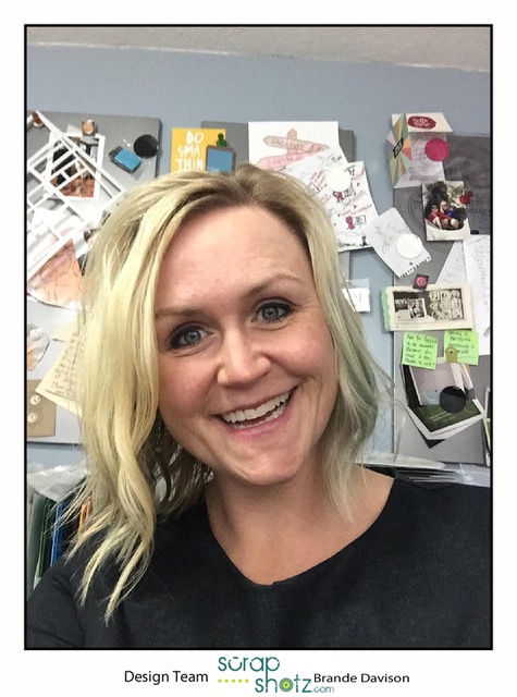
Hello, hello! So excited to join the Scrap Shotz Design Team. Pinch me! We have such a supportive community here and I am excited to be part of it. Also, I am really looking forward to get to know all of you.

This month I am playing with the February 2019 Scrapbook kit and loving every single bit of this beauty. The kit this month is all about the Pinkfresh Studio, Indigo Hills 2 collection and brings in some matching crystals and cardstock and wow!

I thought as a way to introduce myself I would share the first layout I made with this month's kit and  share some of my go-to scrapbooking tricks while I am at it. I used quite a few of my go-to's on this layout. Here we go, this is my 12x12 traditional layout called Moments.


Now lets break this layout down sort of layer by layer as a way to reveal my go-to tricks for you.

Let the background pattern do the work! When there is a fabulous pattern paper in a kit let it do all the work for you. Do not hesitate to use just a single photo on a layout and even push your pictures and journalling to the side of the background, etc. It the pattern is lovely, show it off! The background paper from the kit I used here is Pinkfresh Studio, Indigo Hills 2  - Eminence. I love it and didn't alter it in any way.

Find inspiration online! One of the things I like to do when I receive a kit is look for inspiration on social media for that kit or the products in it. We are a community that inspires each other - so be inspired. I went online when I got my kit and discovered the Pink Fresh Studio Facebook Group and would you believe they had this vine/leaves background cut file for free. Yes please! I cut it on plain, flat white cardstock so it wouldn't take anything away from the Eminence pattern paper behind it.

If its pretty, use the product packaging! For those of you playing with the kit this month you may have noticed that the Pinkfresh products packaging is have this amazing light grey/purple diagonal line cardstock insert. It makes a fabulous layer on your project. I cut off the branding and used it to back my photo. Best part is, it matches the collection perfectly!


If you love the ephemera, use the ephemera! If I had an endless scrapbook supply budget I promise you I would get 2 or 3 packs of ephemera with every collection I ordered. I love them! So pile them on, spend out, use em up, no hoarding. I piled every flower bit (ephemera to puffy stickers) from the kit as layers behind my photo. A tip, if you are going to cover half of the ephemera up cut it in half for another layer or for another layout. At least half of mine are cut in half on this layout so I am not wasting their goodness behind the photo.


Add some texture using string! I have loads of different string colours and textures in my stash and I love cutting off a long string, sort of balling it up into a loose knot and tucking it behind a photo or ephemera. If you have ever watched a Missy Whidden YouTube video you will know how my addiction with this string trick started. It adds such a great little pop. I use a colour that either compliments or contrasts my layout and sometimes use more than one colour. There is some awesome May Arts Ribbon - String Burlap in the Scrap Shotz shop in great colours if you want to give this a go on your next layout.


Use a black and white photo! When there is a certain collection or product I want to play with, for example this month's kit, but I don't have a photo that will match the colours - I print in black and white. I love how the muted tones of a black and white photo really showcase the bright features of a  collection. With this layout, I think it really makes that orange/blush color of the stems and flowers in the ephemera stand out. For some reason, I also think black and white looks more fancy.

My final layer on this layout was some paint. Once complete, I took a few minutes to just gently splatter some paints in blue, purple and orange gently around the photo to give the white cut file a little something. I really like the way it turned out. Its a little too pretty for me to add journalling to so I am going to do my journalling on a 2x3 pocket card and just attach it with a flap once its in my album. Oh maybe that's another go-to trick!

Well that is me! Thanks for reading. If you try one of these tricks, I would love to see. Please tag Scrap Shotz on any of social media channels when you share so we can oooh and aahh. Also, would love for you to say hi in the comments - I look forward to getting to know you.