Friday, April 12, 2019

Farmer's Market Layouts using the April Kit

Hello friends! Karla back today with two layouts completed using the April Scrap Shotz Kit featuring the Happiness Collection from Cocoa Vanilla Studio. I love this kit!! The beautiful watercolour and florals are perfect for so many occasions, and since I am definitely in need of some bright spring colours (especially after snow in Calgary last night!!) this is just the thing to make me happy! I started off by using the Creative Scrapbooker Magazine April Sketchy challenge as inspiration along with photos of our family at the Cochrane Farmers Market in Alberta. I used the small flower paper as a border and layered a piece of white cardstock on top before stitching around with my sewing machine. My daughter had been practicing sewing and had green thread in the machine and I decided to go for it, lol. 


I used some free cutfiles from the Cocoa Vanilla website and cut out the 'lovely' title on white cardstock along with two circle wreaths included. These were the perfect thing to add to the page to coordinate with the sketch. I misted them with Glimmer Mists to add colour and customize them to coordinate with my page. I also used the packaging technique to add some of the mist to the background of the white cardstock. I really love combining fonts to create a title, so I added one of the 3x4 cards with 'weekend' in the center and a 'day' sticker from the Thicker Kaleidoscope Words sticker pack which is an Add-On available.  


I love the CV Happiness Accessory Sticker Sheet with the tiny word phrases! This is also an Add-On available in the shop. Don't forget as a subscriber you'll get first choice to get those fun Add-Ons you want to coordinate with the amazing kit! I layered some of the words to create some fun sentiments beside the photo of my two girls. 


I layered my photos on cardstock and paper included in the kit and then embellished with some of those Add-On Thicker stickers and little flowers that come in the Die Cut Ephemera pack, which is part of the Kit. I also added some enamel dots created with the Add-On Carnation Nuvo Crystal Drops. I love being able to customize the size of the dots I'm creating!! 


For the second layout I'm using a sketch from the SCT 365 Layout Class. I honestly love starting with a sketch! I often find I layer papers in a way that I wouldn't have thought of, and even if I use this sketch again and again it always turns out different each time! 


I used the 'good vibes' sentiment from one of the 3x4 cut apart pages in the Kit to start creating a title, adding the Add-On Thicker Kaleidoscope Stickers 'and' with 'happy times' from the Diecut Ephemera pack. I again used the packaging technique to pick up mist from my splat mat with a plastic package and then press it onto the white cardstock background. 


I absolutely love the tassels in the Diecut Ephemera pack in the kit and I used a bit of twine from my stash to create a hanging effect. I added a 'hello' from the Add-On Accessory Sticker Sheet and layered on the 'weekend' flair badge from the Kit. 


This wonderful flower diecut is from that free cut file (linked above) and I backed it with papers all included in the Kit. I added the pretty wood veneer butterfly and embellished with the tiny pink flowers - also in the Kit. A few more customized Nuvo Crystal Drops (an Add-On) finish off the pretty details.


 Thanks so much for stopping by today! Be sure to check back all month for lots of projects featuring this gorgeous Kit and Add- Onsand don't forget to check out the Reveal Video post HERE where you can see exactly what's included in the kit! Have an awesome weekend friends, and happy crafting!


Wednesday, April 10, 2019

April Kit Club Reveal!!

Hello friends! It's Karla here today, and I'm so excited to bring you a new Kit Club reveal with the April Scrap Shotz Kit featuring the Happiness Collection from Cocoa Vanilla Studio!! The lovely spring colours and gorgeous watercolour look that Cocoa Vanilla is famous for is so lovely - and of course would make anyone very happy!!


Here's a look at the video where I'm giving you a closeup look at all the wonderful supplies included in the kit - as well as a few yummy add-ons available!


Here's what's included in the kit -
Beautiful Bazzill cardstock in coordinating colours
A lovely sheet of glitter paper
Fun black foam Thickers in an awesome font
CV diecut titles


9 sheets of gorgeous patterned paper-
Here's a look at both the front... 


... and back sides! Ummm, you might want to grab the Double Patterned Paper Add-On - these are beautiful designs!


CV Diecut Ephemera - this is a huge pack of beautiful diecuts!!
Assorted wood veneer pieces
Mini flowers that are super cute
CV Flair badges - love these!


Wow! that was a lot of yummy fun! Now here's a look at just a few of the awesome Add-On's available. Of course, you get first choice when you are a subscriber...
Kaleidoscope Thickers Words (only one sheet of two included shown)


Thanks so much for stopping by today! Be sure to check back all month for lots of projects featuring this gorgeous Kit - I'll be back Friday with my first project.  Have a wonderful week friends!

Friday, March 29, 2019

Vicki Boutin Color Kaleidoscope with a Sketch

Carolyn back again for some more layouts and more Color Kaleidoscope! I love, love, love this collection. Here are a few more ideas to get your creativity flowing.

First up, I have my interpretation of the Creative Scrapbooker Magazine March Sketch. Here is my layout.
Here is the sketch.
As you can tell, I may have gotten a little side tracked with the sketch, but that is what is great about a sketch. It gets your creativity going. At first I wasn't sure what I wanted in the giant space at the bottom so I figured a giant title would work well. I really wanted to use the purple paper as part of my background so I found some pictures with purple in them. Since my daughter is on a swing, the cloud paper and die cuts were an obvious choice. There is even a chipboard sticker that says "goofball". How does Vicki know my kid so well?

I also used a puffy sticker in the camera and cardstock butterfly stickers. The title was easy to make using my Silhouette Cameo. I chose a font I liked, used the offset button to make an outline and cut the outline from black cardstock. The rainbow letters I traced using the scraps from my cut mat and glued them to the back of the outline. I cut the chain with my Cameo using grey cardstock. The final touch was to raise up the clouds with some foam backing and add some journaling.

Here is another project that was super easy but I think it's my favourite! It catches my eye every time I walk past it.
This one started with me flipping through my photos trying to find one that matched the "Pop Dots" paper. I was so excited when I found this one. How lucky was that? I used a stencil with some modeling paste mixed with black paint. I taped over the parts of the stencil I didn't need and taped the stencil to my paper. Be very careful not to drag paste through any open areas of the stencil, off the edge or let the stencil fall into the paste elsewhere on the paper. 

Next, I used some punches to cut circles out of matching papers in the collection. I scattered them around. I left space to do some journaling. Here is the border paper in the Scrap Shotz's store. The title is so cool. The first three words are from the chipboard sticker sheet. The word "house" I made using a similar font in my Silhouette Cameo and pasting it to a white paper. I added some thread for good measure. There are also puffy stickers and cardstock stickers on this layout too.

That's all for now! I hope you have a creative day!

Wednesday, March 27, 2019

Vicki Boutin Color Kaleidoscope Scrapbook Layouts

Hello everyone! Carolyn back with some awesome new products. I've been playing with the new Vicki Boutin - Color Kaleidoscope Collection. If you love color, you will love this collection. The colors are rich without being too bright. It also lends itself to mixed media. Especially if you are like me and get a little scared to take the plunge. Some of the "mixing" is done for you in the embellishments and papers.

I have two layouts to show you today. One includes a photo tutorial.

Here is the first layout.
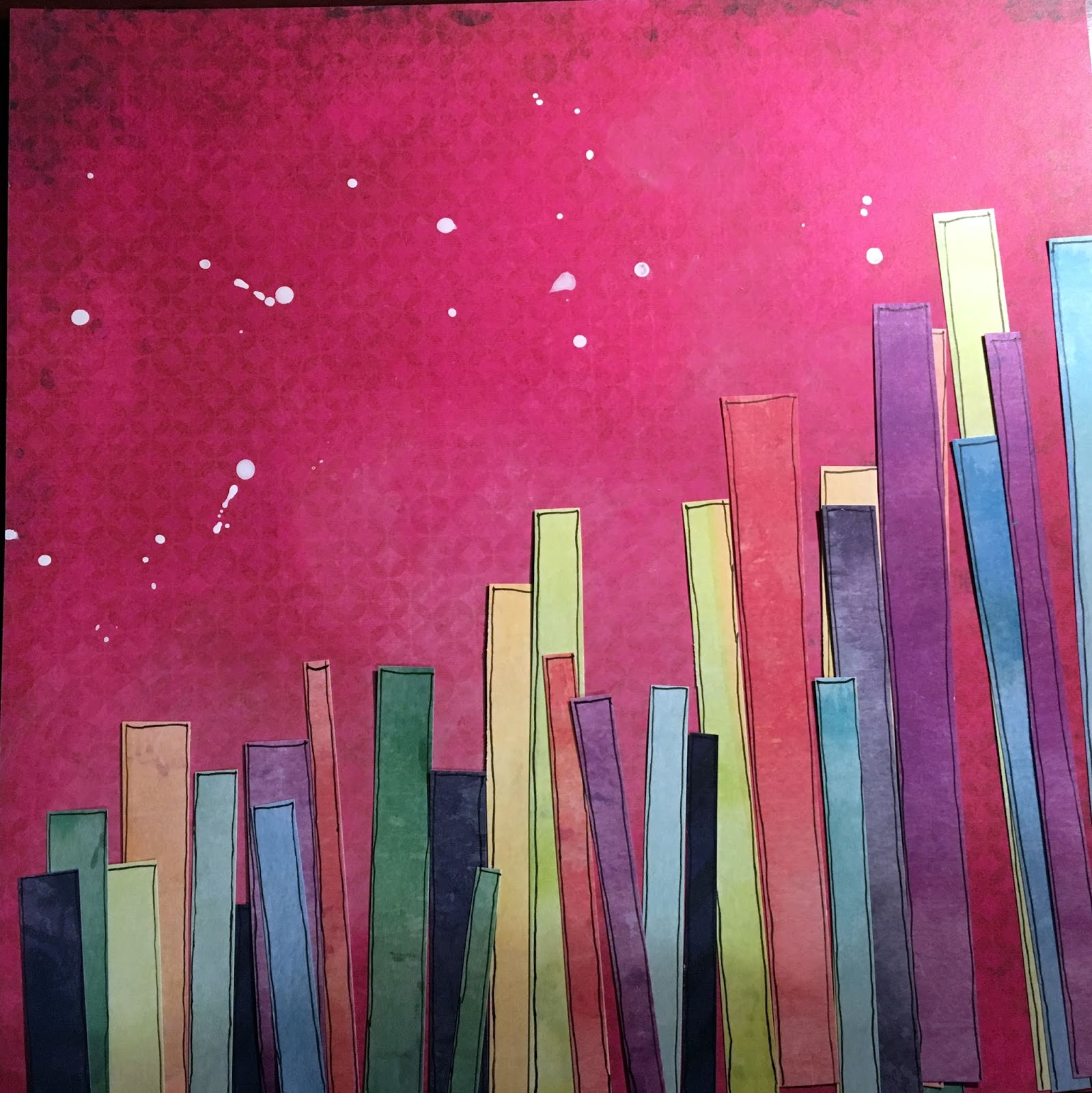
I began by adding lots of water to some white gesso. I used a tissue to swirl it onto the back of the Hearts Paper to tone down the pink colour so my paper strips will pop. I splattered some non-watered gesso around the top of the page. Next, I cut strips out of this rainbow paper. I tried to make them a variety of lengths. I outlined them with a black pen so they would stand out. Then I laid them on the page until I liked the combination of lengths and colours.
I cropped my photos and picked an arrangement for them. I glued all the strips to the page and chose a title.
I used flowers from the Ephemera Die Cut Pack. I moved them around until I liked the arrangement around the photos. I ended up moving them slightly after I glued my photos. I also added a paint brush under my title. I thought it went with my theme of the girls doing their make-up.
Now the final steps. I decided I needed to matte my photos so I used the purple paper that is on the back of the rainbow paper. I only tacked down the center of the photos so the flowers could be slid underneath. I chose some phrases from the Chipboard Stickers and cut them apart in groups of three. The rule of three is something I always try to follow. Especially when I'm having a hard time making my layout look balanced. 
I added some journaling and the date with chipboard stickers. I felt that too many of my splatters were covered so I placed a paper over certain parts of my layout and added splatters. I tucked some grey thread under the flowers. I also saw these butterflies lying on my desk from a previous project. They were the insides of a cut file. I used some yellow paint and a black pen and bent them so they were dimensional. I just glued the centers so I could bend the wings how I wanted. The last touch was to rough-up the strips along the bottom. I felt the top was messy and the bottom was too clean so I ran my fingernail along the edges of the papers and tore them slightly. So here is the final product!
Now for layout #2! I seriously couldn't stop playing with this collection. I had so many ideas, I had piles of different papers and photos all over my desk. I guess I was into angles because my next layout has a diagonal across the bottom like the last one but is still very different.
For this one, use a white piece of cardstock as the base. Tear the Pop Dots Paper on an angle. I always tear so there is a white border showing along the edge. I used some clear gesso on the white paper and let it dry. This helps the paint to absorb less into the paper and you can move it around a bit. Then I dabbed yellow paint on top and splattered a little bit. I matted the photo and used a combination of die cut flowers and fussy cut flowers. I hate wasting die cuts so I cut off the parts that were under my photo and used them along the top border. There are so many fun banners and stickers in this collection, I had to add a whole bunch! Check out these Puffy Stickers!

Thanks so much for stopping by! I hope you enjoy playing with this collection as much as I did. I'll be back on Friday with many more layouts!


Monday, March 25, 2019

More March '19 Scrapshotz Kit - Cards and a Mini

Hello! I am here today to show you a few more things that I made with the March 2019 Scrapshotz kit, featuring Simple Stories Vintage Traveler. I loved that the 6x8 paper pad had panels that could so easily be made into cards. These 4 cards were made with a bunch of scraps from the kit and a single sheet from the paper pad. No stamping at all!
For the first I die cut the panel and then die cut a couple more tags for the layers. For the second card, I took the backpack from the sticker sheet and popped it up over the backpack printed on the panel. I put a few Nuvo drops on each. Those drops are so easy to use and so beautiful.
These cards were super simple! They are also panels from the same sheet of 6x8. I just added a few layers, some sequins and a bit of ribbon and done.

 These cards used die cuts, chipboard elements and stickers. The only stamping was the sentiment on the Congratulations card, that will be good for a Graduate.
These last two are blank, meaning no sentiment. These are always handy to have on hand as they can be used for anything. I keep a ziplock bag of blank cards like this in my rv. It is really surprising how often I go to that bag for a card. I used Nuvo drops on the first and my Tim Holtz - 3 D Texture Fades Botanical Embossing Folder on the second. These folders have amazing detail and give cards an elegant texture. 

My last project with this kit was a mini book inspired by a Maggie Holmes YouTube video that I watched. I've linked it here so you can pick up her pro tips as well. The base of the mini is a bound book, and since I didn't have any that I was willing to cut up, I went to the second hand store in town and picked up this one for $.50. The first step is to cut out the pages. I used an exacto knife and a self healing mat to do the cutting, as per Maggie's instructions.


Then it was just go straight into making the pages. I had a number of photos that I had printed of a vacation to Mexico in 2015 that hadn't yet made it to a scrapbook, so while these are all from that trip, I didn't worry about putting them in any kind of order. It made for a no pressure kind of process that was fun. Here's a couple of the pages.
Rather than make this a super long blog post, I took a video showing you through the mini. If you're inclined to view it all, here's the link. YouTube Mini Album Walk Through

Thanks for stopping by! Make sure to check out the rest of the Design teams projects on the blog. Amazing projects!


Friday, March 22, 2019

March Kit Club and Creative Scrapbooker Sketchy Challenge

Hello, hello! Each month us gals her at Scrap Shotz have a great time playing with the monthly Creative Scrapbooker Magazine's Sketchy Challenge. I am using my March Scrapbook Kit to play this month and I am taking the sketch from what is a pretty traditional 12x12 size and style into a Traveler's Notebook (TN) layout.

The Creative Scrapbook Magazine, Sketchy Challenge for March is really, like all sketches, a jumping off point. You can take it literally and match the design exactly or you can use it to inspire your own layout or even just an elements of your project.

As I was taking my layout from this design into a TN I had to think about how I would incorporate the middle of the notebook into the design. With a shift of the two smaller objects on top from the centre over to the left I was able to stay true to the design while making sure I was not folding photos in half every time I closed my notebook.

Also for my design, I decided to use the journal spots implied in the sketch with the squiggly lines as a placef or my die cuts. The March Scrapbook Kit featuring the Simple Stories, Simple Vintage Traveler has so many amazing die cuts - I am coming up with every excuse to use at least a couple of them on every project this month!

Ok, ok, ok enough of this describing the project stuff ... lets see it!


To keep this design flowing from the others layouts I have already created for this project I added some journal pen 'stitching' around the edges, some tiny staples and the date stamped multiple times. I also added a few scattered X's just using my journal pen again around the die cuts almost in the same way you would embellish with enamel dots. Just a little something to break up the space.

For a peek at the other layouts I have created in this project also using the March Scrapbook Kit, check out my Simple Vintage Travelers Notebook blog post from the other day. I am aiming to complete these project in the next couple of weeks and then publishing a flip through video - stay tuned.

Oh and if you have not yet had a chance to see Lorraine's take on the sketch, pop on over to her March 2019 SS Vintage Traveler Scrapshotz Kit blog post. Lorraine is also using the March kit for the take she did on the sketch and she stayed true to the 12x12 format - its gorgeous!

Thanks for stopping by!


Wednesday, March 20, 2019

March 2019 SS Vintage Traveler Scrapshotz Kit

Hello friends! I'm here today to show a few layouts created with the March kit featuring the Simple Stories Vintage Traveler line. This kit has so much to offer!


With this first layout, I sprayed dylusions "melted chocolate" ink spray just where I decided that I wanted to put my photo. This ink is wonderfully vibrant and I love the way it covers and drips. Once it dried, I wanted to put a bit of contrasting glam on top, so I dripped some gold Irresisible spray sparingly, then set it aside to dry thoroughly. I cut a panel of patterned paper from the kit, inked the edges with Walnut Stain Distress Ink and adhered it to the top of the page. After I put my photo on the page, I inked the edges of the chipboard photo frame, then used glue dots to stick it on top. I added some sticker embellishments, always inking the edges, and used foam pop dots under some, giving the page more dimension. The title was cut out of a (probably vintage, lol) Quickutz die set called "Stardust." I used Gina K Connect glue, and I can tell you that you don't want to change your mind after you've given that glue a moment. It's really super stuck! I did my journaling with a Pentel Liquid Gel Ink.


While we're traveling, I often pick up postcards from the souvenir shops or where ever they can be found. I love that I can use them immediately, they often have some fun information on the back and this one actually has an aerial photo of the resort that we stay in. I mounted the patterned paper on Bazzill cardstock. I cut the side banner off of the patterned paper, and backed it with Bazzill in the same brown as the base. I used some heart and you are here word and icon stickers to embellish the page. A bit of glossy accents on the stickers customizes and highlights them nicely. I did a line of journaling on the border strip and added a chipboard arrow. This one was really fast!


I love to do double pages! My first step is to tape together the base pages. This way I can always see the flow between them.  For this spread I found posters online of the Broadway shows that we've seen and printed them on photo paper. I used 6" panels of patterned paper then used 3" strips of another pattern as borders. I mounted the photo and journaling spots on gold mat paper that matches the Thicker alphas in the kit. I also cut the stars out of the same gold. and spread them around. To give my title a little bit of movement, I used the curvy ruler in the American Crafts Alphabet Alignment Guide available from Scrapshotz here. I keep these guides handy and use them for almost every layout. They're perfect for titles.


My title uses a lot of A's. I actually ran out, but used an upside down V on the last word, and most people won't notice. I used pop dots all over the page, under some of the posters, stars and journaling blocks.

While I think it's important that the 2 page spread is balanced, I like to make sure that each of the single pages is also balanced and pleasing to look at. Here you will notice that my star grouping goes over both pages. I left the tape on the back for display purposes in my family room. To put it away, I will use an exacto knife to cut the pages apart.

This month the Design Team was tasked to use the Creative Scrapbooker Magazine's monthly sketch to create a layout. Here is the sketch.
 Here is my take on it.

I used a patterned paper from the Vintage Traveller line that already had some of the elements that would compliment my photos, and used the large block on the bottom to showcase a panoramic photo. The two smaller photos are just slightly overlapping, giving the page a pretty good balance. The title is from the sticker sheet, but it got sort of lost on the paper, so I outlined it with my journaling pen and that gave it just enough pop.


This "Haven't Been Everywhere" layout was fun to create! I layered some Snap cards from the kit with a quote page from the 6x8 add on pad, and adhered them in the center, so that they could curl up on the edges, looking like they were tossed in the pile. I matted the photo on black, then gave it something to sit on with a border sticker. I put a few pop dots under the bottom of the sticker to help it stay raised up, as well as the photo.  The sticker dots and compass got a layer of glossy accents to liven them up. Journaling was done on the Post Card with a gel pen.


This last layout I'm sharing with you today is very simple. My friends seemingly coordinated their outfits for it - thanks, girls!! The yellow block journaling pattern was perfect and to give it interest, I used a collage patterned paper behind the photos. I printed the photos with the white border (one layer done!) and matted all the elements except the title on black Bazzill cardstock. The title was quickly done with the Thickers in the kit. (Thankfully, I didn't need any A's!) Simple, but I was really happy with the result.

I will be back next week to show you what else I've done with this kit. Until then, enjoy our spring weather, where ever you are!