Showing posts with label Lorraine Melin. Show all posts

Wednesday, April 17, 2024

Photoplay - To the Moon Collection

At first glance, I loved this collection. The colors in the line are gorgeous and so different from most of the lines out there right now. Then last week we were in Houston, and the patterned paper and stickers were perfect for this photo from the Space Center. I popped up the stickers and when I cut out the alphas, I loved the look of the negative space, so used that instead of the individual letters.
This plaid patterned paper is very gender neutral, so easy to use for masculine pages. I printed the photos in black and white so they would stand out  and matted them with black. The alphas are from my stash, an old Heidi Swapp booklet. They weren't distinctive enough, so I traced them with a black pen after matting them on solid cardstock from the add on cardstock pack. To cut out the words, I find it easier to draw a bubble around them with a pencil then fussy cut. If there are any stray pencil marks, they are easily erased.

Finally, I used the sticker sheet and the 3x4 cut aparts in the collection to create baby cards. These are really sweet. All I added was foam and enamel dots and some twine and ribbon. I also used stickers for the inside sentiments where I could. This made for no-stamp cards, which are fun for a change!


Thanks for stopping in! 


Monday, August 28, 2023

Simple Stories - Simple Vintage Essentials

Hello! I am back in my craft room after a busy summer. It feels pretty good to being back in creative mode. I was excited to work with this line. "Simple Stories Simple Vintage Essentials" is very monochromatic, and I love how colors pop on it!

These older photos of my sweet granddaughter make me smile, and her bright coat helps them jump off the page. I used a few different patterns from the patterned paper pack, cutting squares at 4.5 inches and mounting them on a mat, that was mounted on a dotted background that was adhered to a cardstock base.  Over the quad patterned paper, I mounted another pattern in a larger square, popped it up on foam and used that as the base for my photos. The gold heart accents and the gold thickers are from my stash and the clipboard clips are from the Chipboard Clipboard ephemera pack. 

I really like the pattern on this paper with all the rulers on it. I mounted a 8" strip in the middle and built my layout up from that, using foam to pop up the photo, different words from the foam sticker sheet and a die cut Hello from my stash. The postcard and other layering bits were from the ephemera packs, and more of the clips from the Chipboard Clipboard pack. I knew that this photo was going to be on a layout as soon as I took it. That's my sister climbing up the ladder on our RV attempting to get a cell signal at the Big Valley Jamboree. 

This layout was fun. The layers under the photo were already done for me, I popped one of the ephemera pieces on a bit of foam, then mounted it on another. So easy to get the multi-layers! I put that onto a patterned paper piece that I cut around the tags about halfway up the page, distressed them a bit, inked the edges and sewed around it a couple of times. The flowers are 49 and Market blooms that also had a bit of distressing. I used the labels from the ephemera pack with the inserts intact. (You can use the frames or the words separately if you'd like.) To give the labels a bit of dimension, where ever you could see them, I put glossy accents on the rivets to make them look 3D. I also put glossy accents on the clips and on the heart under the photo. 
 

Of course, I ended my scrap session with some cards. These were fun and easy to create, and I think they'll be ones I use quickly. They'll be great for office greetings and occasions.


Thanks for having a look! Anytime you have a question, please just ask. Have a great week!


Sunday, April 23, 2023

49 and Market - Vintage Artistry "Everywhere"

 I am absolutely in love with the 49 and Market releases, and I can't choose a favorite. That's okay though, as they all will work together. For this layout I used the Vintage Artistry Everywhere collection. It works so well as a travel line, with great chipboard words for all your vacation photos.  I used one of these to highlight the Michael Buble' Higher Tour that I attended in October. I used gold thickers and Doodlebug Alphabet Soup Alphas in the Coral color for my title and sub-title. In the background I used some of the acetate filmstrip frames. My journaling was typed and cut into strips that I ink blended the edges. Just a few chipboard word strips and it was finished. 


The second layout using this collection is more of a travel theme. Once again the filmstrip frames gave the background interest, and the title was created with chipboard words, highlighted with chipboard hearts. My journaling was hand written on a postcard from another 49 and Market collection ephemera pack. I am sure that I could fill several albums with just sunset photos from Puerto Vallarta. This view is amazing every day.
Thanks for stopping by. I am continuing to work with 49 and Market and plan to make some more cards with these gorgeous elements.


Sunday, November 6, 2022

Vicki Boutin Print Shop - Scrapshotz October Kit

 Hi! I am having so much fun with the American Crafts Print Shop by Vicki Boutin line! It is so versatile and fun. 

It's not often that I am allowed to use pink on a hockey photo for the boys, but this one is just right for it. I trimmed a piece of patterned paper 1/8" on all sides and matted it on a black base. The photo is also matted and popped up with black cardstock. The funky thickers are part of the kit, and I added a puffy heart sticker to dot the i. The rest of the embellishments are from the Paperie Pack. I love the variety of this pack and 200 pieces? Wow. I embellished with a trio of ink splats and a few more puffy hearts. I didn't want to put all the names of the players on here, so I put the program from that game in an envelope on the back of the layout. It lists all the players from both teams, so that's perfect.

I also used the patterned paper to create some cards. 


Check out this line of awesome goodness! It is amazing! Vicki Boutin Print Shop is in the store!

Thanks for stopping by.


Friday, May 6, 2022

Cocoa Vanilla "No Limits" Scrapshotz Kit Take 2


Hello! I'm back with more layouts from the April Scrapshotz kit - Cocoa Vanilla "No Limits." What a fun patterned paper this one is! I used a No Limits Pocket Card for the journaling and embellished with chipboard and lightning bolts from the Die Cut Ephemera pack. Lots of foam used under various elements on this layout gives it depth and dimension!


Another hockey layout! This time I drew a border around the outside of the patterned paper with a black pen and used a phrase from the No Limits Die Cut Titles pack for the title. A couple of cards from the Pocket Card pack for a journaling spot and a ticket out of the Die Cut Ephemera to finish it off.

This simple card used a die cut from the Die Cut Ephemera and a word strip from the 6x12 Accessory Stickers. To add to the galaxy effect, I used some Tonic - Nuvo Dream Drops Enchanted Elixir for stars. So pretty! They add a shimmery glow to the background.

The main sentiment on this card was die cut twice with the Lawn Fawn Giant Thank You Die (available in the store!) from patterned paper out of the No Limits Paper Stack. The rest of the embellishments are from the 8x12 Chipboard sheet and the 6x12 Accessory Stickers. To give the card a little extra, I used Ranger Glossy Accents on all the bits as well as the die cut. I love the smooth shine that it gives the card.


This slimline card was created from bits and pieces from the chipboard, stickers and ephemera that makes up this fabulous line. I hope that I've inspired you to create with this awesome kit!


Monday, May 2, 2022

Cocoa Vanilla "No Limits" Scrapshotz Kit


I was thrilled to be able to work with the April Scrapshotz kit featuring the No Limits line from Cocoa Vanilla! This line is perfect for sport photos as well as almost any other event that life presents. I used it for this double page spread of my grandsons hockey season.

The title on the left side of the layout is from the chipboard embellishments. I wrote the journaling on a pocket card and the stars and banner are also from the 12x12 chipboard sheet.

The big titles on this side are from the Die Cut Titles. There are so many to choose from in this package! The stars and circle embellishments are from the Die Cut Ephemera package, and the word banners are from the 6x12 Accessory Stickers.

I had to use the paper from the paper stack to make cards! This big die cut was cut from the patterned paper with a Lawn Fawn die that is in the store here Big Hugs. I backed it with a second die cut in black and used small chipboard embellishments along with some Ebony Black Crystal Nuvo Drops that are in the store. This card would work for so many things.

For this card I used some starry patterned paper and a pocket card with some stickles on the letters. So colorful and easy! The stars are from the Die Cut Ephemera pack and got a Stickles treatment as well.

This card uses a sentiment from the Die Cut Ephemera package and word strips from the 6x12 Accessory Stickers. I used foam squares to pop up the sentiment and puffy stars to highlight the word strips.

Thanks for looking! I will be back later this week with more projects from this awesome line.


Thursday, March 12, 2020

Pinkfresh Studio - Super Cool 2

Hi! It's Lorraine back today with a couple of Pinkfresh "Super Cool" layouts.  This bright, versatile paper line is available at Scrapshotz.com!
For this school photo I used a alpha stamp in my stash to create the title, and cut it out twice to give it a shadow with the red cardstock. The number 7 is a Mega die from Altenew.


For an embellishment that would stand out on this patterned paper, I stamped a Tim Holtz Book Sketch stamp with blue Momento ink, colored the image with copics and used Ranger Glossy Accents to achieve the shine and depth that it has. To keep each book separate, I applied the glossy accents to each book and let the layers dry in between. This gave the books a piled up look, rather than a smooth finish.


For this layout, I used a sketch from PageMaps for inspiration. I love to look through their monthly sketches for a jumping off point! I stamped the "Hashtag" and "Moments" and embossed them with white embossing powder and added the "Family" from a past kit's thickers - this one was the Heidi Swapp "Wolf Pack" line. Enamel dots and puffy stickers finished it off.


I fussy cut some banner flags from a sheet of patterned paper in the line and grouped them in threes around the page.
And here is my 2 pager for the month. I like my 2 page layouts to work together, but both sides are able to stand on their own a bit. This one has the multiple snap chat pics on the left and the title, main photo and journalling on the right.

The small photos were piled up by adhering the bottom of each picture with glue tape and using a foam pop up under the top. Interspersed throughout are puffy stickers and enamel dots.

The pale blue of the line's Thickers needed a boost, so I outlined the letters with a black pen. There wasn't any punctuation in the pack, so I used a "weeded" inside of an "O" and cut another spare bit to create the exclamation point. The dashes on either side of "Chat" are the inside of the "A's."

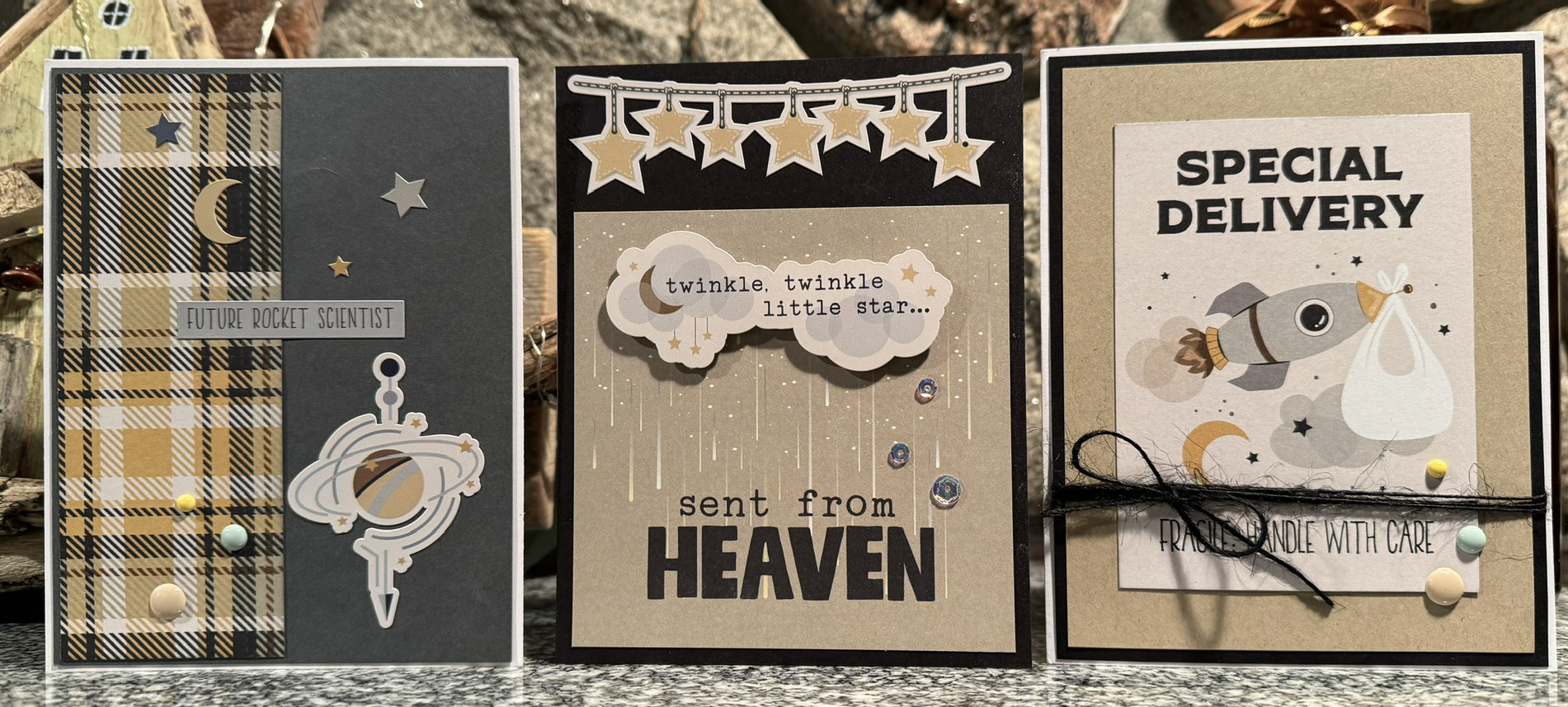
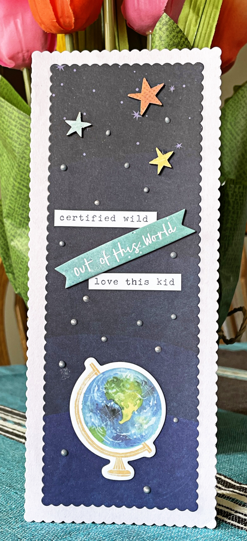
Last but not least, I created a couple of cards with leftover pieces that are perfect for teens - teen boys, even! Not an easy task, as teen boys don't really want flowers, cute animals or mermaids! There are plenty of suitable ephemera parts for them.

Thanks for having a look! If you have any questions, please do not hesitate to ask in the comments, Have a great week, and be safe out there!


Thursday, February 27, 2020

January Prima Marketing Scrapshotz Kit - Pt 2


This photo is a blast from the past! I have to smile looking at my kids at this age. Because it's kind of an old photo, I had no problem giving it a vintage feel with this gorgeous paper line from Prima Marketing. The "Darcelle" line has some lovely tones of burgundy and the blooms included in the kit are really beautiful.
Here is a boyish page with the same line. This paper is filled with numbers and file drawers, so a school photo is just right for it. The kit thickers have just the right amount of glitter and have a great classic font.

And now for a few cards! There is plenty of variety in tones and moods created from scraps and sentiments from the chipboard and paper.
That's a wrap for my January kit projects! Thanks for stopping by. If you have any questions about any of this, please leave a comment and I will get back to you!