Carta Bella hit it out of the park with this collection. With 3 grandsons playing and all of us being big fans of baseball, these papers and embellishments are perfect for me. Let's get going with some layouts created with this line.
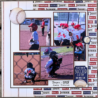
I love the rich vintage looking colors in the line. They are bright, but don't try to take over the layout. Because the boys' uniform colors are mostly red and grey, I stuck mostly to mats in red and navy blue. I love the large photo in this layout. I cut a mat for the title panel as I wanted it to be prominent and not get lost in the patterns. The alphas are American Crafts Thickers from a past Scrapshotz kit.
The patterns in this paper are busy, but with a large mat to park the photos on, they still take center stage. Baseballs from the ephemera pack are the only embellishments needed.
This layout is super simple. A strip of "Take Me Out to the Ballgame" patterned paper to rest on, more ephemera and a bit of doodling around the outside complete it.
The letters are dies from Pinkfresh Studios "Adore Alpha Set" and the numbers are from Concord and 9th "Notable Numbers Set." If you are looking for dies, Concord & 9th also has awesome double cut alpha and number sets. These dies can be special ordered through Sandy. Just let her know what you are looking for! I cut out both in red and blue, using just the outline of blue on the red letters and shadowing the numbers for depth.
The only embellishments on this layout are stickers from the sheet in the collection pack. I love that they are thick enough to pop up and make a real statement on the page with some foam dots.
These little swingers are popped up and perfect for this page!
This layout was fun to do. A little tedious cutting out the long title, but it was worth it in the end. I used an old Quickutz alpha set that I have had for forever, called "Blossom."
This layout also has lots going on, so a tag from the ephemera pack and some chipboard pieces were the only embellishments.
This final layout is one of my favorites. The single photo with a little bit of bling from the brads scattered down the page with a some ephemera is just what it needed. I cut the journaling block with a spellbinder die and added some Maya Road stars.
Thanks for sticking with me on this double-header of baseball layouts. I love this collection, and still have a few sheets of patterned paper that may still make it onto another spread or two. 😊
Have a great weekend!


No comments:
Post a Comment