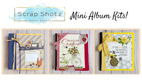
Use the colours in this card to create another card or LO.

The paper and embellishments are from this month's kit and the stamp can be purchased in the store! Can't wait to see what you come up with!
Gorgeous Wendy!


For the Fabulous Friday challenge today, I wanted to not only supply you with an inspiring color theme, but to also tell you about a design rule that you can use on all your pages. Here is the color pallet that I am working with.

This was a paint swatch on the Better Homes and Gardens website, colors that were suggested for painting a balanced, well-designed room. I noticed that the size of the paint lids were all different, and thought of the Gallon/Quart/Pint rule. We can use this rule to balance our layouts! I'm not sure where I first heard of the rule, but when I googled it, an excerpt of the book "Teach Yourself Visually Scrapbooking" by Rebecca Ludens and Jennifer Schmidt came up, and explained it this way:
"Create color balance on your layouts by following the gallon, quart, pint rule of thumb. Basically all you need to do is select the color you want to be the most dominant on your page. This is your "gallon" color - generally it becomes your background color.
Pick one more color for your main accent color, or "quart" color. Use only half as much of this color as you use of your "gallon" color.
Then, select the third color - your "pint" color - and use just a bit of it here and there to accent the layout. Again, use only half as much of this color on the layout as you used of the "quart" color."
Here is my layout, using the above color pallet and considering the GQP Rule.

Your challenge today is to think about the Gallon/Quart/Pint rule on your layout. You can use the colors shown here or choose your own. Upload a link here or show us your layout in the Scrapshotz gallery! I'm looking forward to seeing what you do with this basic design rule of thumb!
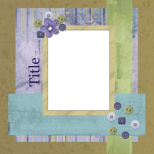 Sketch Created using the Royalty collection
 link us up or post your version in the scrapshotz gallery!