Friday, October 30, 2020

October Kit Reveal with Two Fall Layouts!

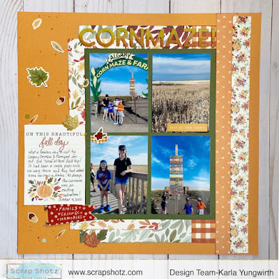
Hey there friends! Karla back today with two fresh Fall layouts using the fabulous October Scrapbook Kit featuring the Carta Bella Hello Autumn collection!! 🍂 You're going to love this beautiful kit, perfect to document any Fall activity!! I had fun using it today to complete two layouts of our visit to a local Cornmaze here in Calgary, but I'm definitely going to be getting our Fall photo shoot and Thanksgiving pics out too! It would totally work for pretty fall cards too!!


One of the things I love about Carta Bella paper is the thick, textured feel! I love this watercolour look pumpkin paper too - and of course I had to use it with these awesome pumpkin pics!! I used a sketch from the CSM October Sketchy Challenge to kickstart the design of my layout. You can find all the previous sketches and lots of inspiration in the group HERE!


I used elements from the Chipboard and the 12x12 Sticker Sheet to create some fun clusters on the page. I just love this old farm truck!! I used my Cricut to cut a cute pumpkin patch title and added several sentiment stickers from the Sticker Sheet as well as the Hello Autumn Sticker Book, one of the amazing add-ons available. 


I layered more of the stickers and chipboard on, and even popped up some of the leaf stickers as well as adding little adorable acorns (and check out the squirrel at the top of the layout!) from the add-on Puffy Sticker pack! I might have had as much fun scrapbooking with these awesome supplies as I did visiting the Cornmaze... 😉


For the second layout I used a sketch from Jennifer Edwardson's Makin' More Memories Sunday sketch Live. She actually embossed on the left side of her layout, but I decided to use the cute leaf stickers from the 12x12 Sticker Sheet to create a fun background element. 


I used the fun customizable Thickers included in the kit and created an ombre effect with Distress Oxide Inks - of course using the new Crackling Campfire orange! Then I added some White Blizzard Nuvo Glitter drops over top for a sparkly effect. 


I added some splatters of Dina Wakley's Gilt Gloss Spray, which has a beautiful, metallic effect and some of the add-on Pumpkin Spice Leaves, which are so pretty!


I journaled on one of the cut apart cards from the 12x12 paper collection and added a banner from the Simple Stories Foam Stickers included. They match beautifully and have such lovely images and words!


Here's a look at the amazing bundle of products you receive in your kit! It's a fabulous deal and every month kit club members receive first choice of many fantastic add-ons available, plus a discount! Read all about the Kit Club Details HERE.


Here's a look at the LIVE Unboxing Video during our weekly 3 pm MST Thursday Facebook Live on the Scrap Shotz Facebook Page. I'm even giving a peek at some of the amazing add-on's available!! Be sure to follow us on Facebook and Instagram so you don't miss a thing! 


Thanks so much for stopping by! Be sure to check out the wonderful October Kit in the Scrap Shotz Store HERE!! You can find all the fantastic add-ons HERE and everything that's fun and NEW HERE!! I'll be back next week with more projects you can make with your October Kit. Happy crafting and have a wonderful weekend!!


Friday, October 23, 2020

Paper Rose - Nature Paper Collection

Hello everyone! Today I'm sharing my cards that I created with the Paper Rose - Nature collection. This paper is amazing. Once I started using it, I just kept finding new ways to use it. I was able to create masculine cards, sympathy cards, fall cards, kids cards and some feminine cards, too.

I created some fancy fold cards, a Z fold and a card using the Lawn Fawn Shutter Card dies.
This paper is a great weight and quality, and it can take lots of different techniques without showing weakness. Here I added some blooms and brads, and on the other I splashed on some Cosmic Shimmer Opal Blaze for sparkle.

 It was awesome for using various embossing powders. There are plenty of embossing powders here in the shop. Embossing
I used some Cosmic Shimmer Opal Polish through a stencil on some, and the paper took it very well! For two of these cards I used these Paper Rose Bamboo Stencil and Paper Rose Hexagon Swirl Stencil.


I did some dry embossing on the Thank you card. The paper is so detailed, it's hard to tell in the photo that only the light brown checker plate is actually raised.
I used different die cuts and elements from my stash. Every sheet of this paper has such great texture!
The paper pad is A5 sized and a couple of the patterns are full pages and worked for slimline cards.
Some of the paper was almost too pretty to cover, like this one with the drawers. No embellishment needed!
I made 30 cards with this single pack of paper, and still have a few part sheets left. I used various bits and pieces from my stash to embellish and decorate my cards, so if there's something you'd like to know about, just ask. It was fun!

Thanks for stopping by! Have a great weekend.


Thursday, October 15, 2020

Rainbows, Rainbows, Rainbows


Hello! Today I am here to give you one more reason to pull out those small yet mighty scissors to get your fussy cut on...

If there is a paper in a collection with repeated designs or elements that you love, think about if you love it as a paper for one layout OR could you love it as a die cut and use it on multiple layouts. That’s how I make my decision when it comes to what to fussy cut. 

The decision to fussy cut all the Little rainbows out from the Up In The Clouds pattern paper from Cocoa Vanilla Studio in the September Scrapbook Kit was a no-brainer for me! I needed all of those rainbows to tuck and layer for this layout and many more to come from this Kit. Yup, needed em! 


The simple shape of a rainbow made fussy cutting these little cuties simple. In no time at all I had about 25 of the rainbows at my finger tips - perfect! 

From there I created a cascade of clustered rainbows down the page in a diagonal direction - I added a few white splatters to the background pattern to give the eye a little break from all the patterns, and used foam tape to pop up a few of the rainbows for dimension. 


Then I added my photo with a cluster of rainbows, die cuts and title to give the page focus and finished at all off with some sticker and fussy cut hearts tucked here and there among the rainbows. 


I love how it turned out. I have found this kit absolutely perfect for documenting my cutest ever little niece - rainbows and sunshine are just perfect for her smiley photos.


Tuesday, October 13, 2020

Use ALL the Die Cut Words

Hello, me again playing with the Cocoa Vanilla, Daydream collection (the September Scrapbook Kit). 

I know I have said it in past posts but I will say it again ... I love this collection, it really is so dreamy! I have not spared a single embellishment or touch here or there, no hoarding is possible with this beauty. All of it must find a forever home on a layout. 

In my pursuit to use it all (kill the kit as you may see on social media, a great hashtag to follow btw), I decided to take all of the remaining Die Cut Words and see if I could make a sentence to inspire my next layout. Well, my grammar is a bit off but the sentiment is perfect! 

Here is my layout titled "Lovely, little, big, beautiful, dream together. Our home."


Honestly, I did not do too much more to this layout besides the "fancy" title which I jazzed up a little by tucking the 3 little homes and some florals from the Die Cut pack in and about, added a few floral and heart stickers (which I first backed on white cardstock then fussy cut),and then tucked in a few of the phrase stickers too. The rainbow background pattern did all of the work for this design! 


The photo is an awful one - well I love the photo but it is not of great quality - so I printed it quite small 2x3. Printing small also left loads of room on the page for my long sentence title. (The photo was a just-for-fun selfie I took while we were out house hunting. We didn't know at the time this would be our home. We just moved in a couple of weeks ago!) 

I used one of the tags in the Die Cuts and the Pinkfresh Studio alphas in my kit to document the actual house address, and then tucked that behind the photo so it just peeps out. 


I love how this page turned out - sometimes I am inspired by a photo or a story, and sometimes I let the product do the work. Between the little Die Cut houses in this kit and the fact that such a fitting sentence came together for a big bold title is well .. a Daydream. See what I did there? wink, wink


Monday, October 12, 2020

September Kit - One More Layout

 Hi there! Just popping by to share one more layout with the September Kit

I'm quite proud of myself for printing my pictures in different sizes this time. I used Picasa and made a collage when I had several pictures for one topic. I kept one large and then the rest printed on one 4 x 6 photo. What a huge difference it makes (and cheaper)! I always crop my photos before printing but find it limits me to using 4x6's which limits my creativity. I love how I got 4 photos on the page but it doesn't look like I tried to cram them in there. 
 
I really wanted to use the butterflies on the Vicki Boutin specialty paper. I fussy cut them and placed them randomly around the Stepping Stones paper using an odd number for visual appeal. I used my random scraps in triangle for on the background. The rest is a combination of flair, ephemera and stickers. The Pinkfresh mini alphas are great for the date. Can you tell I made my own title? If you look close I'm sure you can see that I cut three words apart to make the word 'slime'. 

Thanks for checking out the layout! Have a great day!

Thursday, October 1, 2020

Rainbows and Daydreams

 Hello everyone. Carolyn here with rainbows and hearts and sequins. I used the September kit which is full of Cocoa Vanilla Daydream products. 

I began with the Over the Rainbow paper. Sometimes it is so nice to have these premade backgrounds so it is one less element to worry about. I layered many elements from the ephemera pack.
Here is a close-up of the title. Those fabric hearts are so cute! I'm so glad I found space for one. The small alphas are from the Pinkfresh Studio. I like using contrasting fonts for titles so this was a nice way to make that happen. 
See those little gold leaves and sequins? They are so pretty and can be found in the sequin pack. I love those little gold foil components.
Thats all for now. I'll be back with more layouts.