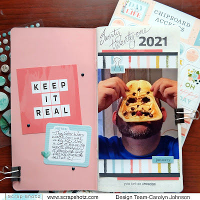
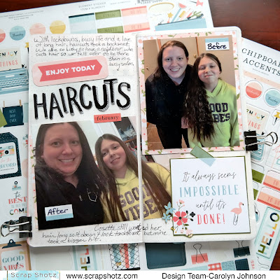
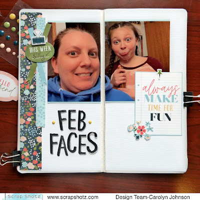
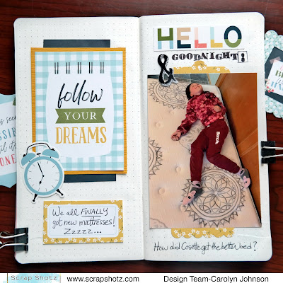
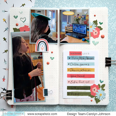
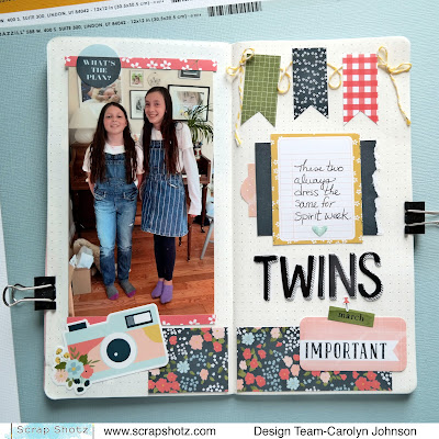
Hello! I've been playing with the January kit featuring the Echo Park "Day in the Life" Collection. This collection has all the usual fun papers and embellishments but it is also perfect for a planner or traveler notebook. I have so few pictures from 2021 due to the pandemic that I can probably do a traveler notebook for most of the year!
Sunday, February 20, 2022
Day in the Life Traveler Notebook
Wednesday, February 9, 2022
More Feelin’ Frosty Inspiration!
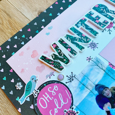
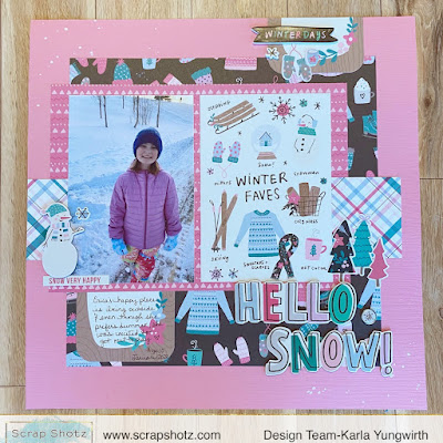
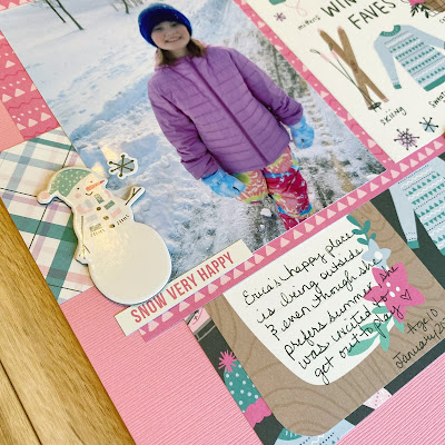
Hello friends! It’s Karla back today with a couple more projects from using the Feelin’ Frosty Collection by Simple Stories! I think pretty papers and stickers make winter more fun, and this collection definitely has lots of fun and cuteness!! Here’s a look at the first layout I’m sharing today.
Monday, February 7, 2022
Simple Stories, More Good Stuff
Hello, I am here today to wax poetic (again) about the Simple Stories, Good Life! Scrap Shotz sent me this collection to play with this month and I am loving it! You can check out my first 2 layouts here.
Wood grain for the Win
I finished off the layout with these super cute photos of my niece (which I printed with a muted filter so they didn’t clash too much with the collection colours), and tucked and added embellishments and enamel dots all about.
Add Some Black to Make it All Match
For my next layout I wanted to document a fun, fancy donut shop adventure with me and a couple siblings - all of us donut addicts. I was keen to include the Boca Grande logo I cut from the donut box but it looked too dark with the bright Good Stuff colours. So I added some more black to the collection goodies to make it all matchy-matchy!
I started with this great circle pattern paper and using a washi tape roll and a glue bottle bottom as a stencil, used a black journaling pen to add black circles just off centre on many of the circles in the pattern. Drawing around each a few times and not perfectly. Then I used my favourite Picket Fence Studios, Paper Glaze in Black Peony and a Vicki Boutin stencil to add those cute starbursts in and around the circles and some splatters. I also messily drew lines around the outer edge of the pattern and backed it on black card stock.
From there it was just a matter of finding all the foodie inspired bits & pieces from the collection and tucking them around the Boca Grande and my photos. I fussy cut the saying from one of the cut apart cards in the kit to use as my title.
Let the Collection Inspire Your Design
For my last layout, I let the Collection inspire me - from photo choice, to story and all the way to design. One of the pattern papers featured these 3x4 cut apart a cards that had the titles: Nope, Maybe, and Yes. The titles reminded me of attempting to take a selfie with our dog and the pictures went for bad to worse. Ha!
I used each 3x4 card as an anchor and then matched a bunch of stickers, bits & pieces, and brads to the colour of the journal card. It was really fun to focus on the colour instead of how much sense the embellishments made - my fav is that thumbs up in the middle, yellow pile. So fun!
I did add some white splatters to the background and punched out a bunch of these film strips in white to create a break between the busy polka dot pattern and my photos. Then added a few film strips to the top and some more embellishments to balance the page.
I had such fun with this collection and love that it was so perfect for just the everyday fun stuff. There are still Simple Stories, Good Life in the Scrap Shotz shop!
Thursday, February 3, 2022
Simple Stories, Good Stuff
The Simple Stories, Good Stuff collection is just that - good stuff! Actually, great stuff! This collection features 12 fantastic pattern papers for the 12x12 scrappers and on the B side some amazing cut apart cards in 2 sizes for pocket scrappers. There is even a 4x6 calendar card for each month of the year for the project life folks too.
When the Good Stuff goodies showed up at the door in my Scrap Shotz happy mail, I went straight for my fun and bright photos! The collection is all pinks and peach and mustard with pops of black and green. Fun photos it is.
Numbers? Yes Please.
Many of the Simple Stories collections have numbers in the Bits & Pieces (die cuts) set. They are so fun to play with. I have done a jumble of Simple Stories numbers before as an anchor for a photo and they are a great jumping off point to journal things like: # number of favourite moments from that memory or # reasons that you make me laugh, etc. For this layout I tucked in some journaling titled ‘12 weird things I love about our family’. I was laughing as I wrote them out.
Pretty simple approach to this design. I added some white acrylic paint splatters to the pattern and used a film strip punch with vellum to anchor my photos. From them I literally tucked and played with the die cut numbers to make a jumbled mess around the photo, added some of the stickers form the 12x12 collection pack in and around the numbers and some of the enamel dots.
To break up the busy green polka dot, I ripped a slim strip from the side and stapled on one of the stripe patterns to fill the gap. I love using this technique to bring in another, contrasting pattern. Tip: this is a great way to use a full length pattern branding strip you have left over!
Envelopes? Of course.
I don’t have an envelope punch board or die, so just took apart a small envelope I had in my scrappy space and traced it onto the pattern paper, cut it out, and folded it into an envelope-like shape. They are not perfect but I added so many die cuts you can’t tell. Tip: there are no imperfections on a layout, just opportunities to add a die cut!
I prepped my background with a little Tim Holtz, Distress Ink in Picked Raspberry and the Heart Spiral Stencil from Peartree Cutfiles, and then a few white acrylic paint splatters.
From there, I added my envelopes to the layout sort of overlapping each other a little to the left, and then started tucking and layering. I put a square or two of pattern papers in each envelope along with the photo - sort of a off kilter photo mat but also like a multi page letter. Then added all the floral bits from the die cuts and stickers, some phrase stickers, and a few more die cuts to top it off. The finishing touch was the brads in a few little spots around the envelopes.
Just before I set it aside, I felt the pink background was a bit too much - so ripped off a thin strip on the right and added a touch of a different pattern behind. Just like I did on the green polka dot layout above. Tip: if there is a design element you love, bring it into all the layouts your want. It’s not repetitive, it’s your signature touch!
More pages in the making …
Well I am off to make more good stuff with Good Stuff! If you are interested in playing with this collection, there are lots of goodies to choose from in the Scrap Shotz shop. Pop over and check them out at Simple Stories, Good Stuff
Wednesday, February 2, 2022
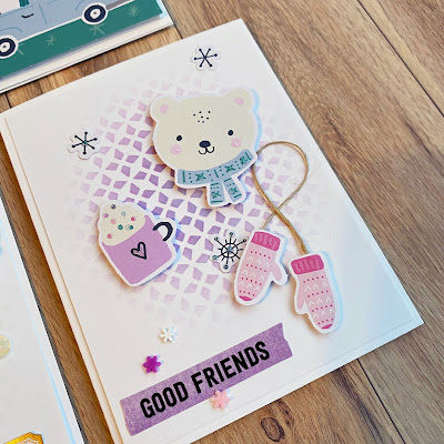
Inspiration From The Feelin’ Frosty Collection by Simple Stories!
Hi friends! It’s Karla back today with some projects using the awesome Feelin’ Frosty Collection by Simple Stories! This is such a pretty wintery collection with sweet images and designs!

