Monday, December 11, 2023

Sugarplum Wishes for Christmas

Just 13 sleeps to Christmas and I am feeling inspired to scrapbook some past Christmas memories. So I reached for the Paige Evan’s, Sugarplum Wishes  that arrived in happy mail from Scrap Shotz and had some fun! So many bright patterns and the embellishments are such fun. 

Go Busy or Go Home 

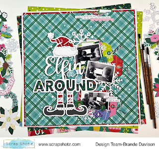
For this first layout, I wanted to use all the patterns and embellishments - go all out with way too much, in a good way. A great way to keep a busy page  focused is by using a single big feature - in this case I reached for a Peartree Cutfiles cutfile. The large, white cutfile on the page breaks up the busy patterns. So you can use them all but not worry about it being too much. 

For this layout, I first backed the cutfile with a few of the fun patterns from the Collection. Then I used the cut apart tags from one of the pattern papers to anchor my small black and white photos beside the cutfile. 

From there, I tucked in a few of the embellishments in and around the tags. I finished the page off with a little ripped feature at the top right of the layout and some Nuvo Crystal Drops in Snow White. 

Make Your Own Background

Loving the look of the bright Paige Evan’s pattern papers combined with a cutfile - I reached for another Peartree Cutfiles cutfile to inspire my page design. 


After backing the cutfile with a number of the amazing pattern papers, I realize of I had created a bit of a colour theme for the page - so I ran with it! Pink, red, dark green and lime for this layout. 

For my background I used a 12x12 Completely Dotty stencil from Peartree Cutfiles. I simply used a sponge dauber and Ranger Ink, Distress Ink in Barn Door, Victorian Velvet, Twisted Citron, and Pine Needles and rubbed them each in random across the stencil allowing some to blend here and there. I added a few splatters of each ink as well. To do this, smoosh some of the ink from the ink pad on some plastic and add a couple spritz of water - then flick over the page with a paint brush. I love how it turned out! 


From there, I added my three photos in black and white below the file (each backed with a coordinating pattern paper or two) and then picked a bunch of the Sugarplum Wishes die cuts and stickers in the layout colour theme. 

Full disclosure, I am also Design Team member for Peartree Cutfiles. The cutfiles featured here are from their exclusive December Advent subscription from year’s past. Such fun to play with. 

Are you scrapping this December or maybe December past? Do you create a December Album each year? Well, if looking for bright and fun design  - reach for Sugarplum Wishes! 

Happy Holidays! 


Saturday, December 9, 2023

More Travel Memories with Mintay Papers

I am back to show off a few more ways to use the Mintay Papers, Places We Go collection in your travel layouts. I received this collection via happy mail from Scrap Shotz and I cannot stop creating layouts – the patterns are so fun, and the die cuts and chippies are dreamy to play with. 

If you missed my first couple of layouts, you can pop back to the blog here

Embrace the Pattern 

For this layout, the pattern paper did all the work! I had some travel memories of staying in the most haunted hotel In Aberdeen, Scotland which resembled the look of the building on the pattern paper. So I added some white splatters (white acrylic paint with a few spritz of water) to bring my usual grunge touch and then added my photos. They are 2x3 photos all backed with a couple of coordinating pattern papers from the collection and slightly overlapping for a layered look. I added a piece of vellum paper behind each to soften the pattern paper around the photo strip.


Once the photos were in place, I added a cluster of the die cuts on the bottom right. The chippies from the collection provided the title “travel” which I balanced with the matching “geo tag” on top of the photos to finish off the layout.

Designate a Spot for Embellishments

When the die cuts and chippies are as good as those in the Places We Go collection, you want to show them all off - so I did just that. I used my go to grid design but instead of using 4 photos, I designated one of the 4 grid spots for a collection cut apart journal card and loads of embellishments.

First, I prepped my layout background with some white acrylic paint spread almost edge to edge but in a really thin layer. This is a great way to soften a busy pattern. Then I cut a couple of 9x8 rectangles of pattern paper which I adhered centre stage a little of centre/titled from each to make sure the patterns were both showing. From there, I printed my 2x3 photos and backed each with a few pattern papers each – again with a little title behind each photo to show off the layers. 

I adhered the photos down in a grid pattern centre stage. For the fourth spot I used one of the collection cut apart cards and this is where I focused the majority of my embellishments. I started with that amazing “globe” chippie and layered a bunch of embellishments on top. For balance, I added some embellishments to the photo on the opposite corner.

Half Page Design 

When I cannot decide which pattern paper is my favourite – I use both! I ripped that great floral pattern in half and layered it over the green marbled pattern. I added another dark pattern between to create some contrast between the floral and green. A few white splatters finished off the background prep.

I printed a couple of 2x3 photos and again backed them with a few pattern papers and a layer of vellum. I made a messy photo strip with my two photos and one of the cut apart cards on top of the ripped portion of the page. From there I added a number of the die cuts behind the photos and to the side of the cut apart card. I also made a little tear at the bottom of the page to show off the contrasting pattern, and placed a small cluster of die cuts on the rip.


Before I added the chippies to the page as a final touch, I covered each with some Nuvo Crystal Drops in snow white. I also backed the little backpacks with the fun floral patterns. So cute!

Thanks again for swinging by … pop over to the Mintay Papers section of the shop for your goodies.


Wednesday, December 6, 2023

More Simple Stories Simple Vintage Tis the Season Layouts

 Hello again! I'm back with more of the Simple Stories "Simple Vintage 'Tis the Season" Collection. Get ready for lots of embellishments!


The first layout uses one of the patterned papers as a border with some black cardstock around the inside. I noticed there were three journaling cards that all had similar brown paper with bits a pieces layered in behind. I added a few more to each card and added my text. The remainder of the layout has foam stickers, chipboard pieces and brads to create clusters. 


The second layout uses one of the premade background papers. I tried to layer chipboard pieces behind the photos and in the corner clusters. The kit has an entire paper of cut apart tags from which I've used three to decorate the page. A little twine from my stash makes them look finished. My last task was to splatter black paint around the pictures. 

That is all for today. Have a scrappy day!

Monday, December 4, 2023

Simple Stories Simple Vintage Tis The Season Layouts

 Happy December everyone! I have two Christmas layouts today using the Simple Stories - Simple Vintage 'Tis the Season Collection. This collection has all the Simple Stories staples - ready-to-go background papers, cut apart tags, cut apart journaling cards and patterned papers for layering. 


The first layout uses a patterned paper as a frame. I cut out the striped paper to make an outside frame for another layout and cut a second frame from the leftover paper. I don't usually put a frame on my layouts like this, but it definitely created a look I would try again. The brown distressed papers on the left hand side are from the cut apart cards. On the right-hand side I tried to do a similar look with a different paper. I used brown ink to make it looked distressed and match the other side.

The big floral picture is actually a large piece of chipboard. These are great for filling the negative space on a layout. Another feature are the foam stickers. They were used for some of the flowers and titles to add some dimension. I also used some cardstock stickers that are in the paper kit. The final touch was to spatter some white gesso with a bit of water added to it.


My second layout uses a premade background paper. I was looking for a way to not always frame all my pictures, so I used photo corners from my stash. I also used a few doilies from my stash to add dimension. The trickiest part of the layout was to try to get the lantern as part of the image cluster on the bottom right. First, I fussy cut it from a different paper, then I cut through the background paper and tucked the lantern behind the white flower. The stickers are a variety of cardstock and foam stickers and a few foam-backed brads. Lastly, I splattered some watered down white gesso. 

That's all for today, but I'll be back on Wednesday with two more layouts!