Monday, April 29, 2019

Sunshine and Blue Skies by Simple Stories

Who's ready for the beach?! I certainly am. Carolyn back again to show you another layout with the Sunshine and Blue Skies Collection by Simple Stories. This collection is bright and fun, fun, fun! Here is what I made:
I used the blue cardstock as a base and chose two matching pictures of the kids playing in the hot tub. I originally wanted to have the word "summer" repeated really large all over the left side of the paper. But once I cut out all the summer words from the collection, I realized they didn't fill the space as I hoped so I changed it up a bit making a smaller "summer" section. I used stickers for the main title and fussy cut them off the yellow cardstock paper and outlined them with a black pen. I also really needed to use the chipboard pineapple banner! The remaining embellishments are a mix of stickers and die cuts. The journaling spot is fussy cut from a Sn!p card which I thought worked really well.

That's it for this layout! Easy peasy! Thanks for stopping by and have a great day!

Friday, April 26, 2019

Carta Bella Baseball Hits A Home Run!

Oh.My.Goodness.


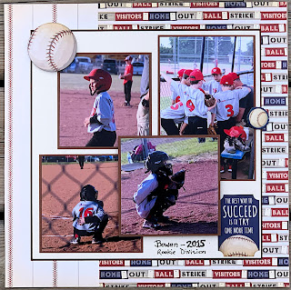
Carta Bella hit it out of the park with this collection. With 3 grandsons playing and all of us being big fans of baseball, these papers and embellishments are perfect for me. Let's get going with some layouts created with this line.

I love the rich vintage looking colors in the line. They are bright, but don't try to take over the layout. Because the boys' uniform colors are mostly red and grey, I stuck mostly to mats in red and navy blue.  I love the large photo in this layout. I cut a mat for the title panel as I wanted it to be prominent and not get lost in the patterns. The alphas are American Crafts Thickers from a past Scrapshotz kit.

The patterns in this paper are busy, but with a large mat to park the photos on, they still take center stage. Baseballs from the ephemera pack are the only embellishments needed.

This layout is super simple. A strip of "Take Me Out to the Ballgame" patterned paper to rest on, more ephemera and a bit of doodling around the outside complete it. 

I had so many different photos from this one game that it had to be a double pager. The layout is the same on both sides, but I used different patterned papers and colors for each side. I matted the photos on each page with the opposite pages base color, and cut out the letters and numbers from cardstock too.


The letters are dies from Pinkfresh Studios "Adore Alpha Set" and the numbers are from Concord and 9th "Notable Numbers Set." If you are looking for dies, Concord & 9th also has awesome double cut alpha and number sets. These dies can be special ordered through Sandy. Just let her know what you are looking for! I cut out both in red and blue, using just the outline of blue on the red letters and shadowing the numbers for depth.
The only embellishments on this layout are stickers from the sheet in the collection pack. I love that they are thick enough to pop up and make a real statement on the page with some foam dots.

These little swingers are popped up and perfect for this page! 

 
The photo and the title sticker are really popped up. I stacked 2 layers of foam squares under the photo and under the middle of the title, keeping the edges of the title a little less popped with single foam. This gives it a rounded look that suits the shape of it.

This layout was fun to do. A little tedious cutting out the long title, but it was worth it in the end. I used an old Quickutz alpha set that I have had for forever, called "Blossom."
This layout also has lots going on, so a tag from the ephemera pack and some chipboard pieces were the only embellishments.
This final layout is one of my favorites. The single photo with a little bit of bling from the brads scattered down the page with a some ephemera is just what it needed. I cut the journaling block with a spellbinder die and added some Maya Road stars. 

Thanks for sticking with me on this double-header of baseball layouts. I love this collection, and still have a few sheets of patterned paper that may still make it onto another spread or two. 😊

Have a great weekend!


Wednesday, April 24, 2019

Sunshine and Blue Skies Layout Tutorial

Hello everyone! Carolyn here today to show you a summer layout using this month's sketch from Creative Scrapbooker Magazine. I got to play with the new Simple Stories - Sunshine and Blue Skies Collection. If you love pools, popsicles and palm trees ... this is the collection for you!
Here is the sketch:
I stuck pretty close to the sketch. Here is how I put this together. I hope you can give it a try. I used this paper rolling idea that I've seen a few people using on Instagram - it's always fun to do something new!

Step 1 - I chose my pictures based on the swimming theme of this collection. I was lucky to find pictures that had all sorts of colours found in this collection.

Step 2 - I designed the page in my Silhouette Cameo. I was able to add boxes for the sizes of my pictures and draw circles to the size I wanted. I also wrote the title from a font that I liked and cut it from the orange cardstock paper in the collection.

Step 3 - I chose the background paper mostly because of the wave design but better yet, take a look at the back! I wanted these colours to show on the front when I rolled the paper. It was a little difficult to sacrifice this side of the paper, but I think it was worth it in the end!
Step 4 - I cut two 7.5" circles from scrap paper. This could be done with a circle cutter or a die cut machine. This allowed me to move them around and get a sense of where to cut them out. I traced them with a pencil so I knew how far to cut.
Step 5 - I used my Penblade to cut through the paper. I cut the triangles in the picture in half as the rolls were really wide.
Step 6 - I rolled all the triangles back to get an idea of how it would look. Then I added clear gesso around the circles to prep the paper for painting. I used a regular paint brush and used my pencil marks as a guide.
Step 7 - I unrolled the triangles and taped them down so they wouldn't pop up. It also kept them from getting wet. I used Tim Holtz Mermaid Lagoon Distress Paint by dabbing it in a tray and adding water. I painted it around the circle. Then I added larger blobs of paint and sprayed some water and turned my paper around so it looked like it was running across the page instead of brushed on the page. 
Step 8 - I sprayed some Teal Color Shine around the page to get the 'splash' look. I cut the tips of the triangles off before rolling them back because the paper rolls were getting too thick and the tips were sticking out.
Step 9 - I cut out some waves and splashes with my Cameo using the dark blue pattern paper "Let's Escape". They aren't glued down in the picture so I can still move them around. I also started testing background papers for the circles. Without embellishments, this paper looks good, but then I decided it was too much once I added the embellishments so I used the dark blue paper in the end.
Step 10 - So here is the final product! I added some of the die cut people that I thought matched the two girls in my picture. And my daughter wants one of those unicorn floaties so bad but that's not going to happen because we don't have a pool! I added the hammock because - why not?! I used the Sn@p cards for the orange striped borders and used a few stickers from the kit. The beachball is chipboard. Finally, I added the journaling.
I hope you get a chance to play with this collection and try out the sketch! It was a lot of fun!
Have a great week!

Monday, April 22, 2019

Get Your Glitter On

The April 2019 Scrapbook Kit included a eye catching, totally dazzling piece of 12x12 teal glitter cardstock from Best Creations. Stunning in colour, in glitter-ness and wow! As gorgeous as it is though sometimes these full sheets of brilliance can be a bit intimidating to work with - I hear yah, they are for me too.

So, I am here to share how I use amazing product like this in a way that adds subtle pops of shine to my layouts but does not take over the whole design. Instead of using the full sheet of glitter or making it really prominent on a few layouts, I challenged myself to use a little bit on each layout. I love the idea of a challenge - even the ones I create for myself! Here we go ...

First up I created a circle infused layout and used the glitter paper as one of the smaller circles to give each of the clusters a little extra texture and shine. Amidst all the other patterns, watercolor stickers, Nuvo Crystal Drops (Calming Aqua), string and more the glitter is a nice fit and doesn't overwhelm. I adore this photo of me, my little brother and my nephew from my wedding day!


Next up I used the glitter to mat a photo. Just a thin mat to draw the eye to the photo not overwhelm it. I love how it looked against this black and white photo of my husband and I at our wedding - you may have guessed glasses were being tinked during this moment! I used a free Cocoa Vanilla Studio Cut File to create those flowers behind the photo. They are designed to match the Happiness collection which was a big part of the Scrap Shotz kit this month. 


I had so much over on the left of this layout that I decided to do a little peek a boo tear on the right side for balance and popped some glitter up behind that to give it a little shine too. 

I love this trick for bringing balance to a layout or to just add something to catch the eye in a 'white' space. Just make a little tear, fold it back, adhere it in some way (I tend to use staples) and pop another pattern in the hole you created. Sometimes its fun to use this little tear as an anchor for an embellishment cluster as you will see I have done in one of the layouts below.  


For my next two layouts I was all about layering - and used the glitter paper as one of them. Just a little pop here and there to give the design a little something more than a pattern or cardstock paper can do.  

This first one it is just a small layer where there is a bit of gap behind the ripped pattern paper on the left and then balanced that with a couple of punched hearts on the right. Adding this teal colour to the layout also give me "design permission" to use some of the blue hearts from the stickers in the kit and add some dimension with the teal Nuvo dots in the kit too! 


Last but not least, I went layer crazy! I just love this photo of our wee puppy sleep smiling - maybe because its the only peace and quiet our house gets these days with a new puppy or maybe because I think her little puppy teeth look like wee planted hearts. Or both! No matter the reason this photo needed a couple of glitter layers because why wouldn't you!? 


Are you part of our kit club? We would love to see how you used the glitter paper this month. If you have had a chance to play, pop it up on our Scrap Shotz Facebook Group or tag us on Instagram. There are so many great ways to use this paper  - we would love to see yours! 

Want more information about this month's kit? Please swing over to the Scrap Shotz online store to see all the beauty in the April 2019 Kit don't forget the amazing Add-Ons too! Interested in more glitter cardstock? There are many colours available from Best Creations in the Scrap Shotz store. 

Thanks for swinging by and happy glitter paper crafting!


Saturday, April 20, 2019

March 2019 Kit - Traveler's Notebook Flip Through


Hello, hello! So excited to share this video flip through with you on so many levels!

I have just completed a complete Traveler’s Notebook (we are talking 4 notebook inserts here) of my hike of the 186 mile Pembrokeshire Coastal Path in Wales in 2008.

My excitement? It feels so good to finally put the pictures, ephemera, and the words I journalled everyday while walking into a memory keeping solution. Makes me want to go back and walk it again! Seems time has washed away the loneliness that can come when walking alone, my Achilles injury, the blisters, the 102 fever from a spider bite infection, and walking in sideways pouring rain 16 of the 19 days. So glad I wrote all those feelings down at the time and had that to transcribe into this TN!

More excitement? I did it all with the Scrap Shotz, March 2019 Scrapbooking Kit. No joke. The ONLY things I added to this kit were adhesives, the TN Cover and TN notebook inserts, some string, journal pen and a date stamp.  I am so in love with the freedom of working from a kit!

Ok lets get to it - here is the flip through video: 


Now I know its April and there is definitely some playing with my Scrap Shotz April 2019 kit going on in my B Hive (scrapbook room) but I was on such a roll with this decade overdue project that I just kept on, keeping on. So glad I did - even if I am sharing March in April. 

Here are a couple of still shots from this TN: 


I feel so excited to be done this project and feel like the March Scrapbook Kit was the prompt. One of my favourite things about being part of Scrap Shotz Kit Club is that you never know what will show up next month. It is not only a delightful surprise but also a prompt to maybe scrap that photo or project or event that hadn't quite got to the top of the scrapbook list. Like a trip from 2008! 

Thanks for swinging by and happy crafting! 

Brande


Thursday, April 18, 2019

April 2019 Scrapbook Kit Layout and Process Video

Hello friends! Karla back today with another project using the  April Scrap Shotz Kit featuring the Happiness Collection from Cocoa Vanilla Studio. This collection is so gorgeous, and together with all the amazing goodies in the Kit you'll be creating lots of scrapbook pages. The supplies would be fabulous for some quick and beautiful cards as well! Today, I'm sharing a process video, below, of this fun layout from a Calgary, Alberta crop I went to. I think it's so important to not just document the things my family does, but also those things that are important to me. 


I'm using lots of goodies included in the kit as well as some fun Add-Ons you can find in the shop HERE. When you're a kit subscriber you'll be guaranteed the kit as well as getting first pick of the wonderful coordinating extras you just might want to add!


This was definitely a very fun day, and I'm so happy I got to document it!


Here's a look at the video where you can see just how I put everything together-


Thanks so much for stopping by! Be sure to check out the previous two layouts I created with this kit HERE as well as the Kit Reveal HERE. And don't forget you can always check out all the new and fabulous goodies in the Scrap Shotz Store here. Have a wonderful Easter Weekend friends!


Wednesday, April 17, 2019

Mama Elephant Creative Cuts & More

Hello!

As promised, I am back with more Mama Elephant projects.

First up is this card using the Mama Elephant Offset Rainbow Creative Cuts:

I cut the rainbows and clouds from white card stock. The rainbows are coloured with Copic Markers in rainbow order-ROYGBIV, that's red, orange, yellow, green, blue, indigo and violet.
The clouds are inked with Tumbled Glass Distress Oxide ink and the sentiment from the Flying With Friends stamp set is stamped on the cloud in black ink. I popped up an image also from the Flying With Friends stamp that has been coloured again with Copic Markers and die cut with the matching Creative Cuts.


Here's a close up look at the rainbow, I also added a glitter layer with a Wink of Stella clear glitter marker.


I arranged all the die cuts and glued on a white card stock panel which has been embossed with the Cuttlebug Swiss Dots embossing folder.

This second card uses the Mama Elephant Circular Grid Creative Cuts.


I die cut 2 frames, one from plain card stock and the second from this coloured card stock in my stash.

I placed the plain die cut over a piece of copic friendly card stock and traced the circles with a pencil so I should know where to stamp the images.


I then stamped images from a variety of Mama Elephant stamps, Little Chickie Agenda, Little Monkey Agenda and Birthday Monkeys. I coloured them with copic markers and drew in a "high wire" for the 2 monkeys to hang from their tails. The mouse with an orange ballon and red ballon were stamped and die cut with the Flying With Friends stamp and creative cuts.

Next I adhered the die cut panel with liquid adhesive, stamped and heat embossed the sentiment with Versafine Onyx black ink and clear embossing powder. I finished off the card with a few Studio Katia sequins.

My final card uses the Mama Elephant Flip Slider Creative Cuts and the Mama Elephant Little Chickie Agenda stamp set.

Here's a closer look at the die itself:

The solid die is the slider portion and the small and large rectangles are what flip when you pull the tab.

I cut the slider portion from yellow card stock, the large rectangles (4) from the Lawn Fawn 6x6 Spring Fling paper pad and the smaller rectangles (4) from copic friendly card stock
I then stamped images from the Little Chickie Agenda stamp set:
This stamp is not in the store, there is 1 available that's been used for this blog post so contact Sandy directly to order a set in for you or inquire about purchasing the set used for the blog post.

Various images were then stamped on the white card stock with copic friendly ink, I've used Gina K Amalgam black ink which is copic, watercolour and coloured pencil w/gamsol friendly!

After colouring the images with Copic Markers  I layered them over the patterned paper rectangles and then assembled the flip slider. I hope to get a video done soon of how to put the slider together, I watched a few YouTube videos to understand it and it's quite easy once you get it done the first time.


After assembling the flip slider I set it aside and worked on the card front. I applied Nuvo Glimmer Paste in Moonstone through the Altenew 6x6 Molded Lines stencil and set aside to dry. 

The "Pull Here" is from an older Lawn Fawn stamp set called "Push Here". I stamped it and 'celebrate' in black ink on a hand cut banner and adhered with liquid adhesive after the paste dried.

I cut a portion from the Lawn Fawn 12x12 Unicorn Mane paper in the Really Rainbow Scallops paper pack and placed it on the lower portion of the glimmered white card front. I then adhered the flip slider with foam adhesive to make it easier to grasp the pull tab and embellished with  Pretty Pink Posh clear confetti.


Here's a last look at the flip slider card and a couple of links to YouTube videos walking you through putting it together:

Mama Elephant Flip Slider Jennifer McGuire, scroll to 10:30 of the video for excellent instructions to put this together.


I hope you've enjoyed these projects and make sure you come back tomorrow to check out more Scrap Shotz monthly kit projects!

Thanks for stopping by!