Hello, Scrappers! It's Lorraine here with my projects from the beautiful November 2016 Scrap Shotz kit. What beautiful patterned papers from the Prima Rossibelle Collection! To begin, here is a couple of layouts using the product showcase, the "Chipboard and More" package of ephemera. I used the chipboard to highlight and give depth to the already lovely design of the patterned paper. I also fussy cut blooms for the top and added polka dotted washi to the page.
On this layout I used the chipboard and die cuts to create a design element. Grouping them together gives them a balanced, cohesive look.
On this layout, I wanted to go in a bit of a different direction than the rose gold. I printed the photos of my granddaughter and her Daddy in sepia tones to allow me to use a red accent on the page.
Finally, my last layout with this kit is based on the Creative Scrapbooker Magazine's November sketch. Fast, fun and easy!
The shiny foil on this patterned paper is great for home decor. It's got just the right amount of glamour for this marquee letter for my mantle.
I made some cards using fussy cut designs from the patterned paper to be my focal points on the cards.
On this sympathy card, I used the My Favorite Things "Well Wishes" With Sympathy dies to create my sentiment.
Thanks for having a look! Have a wonderful December!
Wednesday, December 7, 2016
Thursday, December 1, 2016
Scrap Shotz November 2016 Kit Reveal
Hello, it's Rosie here to share with you my Scrap Shotz November Kit projects :).
This kit features the stunning Prima Rossibelle Collection, lots of beautiful rose gold foiling on the papers. Let's start with my showcase product layout, the CT is working with the kit Chipboard and More ephemera package.
Breathe In the Sunset
I put my Cameo to work cutting this free Silhouette file from SCT, I filled in some of the negative spaces with the cut pieces popped up with pop dots.
Here is a close up of the title which is a quote I found online.
The chipboard, sequins and rose gold heart are all pieces from the Chipboard & More package we are showcasing included with the kit.
This next layout is based on the November Creative Scrapbooker Magazine sketch :
Hello Darling
This layout came together super fast using the sketch along with more kit chipboard and these lovely flowers and leaves.
Tamale Tradition
This double page layout is also based on the CSM sketch, here a few close ups:
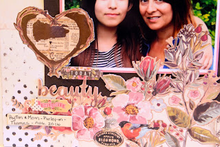
Today
I fussy cut elements from the paper to create a frame for the photo as you can see in this next picture:
I added a few stickers, die cuts and jounaled on a chipboard piece and the page was done!
Trim the Tree
For this layout I pulled out a Tim Holtz die and made use of both the positive and negative pieces:I used a couple of stickers from my stash to complete the title and finished off with some Nuvo Crystal drops in gold, pink and brown.
Love Card
This card came together quickly thanks to all the great die cuts, chipboard and gems included in this kit. I die cut the floral layer with this Sizzix Tim Holtz die.As soon as I saw this kit I knew I wanted to make a Christmas card so I went through my stash of dies and chose to use the Sizzix Tim Holtz die I used in the first card along with an Elizabeth Craft Designs poinsettia die.
I added some Nuvo Crystal drops along with a sentiment from ECD.
That's it for this month's kit projects, thanks for stopping by!
SaveSave
Sunday, November 13, 2016
Scrap Shotz October Kit Showcase Product Layout
Hello!
I have another layout to share with you from the October kit. This layout features the washi tape included in your kit.
I created a custom page background by alternating strips of the washi tape with strips of patterned paper.
Here's a close up of the title block:
I layered the die cut word over the 3x4 block to create the title.
Thanks for taking a look!
Friday, October 28, 2016
Scrap Shotz October 2016 'Homespun' Kit Reveal
**Please Note: Photobucket very recently changed their terms of service and no longer supports direct linking for 3rd party hosting of images. To view the images not displayed, hover and right click over image, then choose either "open image in new window" or "open link in new window" **
Hello!
Thanks for stopping by to take in my projects created with the lovely Scrapshotz 'Homespun' October 2016 kit featuring the Jen Hadfield Warm and Cozy line.
At first glance a body would see these papers as fall themed only but there are so many great patterned papers in this kit, I was able to create tropical vacation layouts and a Christmas card!
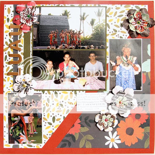
Here is my tropical vacation layout, my kids enjoying the Island Breeze Luau at the King Kamehameha beachfront hotel in Kailua-Kona, HI (Big Island of Hawaii)
I was inspired to make this by subway print while surfing Pinterest. The Adirondak Cranberry paint I found in my stash became the base for these copper kit phrases, October kit leaf die cuts and washi tape.
One of my goals for the year is making use of my die cutting Silhouette machine and I did that for this layout, cutting the leaf template:
I hand cut the backing papers to fit these leaves along with hand cutting the tassels on the right hand side.
The kit includes a paper that is fully printed with 2x2 squares just perfect for cards or layout, here are some cards using the squares:
We love sketches and as a Creative Team we like to either make or choose a sketch to be inspired by and also inspire YOU!
We decided to chose this Scrapbook and Cards Today sketch for this months CT sketch project:
Hello!
Thanks for stopping by to take in my projects created with the lovely Scrapshotz 'Homespun' October 2016 kit featuring the Jen Hadfield Warm and Cozy line.
At first glance a body would see these papers as fall themed only but there are so many great patterned papers in this kit, I was able to create tropical vacation layouts and a Christmas card!
Here is my tropical vacation layout, my kids enjoying the Island Breeze Luau at the King Kamehameha beachfront hotel in Kailua-Kona, HI (Big Island of Hawaii)
Next up is this double page spread, I cut the photos into 2x2 squares, the design and photos flow so well.
I was inspired to make this by subway print while surfing Pinterest. The Adirondak Cranberry paint I found in my stash became the base for these copper kit phrases, October kit leaf die cuts and washi tape.
One of my goals for the year is making use of my die cutting Silhouette machine and I did that for this layout, cutting the leaf template:
I hand cut the backing papers to fit these leaves along with hand cutting the tassels on the right hand side.
The kit includes a paper that is fully printed with 2x2 squares just perfect for cards or layout, here are some cards using the squares:
We love sketches and as a Creative Team we like to either make or choose a sketch to be inspired by and also inspire YOU!
We decided to chose this Scrapbook and Cards Today sketch for this months CT sketch project:
Here is my layout based on this sketch:
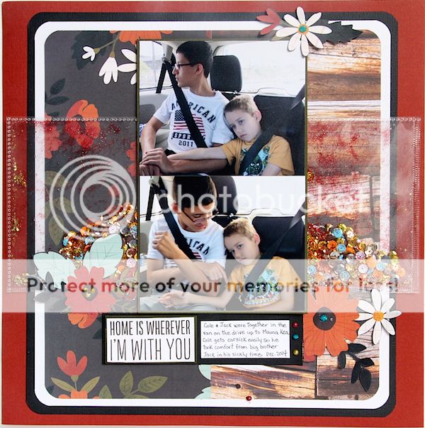
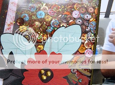
I created shaker windows on either side of the main photos putting to use my WRMK Photo Fuse tool.
This was an easy kit to work with, I am looking forward to seeing what my fellow DT members create :)
Tuesday, October 18, 2016
Scrap Shotz September Kit Featuring PinkFresh Indigo Hills! Part ll
Hello Everyone! Lorraine here with my reveal of the Scrapshotz September kit featuring the fabulous PinkFresh Indigo Hills. Rosie did such a great job with it! I am always amazed at how differently we use these kits.
Here is the Creative Scrapbooker Magazine Sketchy Challenge sketch that we used:
Here is another layout of my sweet granddaughter. I love the "days of the week" washi tape that I used on both of these pages.
I used the washi on this layout as well, adding a day of the week to each of the monochrome elements on the side of the page. A bright photo really pops on this soft colored patterned paper. I used the alpha stickers that came with the kit, but I felt they didn't have enough contrast to the light background, so I added a black ink drop shadow with a pen to the letters. The chipboard hearts add just the right mood as embellishments.
This 2 page layout is bright and fun - appropriate for the playground photos. I had so many photos that were too-cute-not-to scrap that a 2 pager was totally necessary. This girl has personality to spare! the circles on the patterned paper strips give the layout motion and the 3 circle elements - 2 die cuts and a wooden paper clip - help keep it balanced.
This layout of my grandson's science project was simple to create. The borders of half sphere's on the patterned paper are bright and interesting design elements, drawing your eye to the center of the page. The die cut quotes are perfect accents. This kit's versatility really made it easy to use. The Pinkfresh - Indigo Hills line contains everything from soft feminine feeling paper to bolder, vibrant patterns that gives you so many options.
A really fun addition to the kit was this gold embossed vellum. Here I used it as a layer on top of a cardstock base.
This vellum was also used as a layer, but over a distress inked card base, so the varied colors could show through. A simple card given an interesting feature!
This card used some of the twine included in the kit, as well as scraps of the geometric patterned paper, and a wooden paper clip. This one would make a great masculine card. It's bold and "un-frilly," if that's a word!
Thanks for looking through my reveal. I love to play with these kits and see what I can build from the products included. Hope I've inspired you a bit!
Lorraine
Here is the Creative Scrapbooker Magazine Sketchy Challenge sketch that we used:
And here is my take on it:
I fussy cut the geometric shapes from a sheet of patterned paper to create the layers behind the photo. The edges were inked with distress inks. I used pop dots behind the outside edges of each of the 3 elements to give them dimension. I also popped up the subtitle phrase - what a great addition to almost any page.
I used the washi on this layout as well, adding a day of the week to each of the monochrome elements on the side of the page. A bright photo really pops on this soft colored patterned paper. I used the alpha stickers that came with the kit, but I felt they didn't have enough contrast to the light background, so I added a black ink drop shadow with a pen to the letters. The chipboard hearts add just the right mood as embellishments.
This 2 page layout is bright and fun - appropriate for the playground photos. I had so many photos that were too-cute-not-to scrap that a 2 pager was totally necessary. This girl has personality to spare! the circles on the patterned paper strips give the layout motion and the 3 circle elements - 2 die cuts and a wooden paper clip - help keep it balanced.
This layout of my grandson's science project was simple to create. The borders of half sphere's on the patterned paper are bright and interesting design elements, drawing your eye to the center of the page. The die cut quotes are perfect accents. This kit's versatility really made it easy to use. The Pinkfresh - Indigo Hills line contains everything from soft feminine feeling paper to bolder, vibrant patterns that gives you so many options.
A really fun addition to the kit was this gold embossed vellum. Here I used it as a layer on top of a cardstock base.
This vellum was also used as a layer, but over a distress inked card base, so the varied colors could show through. A simple card given an interesting feature!
This card used a scrap of patterned paper from the 2 page layout and a die cut quote from the Indigo Hills line. The beautiful, sparkly jewels are self adhesive and add a lovely bit of glam.
I used scraps of patterned paper for this card, using the B side, a bit of ribbon and some sequins. I love to have all occasion or everyday cards in my stash to send to friends and family.
This card used some of the twine included in the kit, as well as scraps of the geometric patterned paper, and a wooden paper clip. This one would make a great masculine card. It's bold and "un-frilly," if that's a word!
Thanks for looking through my reveal. I love to play with these kits and see what I can build from the products included. Hope I've inspired you a bit!
Lorraine
Subscribe to:
Comments (Atom)


