Check out all the details on the Calgary Scrapaganza 2025 event
HERE!
.JPG)

Hello Crafty Friends!
The Summer Challenge is now live in the Scrap Shotz Paper Crafting Facebook Group .
Your inspiration is this Spellbinders DIY Color Deck card:

I created this card based on the inspiration above:

To participate in the challenge, join the Facebook group and upload your paper project to the challenge album! Your entry gives you a chance to win a $25 gift certificate to the Scrap Shotz online store!
Today I am sharing a bunch of cards that I created with the Paper Rose Botanical Blooms 6x6 Paper Pack.
I love the dramatic look of these papers and I used them in a variety of ways.

I dug out my die cut shapes, frames and some embellishments. Some sentiments and embellishments that were already assembled and some that I put together. Ribbon, dimensional foam and foil cardstock were also used.

I used embossing folders and die cut sentiments from my stash, and twine to "tie" layers together.


I used over half of the package of 18 6"x6" paper, but still have a few papers that will come in handy for fast and pretty creations. I hope some of these have inspired you to look at those bright and bold prints with a refreshed idea! If there is any product that you are wondering about, just drop me a comment and I can let you know the specifics.
Have a great day!

Happy National Name Yourself Day! What a funny national day to celebrate. It's also National Unicorn Day. I'm sure all the unicorns are so excited. I can hardly wait for Lost Sock Memorial Day...
The real reason I'm posting is to share some masculine cards that I created with the Craft Consortium Scorched Wood 6x6 paper pad, that you can pick up now in the Scrapshotz online store right here! All of the cards were created using "Simply Stated" ephemera pieces. I have a stash of these images and find them to be a simple way to create a distinctive card. Sandy has a selection in the store here of some different packs, but if you have a special request, she would be able to order for you.
The Scorched Wood background is very versatile and goes with everything. I have used a bit of twine, ribbon and embellishments on these, and used foam squares to pop up the images and/or sentiments.


I have two hockey layouts to share with you today. The arena is where we tend to spend a fair bit of time watching our grandchildren play.
This first layout tells a story. Vyda scored a goal and I created a semi-circle of the action photos showing the progression of events.


In classic Cocoa Vanilla fashion this collection has fantastic colours, great embellishments, woodgrain elements and more. Their collections are also so easy to play with for all kinds of memories.
Fold Back
Feature two patterns with just one collection paper!

For my first layout, I was inspired by the Floral Ephemera - 58 pieces of floral goodies in this one little pack of ephemera! I wanted to create a layout that sort of spilled out these beauties.
So I picked a pattern paper with both an A and B side that would complement the florals to create a ‘fold back’ design. Super simple to achieve this design:
Once I had my fold back adhered down, I added my photos (each backed with a couple pattern papers from the collection first) over the middle of the fold. Then I embellished with the Floral Ephemera so it looked like florals were spilling from the fold behind the photos.

The title is from the collection’s Raw Chipboard Titles coloured to a complementing grey using Ranger Ink Distress In. And a few of the collection Accessory Stickers finished off the layout.

Circle Anchor
Use a large circle to focus the eye on your photos!

This design another great way to feature two patterns and still keep your page focused on the most important thing - your photo. Simply cut one of the busier patterns in a large circle and drop into onto a simpler pattern (Cocoa Daisy woodgrain for the win every time). If you done have a machine or tool to cut a large circle, pop into the kitchen for a plate to trace!
After dropping my circle down, I added some white acrylic paint splatters for my go-to grunge touch. Then I added my two photos - each with a few layers of collection patterns behind at a few different angles to show off a touch of each pattern.

The circle gives you a great anchor for embellishments. I like to go top left and bottom right for my clusters (the flow feels nice to me), or pick three spots around the circle (design rules are usually in three or a triangle) or tuck and layer all the way around the circle - have fun with it! Cocoa Vanilla has the BEST at Floral Ephemera so you cannot go wrong no matter how you do it.


A few stickers tucked here and there and finally the title ‘best friends’ painted white from collection’s Raw Chipboard Titles finished off this one.
More Circles
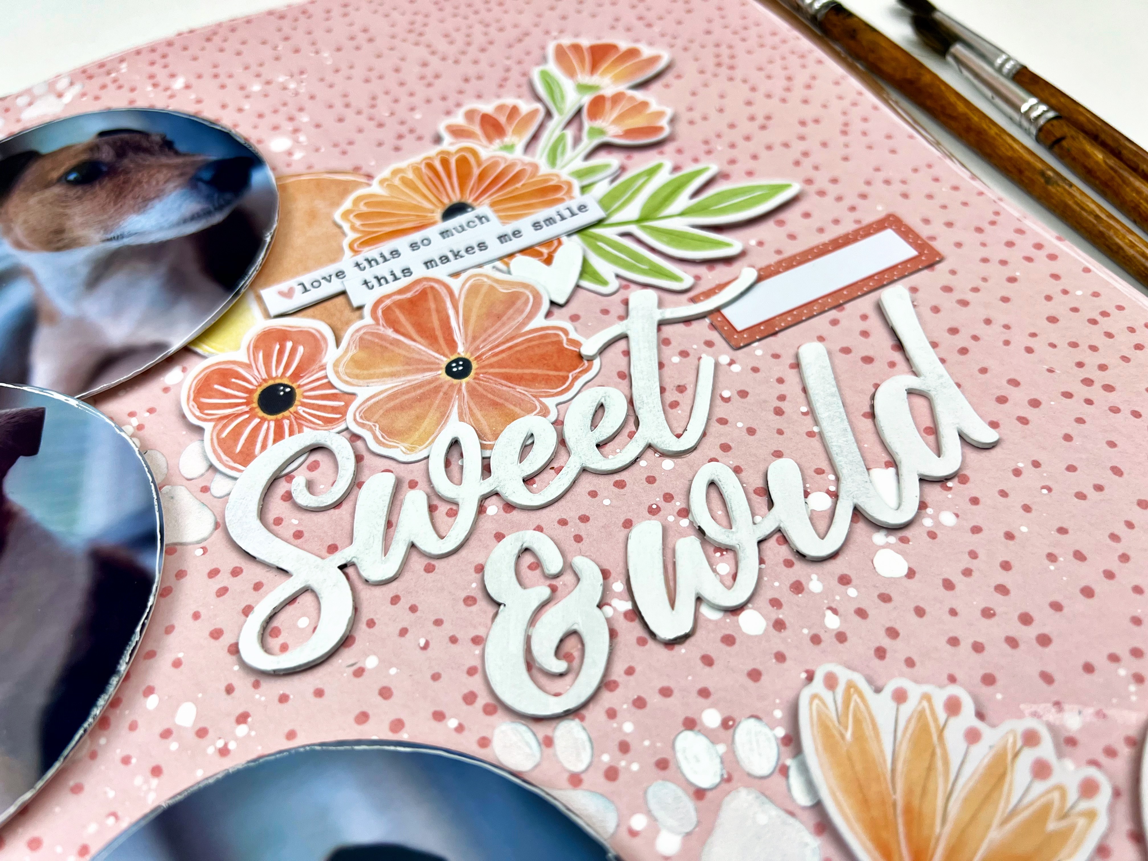
For my third layout, I kept going on the circle theme but this time making them a little smaller. I will admit, almost anytime I have floral embellishments to play, with I am drawn to circle elements as they flow together so nicely. That is especially true with Cocoa Vanilla florals.

I started this layout off with that fantastic tone on tone pink pattern - and added some white puppy paws using a stencil from Peartree Cutfiles and The Crafter’s Workshop - Stencil Butter Pearl White from the shop, and some white acrylic paint splatters.
I used a circle tool to cut my photos in circles and a few from one of the collection pattern papers. Before adhering them down in a cascade on the left of the page, I distressed the edges a bit and outlined them in white journalling pen.

From there I literally just clustered some of the Floral Ephemera beside each of the circles. I made one cluster a little bigger than the others so I could use it to anchor my title which is from collection’s Raw Chipboard Titles painted white. A few collection stickers and voila!
Have you played with Bloom & Grow or other spring inspired collections? Show off your projects so we can ohh and ahh over on the Scrap Shotz Paper Crafting Group on Facebook!