Well, this week I am here to tell you the exact opposite - use more! Let me explain ...
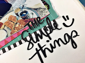
I have this super cute photo of my nephew eating the famous John's Place pancake (plate sized, fluffy and served with both maple syrup and cinnamon icing spread mmmm) on our recent adventure to Victoria, B.C. For my nephew this is heaven - the key to this kid's heart is through great pancakes and chicken wings. What a character! I knew I wanted to scrapbook this story with the Shimelle, Sparke City collection that I received to play with this month from Scrap Shotz. The collection is bright and fun and whimsical - perfect!
While the collection does not have pancakes, it does have all kinds of other foods things (fries and hamburgers, noodle box, soda, bubble tea and more) - so instead of going pancakes I just grabbed ALL the things that are food related and piled these down the left-hand side to create a sort of waterfall of yumminess. Then I mixed in some words and phrase puffy stickers from the American Crafts phrase stickers I also received this month from Scrap Shotz. I love how it turned out!
I added the title "The Simple Things" from my stash as I really do think it is the simple, little things that make life so fun. The little smiley faces that are in the phrase set with this title were also a perfect touch.
Before I put it in my album I will draw some lines with my journal pen and journal all about how these pancakes blew his mind and it was the perfect start to our Victoria adventure. I often do not journal on my pages for blog posts as I tend to get all feelings and mushy haha
Try it! Try adding more (all the things) to your layouts. Instead of going less, go more and see what masterpieces you can create! Think about a theme - all the food items, or all the hearts, or all the butterflies and all the same colours for a monochromatic look.
Have a crafty week!


No comments:
Post a Comment