Saturday, June 29, 2019

Watercolor cards

Hello! Happy Canada Day weekend! Today I'm sharing some cards that have been painted with watercolors. This Mama Elephant stamp is called The Big Roar, and I used Vicki Boutin watercolor markers. The sentiment is a My Favorite Things stamp set called appropriately, From All of Us. After I cut out the large image with the dies, I went to cut out the birds and had a little trouble figuring out which die was for each stamp. So here's what I did.
I cut out each of the small dies on a piece of scrap cardstock and numbered them. I then matched them up with their coordinating die and numbered both the stamp sheet and the dies, so that I will easily be able to match them up next time.
I didn't have any magnetic sheets in my stash to store the little dies, so I used a piece of a magnetic vent cover that I picked up at Canadian Tire. They are nice and thin, easy to cut to size, and not very expensive.
I then used Zig Clean Color markers to color the same stamp with more traditional colors for the animals.  This sentiment is from the Lawn Fawn Simply Sentiments stamp set. The background was created with oxide inks some time ago, waiting for it's chance to become a card. 😉
Here are a couple of cards with the Gerda Steiner Frogs stamps that I was working with last time. I embossed the frogs with Zing Embossing Powder in Cricket green and colored them with watercolor markers. This one has a background that I painted with the markers and another stamp from the Lawn Fawn Simply Sentiments.
This final card's background was made with a My Favorite Things Radiating Rays stencil and Gina K. Glitz Glitter gel in gold. There is some serious sparkle there! The sentiment is from a sheet of stickers from Websters Pages called Painted Passport words.
Thanks for stopping by. I hope I've given you an idea that you can use!


Thursday, June 27, 2019

Ken Oliver Color Burst Trios

Hi Scrap Shotz Friends!

Rosie here with a couple of projects to show you using the Ken Oliver-Color Burst Trios Ocean Waves


Here you can see the Color Bursts themselves along with the Altenew Delicate Flower Bed stamp set used to create the card fronts. I'll show you the cards themselves in my second post, this post will focus on the process of creating the backgrounds with the supplies.

So, what are Color Burst powders? They are a concentrated powder that reacts with water and can be used in a number of ways. They can be added to water and sprayed over water colour card stock and mixed with water, painted on a clear stamping block and "smooshed" on water colour card stock in addition to the techniques shared below.

1. Apply water to your water colour paper, drop a small amount of powder and then spritz with a water sprayer to spread the color. Add the remainder of the trio as desired, you can also pick up the paper and tip it side to side to move the color around. This results in the panel on the bottom left of the photo above.

2. Drop the 3 colours of powder into separate wells of a pallette, add water to the wells.  


Paint water over a piece of water colour paper, apply the color trio in large bands.


3. Stamp the Altenew Delicate Flower Bed stamp with embossing ink on water colour paper-masking off a portion with 1" painters tape, cover wet ink with Emerald Creek Glacier White embossing powder and heat set.


Using the Ocean Waves Colour Burst Trios, apply colour to the embossed images with a small paintbrush.


Here's the trio of completed media:


Stay tuned for my second post to see the completed projects! 

Thanks for stopping by!


Wednesday, June 26, 2019

More is More, Sparkle City is Too Cute

In my post a couple of days ago called Less is More, Sparkle City Sure Does Sparkle I was all about using less on a scrapbook project. I do this when the product I am using is super bold (like Shimelle's awesome collections are), perhaps are out of your comfort zone, you have so much you cannot decide what to start with, or when you have small photos and don't want to overwhelm them.

Well, this week I am here to tell you the exact opposite - use more! Let me explain ...

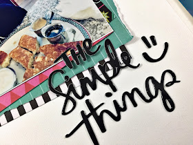
I have this super cute photo of my nephew eating the famous John's Place pancake (plate sized, fluffy and served with both maple syrup and cinnamon icing spread mmmm) on our recent adventure to Victoria, B.C. For my nephew this is heaven - the key to this kid's heart is through great pancakes and chicken wings. What a character! I knew I wanted to scrapbook this story with the Shimelle, Sparke City collection that I received to play with this month from Scrap Shotz. The collection is bright and fun and whimsical - perfect!

While the collection does not have pancakes, it does have all kinds of other foods things (fries and hamburgers, noodle box, soda, bubble tea and more) - so instead of going pancakes I just grabbed ALL the things that are food related  and piled these down the left-hand side to create a sort of waterfall of yumminess. Then I mixed in some words and phrase puffy stickers from the American Crafts phrase stickers I also received this month from Scrap Shotz. I love how it turned out!


I added the title "The Simple Things" from my stash as I really do think it is the simple, little things that make life so fun. The little smiley faces that are in the phrase set with this title were also a perfect touch. 

Before I put it in my album I will draw some lines with my journal pen and journal all about how these pancakes blew his mind and it was the perfect start to our Victoria adventure. I often do not journal on my pages for blog posts as I tend to get all feelings and mushy haha

Try it! Try adding more (all the things) to your layouts. Instead of going less, go more and see what masterpieces you can create! Think about a theme - all the food items, or all the hearts, or all the butterflies and all the same colours for a monochromatic look.

Have a crafty week!


Tuesday, June 25, 2019

Gerda Steiner Frog Cards

Hello! Welcome to summer!!! Here in Central Alberta, that means scattered showers, lots of puddles, and FROGS!

This Gerda Steiner stamp set is very cute.The images are sweet and cuddly, (if a frog can ever be.) I stamped all the images today with a neutral grey Hero Arts ink and colored them in a no line style. The challenges are getting the shadows to be enough definition to give the images shape without a line. I'm learning.
This first card uses patterned paper from a long ago Scrapshotz card kit, and some narrow navy blue grosgrain ribbon. The frog and lily pad were cut out with the coordinating die and the sentiment from the stamp set was cut out with a SU punch. All are popped up on foam dots. The dots are Nuvo Crystal Drops Gloss - Double Denim.

I cut the front panel for this card with a Spellbinders oval die, then put acetate behind it to create the shaker card. The die-cut frog is adhered in the center and I glued a couple of the Studio Katia blooms where I wanted them in the background. Most of them are loose, though, so there is some movement in the card. This frog appears to be jumping for joy so the Congratulations sentiment from the set is appropriate.

The goofy smile on this frog is endearing and I love how he is peeking out at you. The sentiment is stamped with Hero Arts Silver Shadow Ink and the Nuvo drops are Crystal Drops Gloss - Green Apple. The twine is from my stash and balances the layout of the card.

I'm going to keep working with these fellas, and I'll be back later in the week with more inspiration with this super versatile stamp set! Get yours today at Scrapshotz.com.

Have a great week!


Monday, June 24, 2019

Baby Shower Decor with the June Kit

Carolyn here today to show you a unique way to use your June kit. This weekend I got to throw a baby shower for my new nephew. Of course I wanted to use the June kit. The kit is full of Heidi Swapp Wolf Pack goodies. It has more of a nature theme. It is not the traditional cutsie baby stuff but the colours are exactly what my sister-in-law likes. Grey, black and teal. So I made a banner and a card.
The banner was really easy to make. I chose a size for the flags on a scrap piece of paper and traced it onto the star paper. I used the Bazzill teal cardstock and my Silhouette Cameo to cut out the doilies. The letters are cut from the Bazzill carbon cardstock. Behind each letter I put a moon. I cut them out from one of the 12 x 12 papers. I'm pretty lucky the baby's name is only four letters otherwise I would've run out of paper!
I found some black ribbon in my stash and stapled it to the flags while tying a bow between each flag. I covered the staples with the washi tape in the kit. My final touch was adding stars from the ephemera pack.
Here is a closer look at one of the flags.
The card was fun to make. I used one of the cut apart cards from a paper in the kit for the inner frame. I used the kit Thickers for the title and an ephemera heart. The frame is a cut file from a "Friends" collection. My sister-in-law loves Friends so I had to use this. The design is cut from a wolf pack paper and the black paper is the Bazzill carbon cardstock. The background paper is also in the kit.
Here is a last look at the two projects together:
Thanks so much for taking a look at my projects! The party was great and the banner is going on Theo's wall. I encourage you to try using your supplies in unexpected ways!


Saturday, June 22, 2019

Less is More, Sparkle City Sure Does Sparkle

Hello crafty friends!

This month the amazing Scrap Shotz team sent me some of Shimelle's Sparkle City collection to play with and, wow, talk about colour and vibrant and silly and fun. My favourite!

As with all of Shimelle's amazing collections, this one is full of purples, pinks, reds, greens and all the amazing patterns. The puffy stickers are gorgeous and the die cuts are so cute (think smiling cartoon pigeons and little french fry containers) - some of them are even holographic!

Take a peek ...


To be honest with so much colour and so many options (the paper pad alone has 48 sheets), I was a little overwhelmed. I wanted to play with all the things. So I started small. Small photos and a small amount of product. A 'less is more' approach to get the Sparkle City spark going.

My approach ...

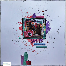
In my photo stash, I had two tiny (2x2 inch) colour photos of my crazy nephew following me around a tourist shop in Victoria, B.C. wearing a plastic horse mask. I was laughing so hard at his antics I could barely take the photos  - so they are horrible. But good photo or not, this memory had to be scrapbooked. Besides how good does a photo of an 11year old in a plastic horse mask need to be?!

Now usually with a bright collection, I use neutral or even black and white photos and very large photos to help bring some calm to the layout. However, this is Shimelle's collection and I feel she is all about colour and would appreciate a more vibrant approach, so I went for it - a big colour, but a small product and photo, approach.


You can probably see that I used very little product - less is more with the super bright and cute collections for me. I used 4 die cuts (the camera and the little city building), two small scraps of paper behind my photo and roughed up the edges to bring some mess and dimension to the layout, 3 tiny stars, 3 phrase stickers and a title. A lot goes a long way with this much sparkle!


I really wanted to draw the eye to the tiny photos so decided to place the photos cluster on a two-tone watercolour 'mess'. I chose purple and red as those are two of the colours of the little die cut buildings but also because I just love these two colours together. I simply found some red and purple watercolour paints in my stash and used the packaging technique to smoosh a puddle of wet paint onto the page. Yes, smoosh is a technical term - all the mixed media gals are using it (wink, wink). 


Once assembled, I finished off the layout with some journal pen stitching around the border of the page - this is where you literally freehand lines down each side of the page with a couple of random squiggles as if the "sewing machine" got all caught up. Then added a few matching purple and red splatters. I like white space but only so much. 

I love how this layout turned out! Off camera and before it went in the page protector, I added some freehand horizontal lines below the photo to the bottom of the page and added my journaling. I was chuckling to myself as I wrote- what a ham my nephew is. Oh he makes me laugh! 

Now that I have cracked open the Sparkle City vault - I am dying to make more, off I go!  Hope you all have a few mins to get crafty this weekend too. 


Thursday, June 20, 2019

June Kit with the Creative Scrapbooker's Sketch

Hello! Carolyn here today with a 2 page layout using the June kit. The kit is full of Heidi Swapp "Wolf Pack" supplies. There are lots of nature themed papers so I pulled out my pictures from my trip to Yellowstone National Park. They also include pictures of my daughter's bear stuffie. There are lots of bear embellishments to highlight it. Then I used the June Creative Scrapbooker Magazine sketch. It's been awhile since I made a 2-pager!
Here is the sketch:
No photo description available.
Here is the first page a little closer:
Here is the second page a little closer:
I used my Silhouette Cameo to cut out the title and photo frames using the Bazzill Basics paper in the kit. The rest of the title is using the Thickers in the kit. The washi tape was a natural fit with the lines across the sketch. There are also some clear embellishments in the kit.
The kit has these fun puffy stickers. I also used the arrow cut-outs as photo corners.
I encourage you to give a 2-pager a try! There is so much fun stuff in the kit! I can't wait to see how everyone uses it this month!

Wednesday, June 19, 2019

June Scrap Shotz Kit - Explore Nature In The City Layout

Hello! It's Karla back today to show you a double page layout created with the June 2019 Scrap Shotz Scrapbooking Kit, featuring the Heidi Swapp Wolf Pack Collection. This is an amazing collection of papers, ephemera, stickers, letter stickers and more that will have you creating in no time! I found some photos of my family from a few summers ago when we visited the Big Hill Springs Provincial Park in Calgary, Alberta, and it was awesome to see how wonderfully this kit worked for a day trip in the woods! 


I started off with a sketch from the SCT365-2019 Layout Online Class. I love starting with a sketch! I cut my papers similar to the sketch guide and layered them on cardstock, included in the kit. A grid ruler is so awesome when it comes to lining up layers and getting things even. I used some Ground Espresso Distress Oxide Ink to shade the edges of all the paper layers.


Next, I layered on washi tape from the kit, added my photos to the layout and created a title using the coordinating Thickers from the kit. I used one of the vellum frames from the Ephemera Pack to frame a smaller photo on the left.


After I got the base done it was time to have fun adding embellishments!


I wrote my journaling on a card included in the Ephemera pack and layered it on some scraps of paper.


I added some cardstock and acetate embellishments from the Ephemera Pack too.


I just love the variety of papers in this kit! And those Embossed Stickers have so much texture and dimension!


I used one of the acetate embellishments with a silver foiled 'Explore' sentiment to add another element to my title. These Thickers are so gorgeous, with flecks of white dotting a black background.


I used various sizes of enamel dots from the kit and layered them along with some Add-On Puffy Stickers


Be sure to check out the June 2019 Scrapbook Kit and available Add-Ons in the Shop - and get all the details on the Reveal Blog Post with closeups and a video!


Thanks so much for stopping by! Have an awesome week my friends!

Hugs,
Karla