Wednesday, April 17, 2024

Photoplay - To the Moon Collection

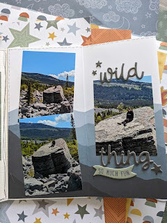
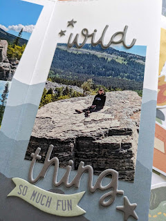
At first glance, I loved this collection. The colors in the line are gorgeous and so different from most of the lines out there right now. Then last week we were in Houston, and the patterned paper and stickers were perfect for this photo from the Space Center. I popped up the stickers and when I cut out the alphas, I loved the look of the negative space, so used that instead of the individual letters.
This plaid patterned paper is very gender neutral, so easy to use for masculine pages. I printed the photos in black and white so they would stand out  and matted them with black. The alphas are from my stash, an old Heidi Swapp booklet. They weren't distinctive enough, so I traced them with a black pen after matting them on solid cardstock from the add on cardstock pack. To cut out the words, I find it easier to draw a bubble around them with a pencil then fussy cut. If there are any stray pencil marks, they are easily erased.

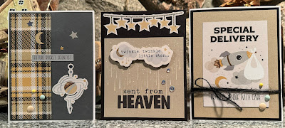
Finally, I used the sticker sheet and the 3x4 cut aparts in the collection to create baby cards. These are really sweet. All I added was foam and enamel dots and some twine and ribbon. I also used stickers for the inside sentiments where I could. This made for no-stamp cards, which are fun for a change!


Thanks for stopping in! 


Saturday, April 13, 2024

Cocoa Vanilla Great Escape Traveler's Notebook by Jenn

 Hello Jenn here sharing some layouts from my Camping Traveler's Notebook, using the Great Escape Collection from Cocoa Vanilla Studio. I am using 12x12 papers, chipboard stickers, cardstock stickers, foam phrases, puffy stickers, and ephemera from the collection to create a TN documenting our camping trips from the summer of 2023. To stretch the collection a little bit further, I am combing it with the Adventure collection from Wild Whisper Designs and a few other elements along the way. 

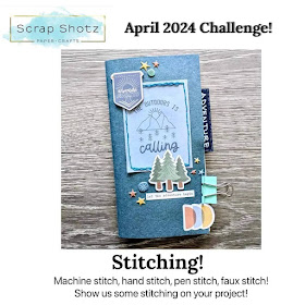
I started with the cover for the TN, where I also incorporated some hand stitching for the Scrap Shotz Paper Crafting Facebook Group's April Challenge. Throughout the album I will carry the stitching by using faux stitching to embellish the pages, and occasionally I will add some hand stitching as well, keeping in mind how chunky my TN is getting!!! The cover is a great place to add some bulky embellishments like chipboard, buttons, flair, foam stickers, ect... that might be too thick to add inside the pages of the TN. Be sure to add extra strong adhesive to the embellishments on the outside cover because they are more likely to get caught on something or knocked off.

I have a lot of pictures from these trips and I'd really like to get as many as possible into the TN so I like to sort my pictures and tuck them all into the pages in the order I think I'd like to see them, to help me judge how much space I have. I have a feeling that I will need to stretch my summer camping picures of a few different TN's but I aim to find creative ways to get multiple pictures onto each page so that I limit the amount of TNs it will take the document all of the pictures. The other goal is to limit the added dimension on each page so that the TN can close nicely when it's finished. Keeping all of this in mind, lets get started and see how I do!!!
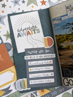
My first page is the inside cover of the TN. This is a great place to add journalling cards, cutapart pieces or ephemera that you really like that you want to showcase in some way! I like adding a table of contents or list of what you will find in the TN. Its also a great place to add photos if you have a lot of them so don't skip the inside cover!!! I added a list of the places we went camping throughout the summer.

I kept my second page very simple! I have a fun tradition of taking a picture of my camping mug that says "The Adventure Begins" at the start of every camping trip. I always try to do it in a different way so that each one is unique. I thought this picture would be a great first page to the album, so I just printed it at 6x4 and then added two stickers, and the title "Let's Go Camping" using some old Basic Grey alphas.
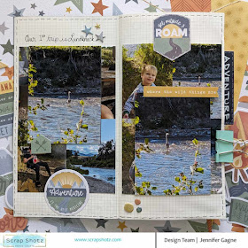
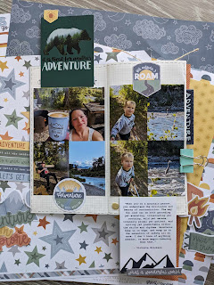
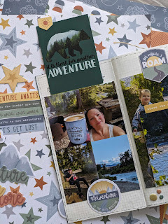
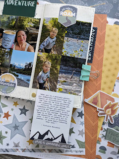
My third page is a full layout that includes 10 photos. I like to print my photos at 2x3 quite often and when I do, I always try to arrange them in a way that I can use the fill 4x6 picture as one, or I can cut them apart as 4 separate photos. For this page I kept the collage together on both sides, but I also had two 4x3 photos that I wanted to add so I created two fun tip-ins to include those photos. The tip-in on the left side flips upwards and I put a Wild Whisper journalling card on the back of it, and the tip-in on the right flips downwards with another Wild Whisper card on the back. I use washi tape to create my hinges because I find it a little it easier and less bulky, but you could easily create a paper hinge as well. An alternative would have been to create just one tip-in with the pictures pasted back to back instead of including the cards, but I like that this is another opportunity to showcase a card you might not want to cover up, or gives you an area to do some journalling of your own. I completed the layout with a simple embellishment on each side from the Great Escape Ephemera Pack.
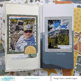
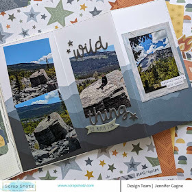
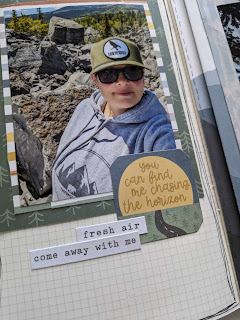
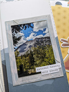
My final page for today is a fun one! On the left side of the page I added just one 4x3 photo, with some layers of paper behind it, and a few stickers. On the right side, I took one of my favourite 12x12 papers from the Great Escape collection and folded it into three sections so that it created a fold out page where I could then add 4 4x3 photos, and also preserve the mountain range image on the paper. I kept the embellishment very simple, with a phrase from the foam phrases, and a piece of chipboard on the middle section, and then a frame around the picture on the right section, with two little phrase stickers. To add the chipboard piece, I peeled back the top layer of chipboard, that has the image on it, so that it wasn't very thick, and then I could add it to my page without adding extra dimension.

I love adding unique pages and elements like the tip-ins and folded page. They are a great way to get extra pictures onto your layout, and also makes the TN fun to flip through and look for all of the interactive elements. There is no limit to what types of interactive elements you can include. My biggest piece of advice is to look at the supplies you are working with and then think about fun ways you might be able to include them in the album. Give your ideas a try and see what works. I try to alternate interactive elements with more simple pages to help keep TN as flat as possible, but I like to have fun and experiment with different ideas that keep each TN I create interesting. I have full process videos on my channel of each of these pages, as well as the others I have created in this TN so if you'd like to see how I put the pages together, please visit my channel https://youtube.com/@JenniferGagne . You can also find me in Instagram and TikTok as KaezMum, with more closeups and flip-throughs of this TN as I progess. If you have any questions, please let me know, and head over to the Scrap Shotz Store to grab the Great Escape Collection for yourself :) Thank you so much for popping by. Until next time, Happy Scrapping!
Jenn


Friday, April 12, 2024

Back to Basics Facebook Live Series: Stamps


 Hello!! This week's Back To Basics Facebook Live focused on Stamps! Karla has pulled out a bunch of stamps and inks to share all of her best tips and tricks on how to add stamping to your cards. You can click the video below to catch the live on replay now! Be sure to comment on the Live and say hello by the end of today (Friday) for your name to entered into the giveaway.


You can also head to the Scrap Shotz Facebook Page to find the whole Back to Basics Series. Catch Karla and Rosie Live every Thursday with a new topic to help you take your card making skills to new heights. Comment during the Live or on the replay within 24 hours of it being posted to have your name entered into the giveaway for a prize from Scrap Shotz. See you next week :) 

Friday, April 5, 2024

Back To Basics Facebook Live Series: Better Press LetterPress


 Hello, welcome to another Back To Basics Facebook Live Series installement! This week Rosie shares everything you need to know about the Better Press Letterpress. Watch the live below to learn what the Better Press system is, how to use it, and how to incorporate it into your card making.


You can also find the whole series of lives on the Scrap Shotz Facebook Page, to catch the series from the beginning. You can catch the Back to Basics Facebook Live series every Thursday on the Facebook Page. Be sure to say hello, and comment during the live or on the replay within 24 hours of it being posted in order to have your name entered into a GIVEAWAY for a little prize from us!!! Thanks so much for joining us.

Monday, April 1, 2024

49 and Market - Wherever Continued

49 and Market - Wherever continues to bring joy to my crafty space …

I received the 49 and Market - Wherever 12x12 Collection PackChipboard SetEphemera BitsLaser Cut Elements and Rub-on Transfers 6x12 Ride in my Scrap Shotz happy joyful mail. I  am excited to share with you my fourth and fifth layouts with this collection - it is so versatile, you can use it for any adventure memory! 

(To my first few pages pop over here

Build on the Pattern 

For this layout, I let the pattern paper do all the work! 

I found this beauty in the Collection Pack and added some of the Rub-on Transfers to the right of the page and then focused my photos on the left for balance. First I added my right side rub-ons making sure some of them went off the page and added a couple chipboard and ephemera bits as part of the run-on cluster for dimension. 

Then, to balance all that right side good stuff - I created my photo cluster on the left. I printed my photos in 4x3 and used the ephemera frames on top. I added some Waxy Flax looped above each to play on the frame design. From there, I added a few rub-ons behind and then focused on added in the chipboard, ephemera and laser cut elements in and around the photos.

The final touch was some black splatters across the page with a big focus on the right side rub on area. 

Play on the Embellishments 

For my next layout, I focused on the air balloon embellishments and chipboards. I wanted to give a feeling of them floating up and out of the layout. 

First, I created an anchor for my photos using Ranger Ink, Distress Ink - Black Soot though a Vicki Boutin Stencil a bit messily in the middle of the page. Then added some black splatters over the stenciled area.

Then I backed the photos with the pattern pages - the small photos were layered on one patter, and  the main photo of me sitting outside the Aberdeen Train Station in a couple patterns a little messily. After adhering the photos down in a grid like pattern, I added a bunch of repeated phrase stamps from my stash and Whatever Rub-on Transfers around the grid - including my title, travel more. 


The final touch was a couple of tags out the left of the grid and those fabulous air balloons. Layered in and around the left side of the grid pattern to give the sense of them in flight. I love the flow of the air balloons in contrast to the grid. 


Just loving this collection - for those road trips, travel far or close from home, a big trip or a little adventure - this it the collection for all those things. 

If you are creating with the 49 and Market - Wherever collection we would love to see! Pop over to the Facebook Scrap Shotz Paper Crafting and post a photo. 

Thanks for stopping by! 


Back To Basics Facebook Live Series: Embellishments


 Hello!!! Wasn't that an incredible Live on Thursday with Karla? In case you missed it, Karla's Back To Basics Facebook Live was all about embellishments!!! Click the link below to watch it on replay.


You can also pop over to the Facebook Page to find all of the Facebook Lives in this series. We are also excited to announce that your comments on the Live could win you a prize, Yay! Simply comment during the Live or on the replay within 24 hours of it being posted to have your name entered into the draw to win a Scrap Shotz prize. We love when you participate in the Lives and this is our way of saying Thank You. See you next week!!