Monday, December 11, 2023

Sugarplum Wishes for Christmas

Just 13 sleeps to Christmas and I am feeling inspired to scrapbook some past Christmas memories. So I reached for the Paige Evan’s, Sugarplum Wishes  that arrived in happy mail from Scrap Shotz and had some fun! So many bright patterns and the embellishments are such fun. 

Go Busy or Go Home 

For this first layout, I wanted to use all the patterns and embellishments - go all out with way too much, in a good way. A great way to keep a busy page  focused is by using a single big feature - in this case I reached for a Peartree Cutfiles cutfile. The large, white cutfile on the page breaks up the busy patterns. So you can use them all but not worry about it being too much. 

For this layout, I first backed the cutfile with a few of the fun patterns from the Collection. Then I used the cut apart tags from one of the pattern papers to anchor my small black and white photos beside the cutfile. 

From there, I tucked in a few of the embellishments in and around the tags. I finished the page off with a little ripped feature at the top right of the layout and some Nuvo Crystal Drops in Snow White. 

Make Your Own Background

Loving the look of the bright Paige Evan’s pattern papers combined with a cutfile - I reached for another Peartree Cutfiles cutfile to inspire my page design. 


After backing the cutfile with a number of the amazing pattern papers, I realize of I had created a bit of a colour theme for the page - so I ran with it! Pink, red, dark green and lime for this layout. 

For my background I used a 12x12 Completely Dotty stencil from Peartree Cutfiles. I simply used a sponge dauber and Ranger Ink, Distress Ink in Barn Door, Victorian Velvet, Twisted Citron, and Pine Needles and rubbed them each in random across the stencil allowing some to blend here and there. I added a few splatters of each ink as well. To do this, smoosh some of the ink from the ink pad on some plastic and add a couple spritz of water - then flick over the page with a paint brush. I love how it turned out! 


From there, I added my three photos in black and white below the file (each backed with a coordinating pattern paper or two) and then picked a bunch of the Sugarplum Wishes die cuts and stickers in the layout colour theme. 

Full disclosure, I am also Design Team member for Peartree Cutfiles. The cutfiles featured here are from their exclusive December Advent subscription from year’s past. Such fun to play with. 

Are you scrapping this December or maybe December past? Do you create a December Album each year? Well, if looking for bright and fun design  - reach for Sugarplum Wishes! 

Happy Holidays! 


Saturday, December 9, 2023

More Travel Memories with Mintay Papers

I am back to show off a few more ways to use the Mintay Papers, Places We Go collection in your travel layouts. I received this collection via happy mail from Scrap Shotz and I cannot stop creating layouts – the patterns are so fun, and the die cuts and chippies are dreamy to play with. 

If you missed my first couple of layouts, you can pop back to the blog here

Embrace the Pattern 

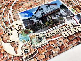
For this layout, the pattern paper did all the work! I had some travel memories of staying in the most haunted hotel In Aberdeen, Scotland which resembled the look of the building on the pattern paper. So I added some white splatters (white acrylic paint with a few spritz of water) to bring my usual grunge touch and then added my photos. They are 2x3 photos all backed with a couple of coordinating pattern papers from the collection and slightly overlapping for a layered look. I added a piece of vellum paper behind each to soften the pattern paper around the photo strip.


Once the photos were in place, I added a cluster of the die cuts on the bottom right. The chippies from the collection provided the title “travel” which I balanced with the matching “geo tag” on top of the photos to finish off the layout.

Designate a Spot for Embellishments

When the die cuts and chippies are as good as those in the Places We Go collection, you want to show them all off - so I did just that. I used my go to grid design but instead of using 4 photos, I designated one of the 4 grid spots for a collection cut apart journal card and loads of embellishments.

First, I prepped my layout background with some white acrylic paint spread almost edge to edge but in a really thin layer. This is a great way to soften a busy pattern. Then I cut a couple of 9x8 rectangles of pattern paper which I adhered centre stage a little of centre/titled from each to make sure the patterns were both showing. From there, I printed my 2x3 photos and backed each with a few pattern papers each – again with a little title behind each photo to show off the layers. 

I adhered the photos down in a grid pattern centre stage. For the fourth spot I used one of the collection cut apart cards and this is where I focused the majority of my embellishments. I started with that amazing “globe” chippie and layered a bunch of embellishments on top. For balance, I added some embellishments to the photo on the opposite corner.

Half Page Design 

When I cannot decide which pattern paper is my favourite – I use both! I ripped that great floral pattern in half and layered it over the green marbled pattern. I added another dark pattern between to create some contrast between the floral and green. A few white splatters finished off the background prep.

I printed a couple of 2x3 photos and again backed them with a few pattern papers and a layer of vellum. I made a messy photo strip with my two photos and one of the cut apart cards on top of the ripped portion of the page. From there I added a number of the die cuts behind the photos and to the side of the cut apart card. I also made a little tear at the bottom of the page to show off the contrasting pattern, and placed a small cluster of die cuts on the rip.


Before I added the chippies to the page as a final touch, I covered each with some Nuvo Crystal Drops in snow white. I also backed the little backpacks with the fun floral patterns. So cute!

Thanks again for swinging by … pop over to the Mintay Papers section of the shop for your goodies.


Wednesday, December 6, 2023

More Simple Stories Simple Vintage Tis the Season Layouts

 Hello again! I'm back with more of the Simple Stories "Simple Vintage 'Tis the Season" Collection. Get ready for lots of embellishments!


The first layout uses one of the patterned papers as a border with some black cardstock around the inside. I noticed there were three journaling cards that all had similar brown paper with bits a pieces layered in behind. I added a few more to each card and added my text. The remainder of the layout has foam stickers, chipboard pieces and brads to create clusters. 


The second layout uses one of the premade background papers. I tried to layer chipboard pieces behind the photos and in the corner clusters. The kit has an entire paper of cut apart tags from which I've used three to decorate the page. A little twine from my stash makes them look finished. My last task was to splatter black paint around the pictures. 

That is all for today. Have a scrappy day!

Monday, December 4, 2023

Simple Stories Simple Vintage Tis The Season Layouts

 Happy December everyone! I have two Christmas layouts today using the Simple Stories - Simple Vintage 'Tis the Season Collection. This collection has all the Simple Stories staples - ready-to-go background papers, cut apart tags, cut apart journaling cards and patterned papers for layering. 


The first layout uses a patterned paper as a frame. I cut out the striped paper to make an outside frame for another layout and cut a second frame from the leftover paper. I don't usually put a frame on my layouts like this, but it definitely created a look I would try again. The brown distressed papers on the left hand side are from the cut apart cards. On the right-hand side I tried to do a similar look with a different paper. I used brown ink to make it looked distressed and match the other side.

The big floral picture is actually a large piece of chipboard. These are great for filling the negative space on a layout. Another feature are the foam stickers. They were used for some of the flowers and titles to add some dimension. I also used some cardstock stickers that are in the paper kit. The final touch was to spatter some white gesso with a bit of water added to it.


My second layout uses a premade background paper. I was looking for a way to not always frame all my pictures, so I used photo corners from my stash. I also used a few doilies from my stash to add dimension. The trickiest part of the layout was to try to get the lantern as part of the image cluster on the bottom right. First, I fussy cut it from a different paper, then I cut through the background paper and tucked the lantern behind the white flower. The stickers are a variety of cardstock and foam stickers and a few foam-backed brads. Lastly, I splattered some watered down white gesso. 

That's all for today, but I'll be back on Wednesday with two more layouts!

Saturday, November 25, 2023

Travel Memories with Mintay Papers

Have you had the chance to get your scrappy hands on a Mintay Papers collections lately? Wow, they are amazing! I am playing with the Mintay Papers, Places We Go collection Scrap Shotz sent me and loving it! 

Let’s show off the Mintay Papers goodness here a little and see how long it takes you to pop over to the Scrap Shotz shop for some Mintay of your own.

Use Circles to Create Focus

Right out of the package, I was drawn to this fantastic brick wall background first – does it have anything to do with my father being a bricklayer? Maybe. I knew with such a bold background I would have to create a design that helped bring focus to my photos. This is where circles can do the work for you.

I cut 4 large circle outlines about 10 inches wide, 2 in white to pop a little and 2 in another pattern from the collection. I placed these centre stage on the page, then used the circles not only to bring focus to the centre where my photos would be but also as an anchor. Any other embellishments, photos, etc. could all be placed along the circle.

I focused on a large photo with a smaller to compliment. I backed both in white to match the white circle, added a few layers of coordinator pattern paper behind and popped them up on foam dots. From there I add a few die cuts to the left and the right of the photos. Inspired by the circles, I tucked in that fantastic chippies globe on the left. For balance I added a couple of chippies words on the right as my title. 

Finally for the ‘design rule of three’ I added a small die cut with chippies cluster at the top right. 

To finish it off I added made some “enamel dots” using Nuvo Crystal Drops. HOW TO: a tiny little drop from the bottle on the page. When it looks like a soft ice cream cone shape do not worry. Gently pick up the page and flick the underside where the dot is with your finger – it will flatten out. The bigger the dot you drop then flick, the larger your “enamel dot” will be. Do I have Nuvo Crystal Drops in EVERY colour for this reason, oh yes I do.

Use Triangles to Create Focus

Another design I go for quite often to create focus is a triangle.

HOW TO: Simply take a background paper and cut it into a large triangle. Then you either put it on the top of the page to point down to your photos OR on the bottom to point up to your photos. Often I will use the ‘from the top’ look when it’s a picture of people, but the ‘from the bottom’ when its landscape, hiking, mountains, etc. I also usually cover the point of the triangle, sometimes make it a little off centre and use a multi layered triangle to show off more patterns. Also, if you have a really busy background paper a plainer patterned triangle can calm down the page (like I did here) OR if you have a really plain background and busy pattern triangle can add some pizazz!

For my background, I reached for that amazing floral pattern which is a little busy so I created my triangles use the simpler patterns in the collection. The point is a little off centre and I used 2 layers – seems I was looking for anyway to use that brick wall paper again. 

Once the triangle was on the page, I added my photo first backed with white paper then some patterns from the collection and popped up on foam dots. Then it was just a matter of tucking and layering the die cuts from the collection to the left and right of the photo, and I dropped in a few of the chipboards as well. Similar to the page above, I added some Nuvo Crystal Drop “enamel dots”. Voila.

I will be back to share a few more pages from this collection! If you want to see these and the additional pages I am finishing off on my scrappy desk come to life, we will be featuring some Reels on the Scrap Shotz Instagram.

Thanks for popping by … see you over in the Mintay Papers section of the shop ;)


Friday, November 10, 2023

Holiday Distress Crayons and FB Live!

 Hello Scrap Shotz Friends!

This past week's live featured an up close look at the super sweet Doodlebug Designs Gingerbread Kisses line and a demo featuring the 2023 Holiday Distress Crayons release!

Here's a look at the projects from the live:


Check out the video to watch me create the top right and bottom left card fronts live with Distress Crayons Holiday Set #5 and Holiday Set #6

The sentiment is the awesome Alex Syberia Designs Hot Foil Plate and Die Set and the embossing is courtesy of the Spellbinders 3D Holiday Floral Swag Folder and the Make It Merry In the Pines Folder.

You can view the video via the link below!

Facebook Live! November 9th!


Tuesday, October 17, 2023

49 and Market Christmas Spectacular 2023!

Hello Scrap Shotz Friends!

Sharing a couple of projects using the awesome 49 and Market Christmas Spectacular 2023


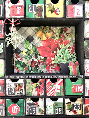
First up is this Kaisercraft Advent Calendar, this is a DIY advent calendar which provides all the pieces for you to assemble and then decorate with your choice of products. 

Kaisercraft no longer produces these calendars so if you want one grab it quickly!  

You can save yourself a bunch and take advantage of the PICK UP ONLY pricing if you're in Calgary!

I painted all the pieces, excluding the boxes, with black acrylic paint and then assembled. 

The individual boxes are assembled and covered with Christmas Spectacular 2023 6x8 papers, Scor-Tape and liquid adhesive.


After covering the boxes with patterned paper, I sanded the edges and inked them with Vintage Photo Distress Ink, you can use any dark brown ink for this. 

The date numbers are a combination of fussy cut and trimmed numbers from the Christmas Spectacular 2023 Ephemera Ticketed


Boxes are also embellished with the Washi Tape Postage Roll, Chipboard Set and Acetate Foliage.


The centre portion is covered with paper trimmed from the 12x12 collection pack (background and word strip). Hanging holly and potted tree are from Laser Cut Outs Greenery. The present is fussy cut from the Laser Cut Outs Greenery packaging. 

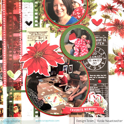
Next up is this layout which is based on this card sketch from Scrapbook and Cards Today.


I love how many fun, coordinating products 49 and Market offers for each of their lines!

The background is from the 12x12 collection pack which I trimmed and matted on a black cardstock base. The photos are cut into circles with a circle cutter and matted on cardstock cut with nesting circle dies.


The photo mats are layered over cards from the Ticketed Ephemera, the left side of the layout holds borders of Washi Tape Roll-Postage along with Film Strip Frames.


I've also added Acetate Foliage, pieces from the Chipboard Set and a heart and dot from the Wishing Bubbles & Baubles.

Thanks for stopping in!

Saturday, October 14, 2023

Cocoa Vanilla Studio - More Happy Days

Here to share some more Cocoa Vanilla Studio, Happy Days goodies from the Scrap Shotz shop and how they are shaping up into summer loving layouts from my scrappy space! 

For a peek at my first few pages with this amazing collection, pop over to Cocoa Vanilla Studio - Happy Days. Now let’s get to my newest layouts … 

Embrace The Alphas


For this layout, I reached for the Cocoa Vanilla Studio - Happy Days, Chipboard Title Stickers. I love the doodled look of the alphas and wanted to use as many as I could on a layout - so decided to use them as my background! 

I prepped this pattern paper from the collection with some black splatters. I also added a few random texture stamps and phrase stamps from my stash around the edges using Paper Rose Studio, Premium Dye Ink - Intense Black. This creates a sort of frame for the layout and love how it draws the eye to the middle of the page. I then used Ranger Ink, Distress Ink in Black Soot and one of my way-too-many stencils from Vicki Boutin and shaded in some colour in the middle of the page to anchor the alphas and my photos. I added a few small touches of the stencil to the edges of the page too. 


From there, I picked my favorite titles and spelt those out across the middle of the page - using a ruler to make sure they stayed straight. I wasn’t worried about covering up some the titles with my photos, that’s part of the fun. I did put the titles a little off set though and added the heart chipboards in between for a touch of colour. 

I then added two small photos, with a few collection patterns layers behind, and then just tucked and layered the florals from the Cocoa Vanilla, Happy Days - Floral Ephemera in and around the photos. My final touch was a couple little tucked tags with black/white twine and the collection die cut butterflies. 

All The Pattern Paper 


For my next magic trick (ha ha), I reached for every single pattern in the collection - they are all so pretty! 

First, I had to create my background. I cut down a 12x12 piece of cardstock to 11.75x11.75 and backed it with the cut apart pattern paper. I like how the cut apart has so many different colours and patterns making the edge of a layout a lot of fun. I used Ranger Ink, Distress Ink in Black Soot and a paw print from Peartree Cutfiles to add some paws to the background, and matched some Distress Inks to the Happy Days collection to add some small splatters around the paws. 

Now let’s get to the pattern paper! First I cut 3 pattern pieces in about 6.5 wide and 9.5 high; used a white journal pen to quickly and messily outline the edge then layered and titled them so just edges of each were peeking out and dropped those in the middle of the page. I reached for my 4 photos and added a layer or two of pattern behind each - also tilted and outlined in a white journal pen. I dropped those down on the larger pattern a little messy too but generally in a grid pattern. No straight lines on my layouts. 


For the final touch, I cut a few thin circles from the pattern paper and tucked them behind the top right and left bottom corner photos. I used the circle to anchor my title from the chipboard alphas and tucked in a few of the florals too. I used the same white journal pen to add some white lines to the leaves of the floral bunches. 

I had such fun with this Cocoa Vanilla collection - definitely one to add to your shopping cart for those summer, hot vacation or everyday playful photos! 


Wednesday, October 4, 2023

Simple Stories Here and There Layouts

Hello! Today I have two scrapbook layouts featuring the Simple Stories "Here and There" Collection.

If you did any traveling recently, this will be the collection for you! The main colours are dark blue, dark orange and pink. They really make light and bright pictures jump off the page. The shop has the kit and many embellishments available.


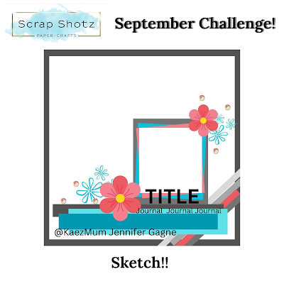
The first layout was inspired by the September challenge sketch in the Scrap Shotz Facebook group. I tend to have a hard time leaving white space on a page so this sketch was good for forcing me to use only one corner of the paper. 

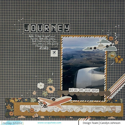
To start, I double matted my photo. Then I cut some strips of paper and used a cardstock sticker for the strips at the bottom. The diagonal paper came in the kit but I added a piece of ribbon for dimension. The flowers are fussy cut from one of the papers. The rest of the embellishments are chipboard stickers or cardstock stickers. The final touch was to use a white pen to journal and then splatter some gesso.


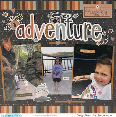
My next layout was built around the title. I used my Silhouette Cameo to weld together the letters from the font. I backed each letter with a different colour from the striped paper in the kit. It always takes me so long to do but it was worth it. This page has more cardstock stickers for embellishments. I kind of cheated with the photo matting and just put strips of paper down the sides of the photos. Overall, I'm glad I got three more large pictures from our Wisconsin Dells trip on a layout!

That's all for today. Have fun scrapping!

Friday, September 29, 2023

Cocoa Vanilla Studio - Happy Days

I don’t know about you but I am not ready to let go of summer just yet! I love a good sweater and a warm pumpkin spice latte as much as the next crafty gal but I would also take another month of summer if someone asked me. So I have decided that playing with the Cocoa Vanilla Studio, Happy Days goodies from the Scrap Shotz shop will keep summer alive in my scrappy space. 

I love the happy theme of this collection - sunshine, rainbows and happiness! The classic goodness of a Cocoa Vanilla Studio collection. For the layouts below I had the following goodies on my desk: Happy Days Collection Pack, Happy Days Title Stickers, Happy Days Ephemera, and Happy Days Floral Ephemera.  

Ok here is the fun I had ;) 

September Sketch Challenge 

For my first layout I played with our September Sketch Challenge. I love the sketch’s focus on the lower right of the page but also the touch of design across the bottom. So classy. 


This sketch design gave me a perfect opportunity to use this word pattern background - I knew the busy pattern wouldn’t steal the show with a single focal point on the lower right. Instead of the straight lines of the sketch, I let the rainbow curves of the Happy Days collection guide my design. 


A black and white photo made sure the ephemera really popped off the page and didn’t draw attention away from the amazing florals embellishing my photo. I will add my journalling to those empty tags along the bottom (in my own hand writing!) before I drop this one in my 2023 album. 

If you get a chance to play with the sketch, drop a photo in the September challenge album on the Scrap Shotz Facebook Group for a chance at a prize! 

Grunge Up Those Rainbows 

I love Cocoa Vanilla Studio’s bright and fun style but I really, really am a grunge-girl at heart. So I decided to ‘grunge up’ the rainbow. 


I used my black journal pen to messily trace the lines between each of the rainbow colours. Then I added a few spritz of water to some Tonic - Nuvo Crystal Drops in Black Ebony and used a small paintbrush to flick some splatters on the page. 

I printed my photos in 1x2 to make a wonky photo strip down the right of the page - I added at least a couple different patterns from the Collection behind each photo for some depth and contrast to the rainbow. I added the fun sketched frame from the ephemera pack to draw attention to my main photo and the flags from the pack as well in and around the others. The phrase stickers I added to bring some white to the layout so there was a place for the eye to rest on all the busy! I will add journalling in a column to the left of the photos before putting this one in my Scotland Trifect 2023 album. 

Inspired to Doodle

I had such fun with this layout! First, I took out my stash of Lindy’s Stamp Gang - Magicals from the shop and the striped rainbow pattern from the Collection and matched Magicals to each colour section of the stripes. Then I used the Magicals, mixed with a bit of water, and the packaging technique to splotch the colours next to the corresponding colour down the middle of a white 12x12 cardstock. I ripped the stripe pattern for the left hand side of the page. 


Before adding my photos and ephemera, I used my journal pen to trace the lines between the colours on the stripes, added some black splatters and a few random stamps here and there to add to the ‘mess’. 

I printed 6 photos for this layout, 2 are 2x3 as the feature photos and the other 4 are 1x2. I backed the photos in white to create some space between the photo image and the colourful background. For the larger photos, I added a couple of Collection pattern papers behind too. 


Liking the doodle look of my journal pen on the stripes, I decided to keep going and create my own leaves to pop out behind the florals ephemera pack goodies. To make these, I literally doodled loops connected to a line on white cardstock and then fussy cut them. I like the pops of white/sketch look with all that colour. To make the florals match the doodle look a little more, I also doodled some lines on each flower. 

I am off to play some more with his amazing collection, stay tuned for part 2 … 


Monday, September 11, 2023

49 and Market for Travel Memories


Hi y’all! Brande here sharing some travel memory projects brought to you by the amazing inventory of 49 & Market goodies in the Scrap Shotz shop! 

I used the Vintage Artistry Everywhere collection as my go to kit for these pages adding in some goodies from the Vintage Bits and Essentials collections too. 

Loving the Film Strips 


I love the film strips that 49 & Market have designed! I find myself designing a page then before adhering everything down I decide to also tuck a few film strips in behind and it’s next level! That’s what happened for this one. 

I started with the pattern paper and added a bunch of the messy rub ons, some splatters and a cluster of photos with a few embellishments was almost where I stopped .. then the film strips happened! One of each colour which then inspired the little circle chipboard embellishments to finish it off. Next level from my original vision. 

Words for the Win 


The Vintage Artistry Everywhere Rub-Ons come with a sheet of the most fantastic travel / adventure / explore the world words. I used a bunch of them to frame my layout! I tried to make a few a little off the page and a few fully on the page - sort of mimicking a pattern paper look. 

Then I added some splatters and a stencil pattern with Tim Holtz Distress Ink in Unchartered Mariner. I used this colour to also inspire the embellishments - adding mostly blue touches here and there, and of course more of those amazing film strips! 

Forced Perspective 
 

For this layout I was inspired by the geo tags in the 49 & Market goodies. I love that they point to where you were, where you want to go a map .. or in this case, where the eye should focus on a layout. I cut the black/white pattern paper on this layout  to mimic the bottom of the geo tag that is sitting there all pretty in the middle of the page. 

From there, I created a cluster of small and even smaller photos, added some embellishments to connect all the photos and a few circles cut with the 49 & Market pattern papers. I repeat stamped the word happy over and over in black and coordinating Distress Inks (worn lipstick, twisted citron) behind the photo cluster. 

If you had the pleasure of seeing the Scrap Shotz crew at the Scrapbook Carnival in Edmonton and Calgary this year you may have seen these layouts on display.  

Thanks for swinging by!