Does your family play a lot a games and do a lot of puzzles? Mine sure does!
Anytime we are together - no matter if we are in the dining room or a table at the pub - there is some sort of game and most definitely a selfie of us playing. We do this so much, I have a whole bunch of photos waiting to be scrapped.
Simple Stories, Family Fun collection I picked up from the Scrap Shotz shop to the rescue. This collection has everything you need to scrap games and puzzle nights. From board game pieces to video game sticker or arcade and bowling and mini golf die cuts and more. So much fun!
Sorry, not Sorry
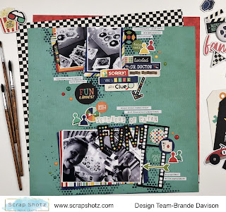
For my first layout I grabbed this awesome teal pattern paper called Your Turn from the collection as my background. I used some
Tim Holtz Distress Ink in Chipped Sapphire with a Peartree Cutfiles Stencil to give the layout a touch of mixed media. I liked that the stencil looks a little like the Connect 4 Game. Remember that game?
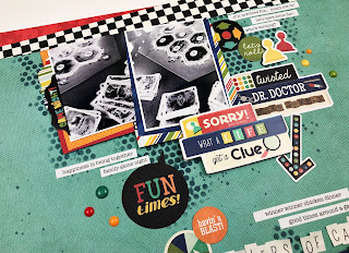
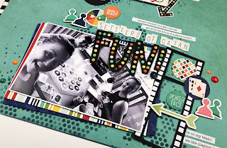
From there I created a top and bottom of the page cluster - focusing on layering all the things behind a 4x6 photo of us playing Settlers of Catan (such a great game!) on the bottom of the page and then a couple of smaller photos of the game on the table at the top of the page. I tied it together with an arrow and the title in the empty space between.
This collection is full of game board related stickers, die cuts and clipboards - so easy to create fun, themed clusters!
All the Words
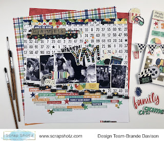
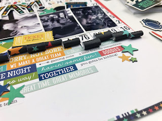
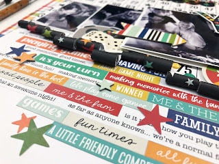
For my second layout I wanted to try two techniques. Using the word and phrase stickers from the Collection Kit sticker sheet and sticker book, and I wanted to try the paper rolling touch I have noticed on Instagram lately. Done!
I started with the pattern paper called Good Times. I cut along the lines of the number rows from bottom to about halfway up the page. Then using the end of a skinny paintbrush rolled each of the strips up - making sure the rolls were at different heights on the page. I used a little tape to keep them in place.
Then I secured that on white cardstock and then created a grid of word and phrase stickers on the bottom half. Making sure the design started right below the rolls of paper and not worrying about covering the whole white space. Where the stickers didn’t quite line up, I added a chipboard, sticker or die cut star to hide the oops.
From there all of my focus was on the paper rolls. I added my photo and just tucked and clustered a bunch of die cuts, stickers, and chipboard to create a nice little mess of fun! I love using a large photo to draw the eye and then a bunch of small photos to add more details.
Triangles for the Win
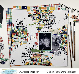
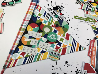
For my final layout I was inspired by a throw back Let’s Get Sketchy sketch - 4 triangles on each edge of the page to draw the eye to the centre where the photo sits. I thought the border of triangles would be a great anchor for loads of goodies! Sure was!
To start, I grabbed some white cardstock and used that same Peartree Cutfiles stencil and my most favourite mixed media paste,
Picket Fence Paper Glaze in Black Pansy, to add a little black texture to the background here and there.
Then I created 4 triangles using 3 layers of the pattern paper each. I adhered these on the middle edge of each side of the page creating a focus point in the centre - where I placed my photos! From there it was all about adding in all the mini-golf related die cuts, chipboard and stickers. So many to choose from!
I really cannot believe how much fun it was creating these layouts - the collection is so easy to play with and it was great to relive these awesome family moments.
If you play Quirkle or Uno, master the 1000+ pieces puzzles or have fun at arcades or go-carts or mini-golf … you just might need the
Simple Stories, Family Fun collection. Lots of goodies still in the shop ;)

